Reformulation of a historic building, for a flexible, interactive work environment.
Before the Berlin-based online mail-order company's locations were redesigned, a corporate architecture was developed in 2012, which was then used as an architectural and creative model across locations.
The landmarked, redbrick Knorr Bremse AG building on the north side of the Spree at Berlin's Ostkreuz has served as a fashion location since mid-2013. The former site of the School of Economics and Law (HWR) was completely renovated and redeveloped for Zalando together with Berggruen Holdings in 2012/2013.
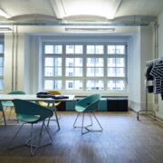
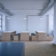
When the space was restructured, a traditional office atmosphere in a cell configuration with hallway areas was deliberately avoided in lieu of an emphasis on recreating an industrial atmosphere. The result was wide rows and common areas with communication zones and open sight lines within the space. The building's original character was reformulated by exposing historic ribbed slabs and technical fittings and by using robust parquet flooring.
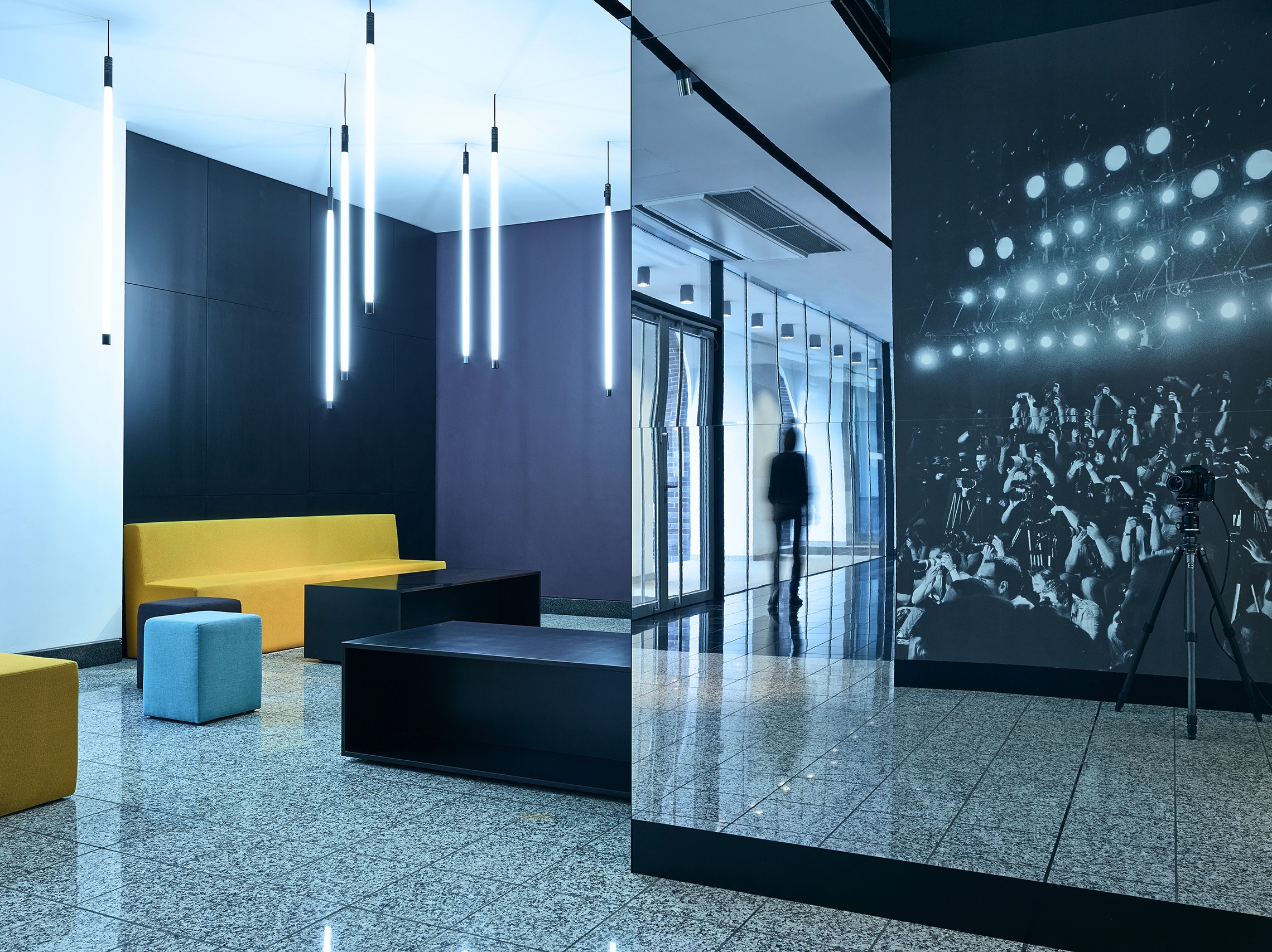
Relocating the glass facade has given the entry area the look of a wider room, an impression that was representatively enhanced by a wall design that creates an illusion of space with high mirrors in combination with fashion show motifs. This image motif was taken up again as an artistic element in the elevator rotunda by means of photographic wallpaper and recalls the principle behind old phenakistoscopes. All of the photo motifs were taken from the award-winning book series The Berlin Fashionweek Photodiary™ (www.thephotodiary.de) published by Joern Toellner and Marc Schuhmann. The books provide a behind-the-scenes look at Berlin Fashion Week – photographed unadorned, true to life, and analog.
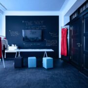
Black floor tiles, vertical neon torches, and colored seat upholstery in the waiting areas complement the concept behind the space. Equipping the workstations with workbenches specially developed for Zalando plays on the association with factory workshops. The plywood tables and chairs in the break areas complement the basic design idea for a flexible, interactive working environment.
