A new office in a varied mix of styles.
Resonate Interior Architecture were approached by Shionogi Limited to assist them with the design of their new exciting hub in Central London. Moving from serviced offices in Hammersmith to 33 Kingsway Holborn, was a fantastic opportunity to create and brand their EMEA headquarters having launched their EMEA operations.
Establishing the new headquarters in 2012 was an important milestone for Shionogi as it further expanded the organisation to the global platform. Shionogi Limited serves as a hub for development and drive the management of new innovative medicines across Europe, as well as the Middle East and Africa. The areas of focus for Shionogi Limited include Infectious Diseases, Allergies, Oncology and Women’s Health. The new EMEA headquarters in London will also support alliances between Shionogi and academic centers in Europe and lead the expansion of the Shionogi Science Program in the region.
The brief provided to Resonate Interior, was to create a home from home environment with personality, rather than a corporate office feel. To incorporate meeting rooms and Welcome area that both represented the style of Shionogi and acted as a nucleus for the new workforce that was coming together within these premises.
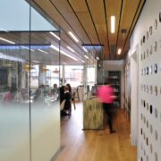
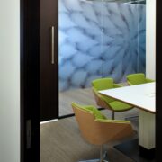
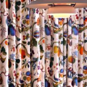
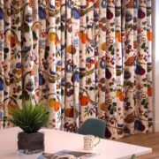
The design was therefore an eclectic mix of both modern and traditional craftsmanship, imbuing style and warmth. Many of the finishes were specialist, with every design feature having purpose and depth. From the hand-painted Swedish curtains acting both as a sub-division of space, along with an acoustic barrier, to the beautiful twigs set in glass partitions acting as wall art, as well as a semi-transparent screen to delineate spaces.
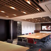
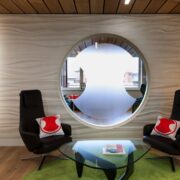
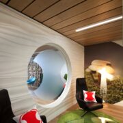
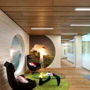
Shionogi did not want a traditional reception area but a welcoming space, the circular logo was set within the wall replicating the logo design and also the very typical Japanese circular window motif. This was framed on two sides with polished plaster - armourcoat representing nature and flow. The inset rug set as a shadow of the window. The only corporate identity in this area being the bespoke cushions with client logo on. Rather than selecting an austere palette of black and white, a more natural scheme was brought together with wide oak timber boards on floors and ceilings. These juxtaposed with dark framework and smoked oak doors gave a sense of heritage and solidity.
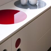
Meeting rooms were designed to be inviting and flexible, quirky touches in furniture introduces an element of the Shionogi red in chairs and accessories.
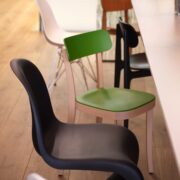
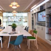
The hub or heart of the project is the kitchen table; 24 differing chairs around a trestle table with library, snug and kitchen area adjoining. Plants and fun accessories softening this space to provide a sense of home.
This is a place for interaction, reflection, and sustenance. Located next to the external balcony allowing employees to migrate outside to enjoy rooftop views of London. This area really represents the firm and their aspirations.
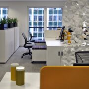
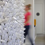
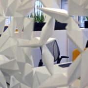
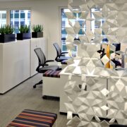
The work area has also been carefully thought through and detailed by Resonate Interior, using white loop leg workstations by Senator with bright yellow screens and long padded pedestals upholstered in Paul Smith fabric. Again the workspace was to take on a more family feel through the use of aloe vera plants (one of the herbs used in the pharma industry) dotted around the office. The area is subdivided by a beautiful diamond shape 3 Form screen, allowing an element of privacy from one team to another.
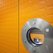
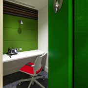
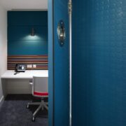
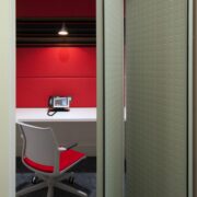
The open plan area is supported by 6no. Bespoke colours and finishes has been used for each of the Quiet rooms. These are little retreats of calm away from the busy hub-bub of the office space. By means of padded wall panelling, Arne Jacobson lights and Paul Smith fabric again these have a quirky personality each to their own. Concertina doors are lined with vinyl wall tiles for extra depth.
Resonate were fortunate to be involved in every aspect of this project, from design concept through to completion on site, selecting accessories and plants, to taking of photographs for their corporate identity and large wall graphics.
The spaces are individual with a strong aesthetic and more than a nod to many European designers but a subtlety of Japanese heritage in the background. This is almost a domestic environment based in an office where people will create, innovate, make strong friendships and thrive in their working environment.
“Having grown from one person working from their kitchen table to a workforce of over 40 people it was time to end the start-up phase of our development and move to our first “home” that encouraged and better supported our collaborative work style. Being spread between various offices within the serviced environment had been taking its toll and we were looking for something that brought us all together, felt approachable and welcoming and created a welcoming multi culturally company heart for Europe.”
