Industrial character meets restrained yet robust design
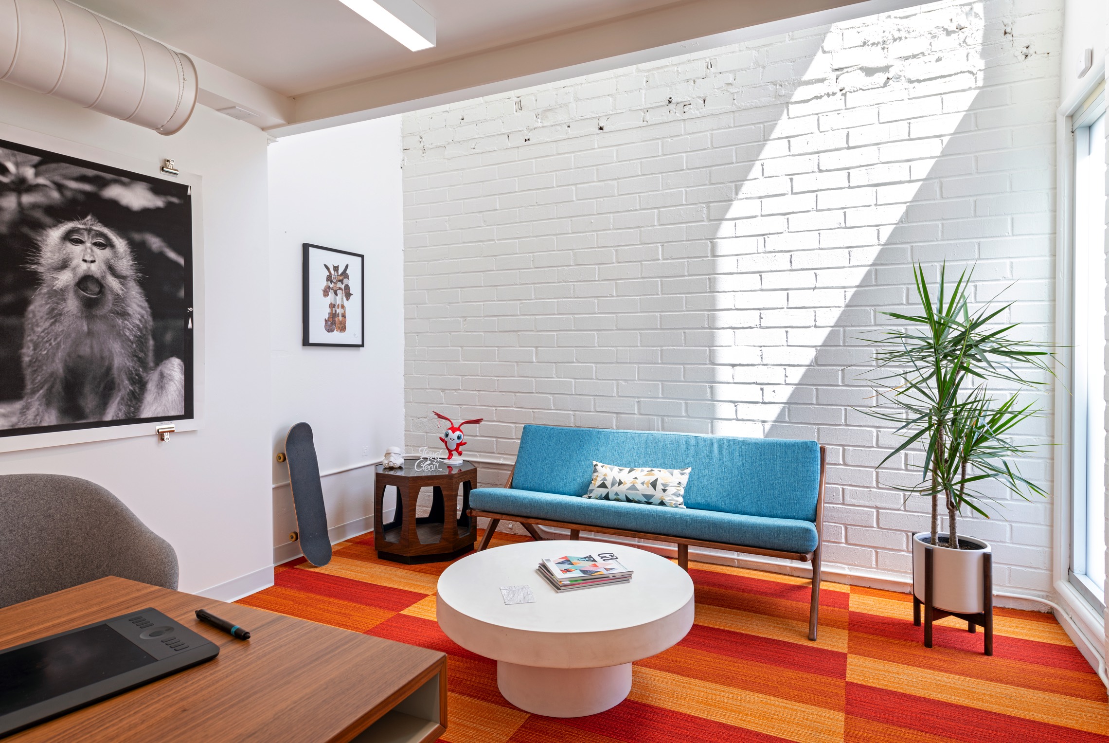
The client is a young, independent motion graphics and animation studio. They intended to move into a 604sqm warehouse and the design brief required it be transformed into a creative workplace. It also required a new partial floor to be added within.
The existing shell was once a garment manufacturing warehouse with significant shortcomings in building, life safety and zoning requirements. The clients additionally needed the design team to work with a multitude of agencies in bringing up the warehouse to current land-use, building, fire, accessibility, energy and life safety code needs.
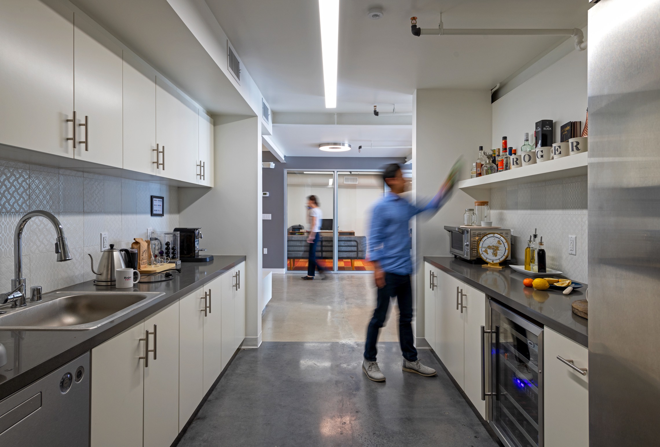
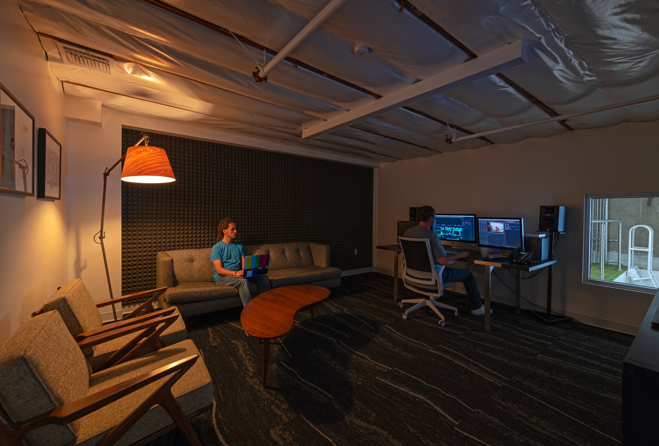
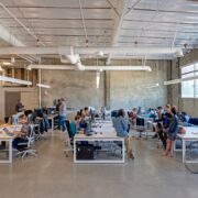
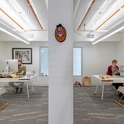
The program brief needed to address dedicated work areas for 30 animators, 6 producers with 4 private offices, 3 editing suites, 2 conference rooms, 3 new restrooms, a large and high clear area for a green screen mockup shoot area, a central pantry, a lounge and a flexible work space all in 6,500 sqf of an existing shell.
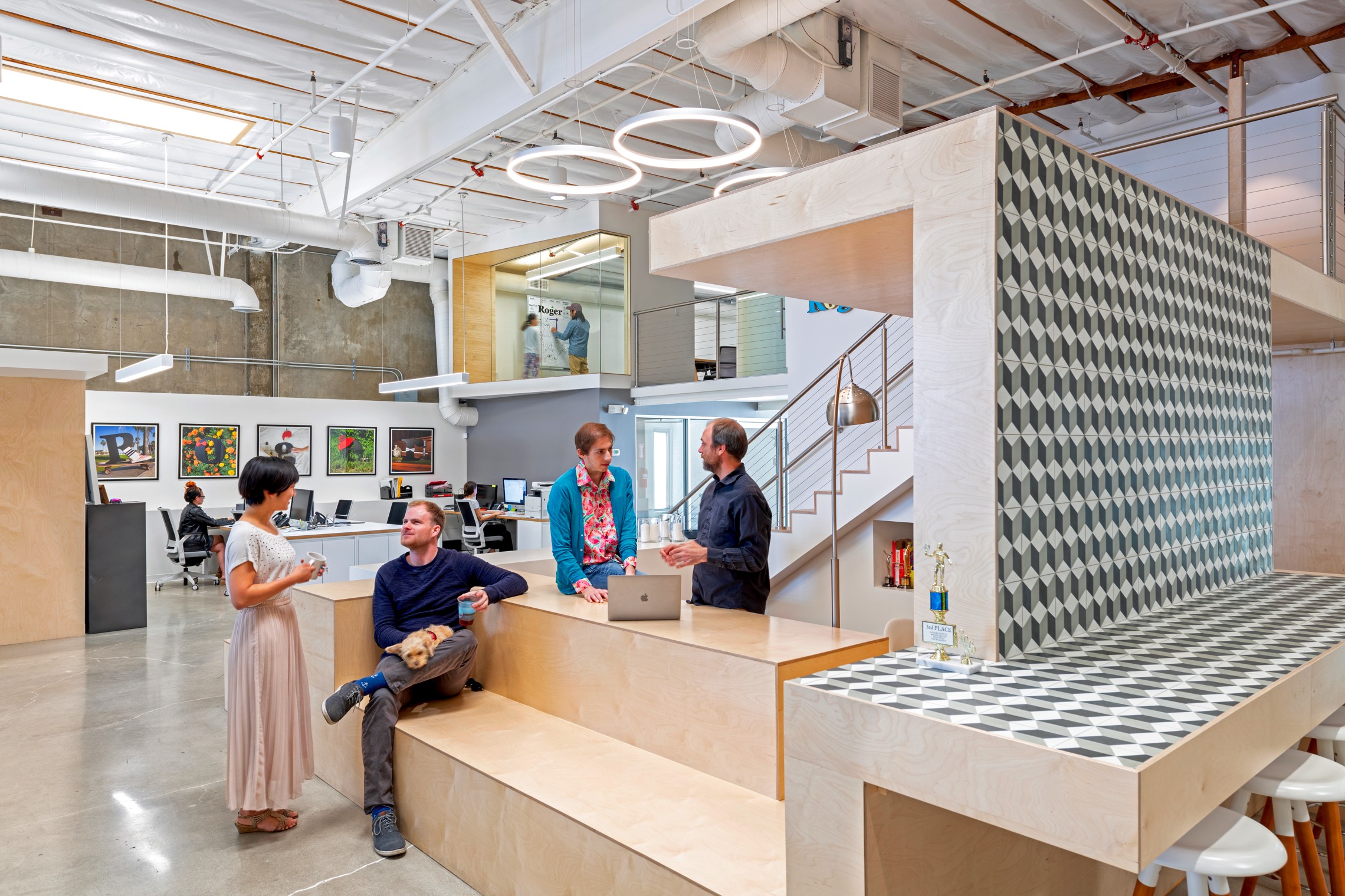
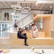
Animation and video culture is as whimsical as it is technologically intensive, therefore our approach emphasized this mixing of two distinct work needs. The design proposed a continuous loop around a central armature customized (nicknamed The Pit) for meeting, working, eating and lounging needs. To address the industrial character of the space architecturally, we sought to go beyond merely retaining it, into emphasizing its raw physicality.
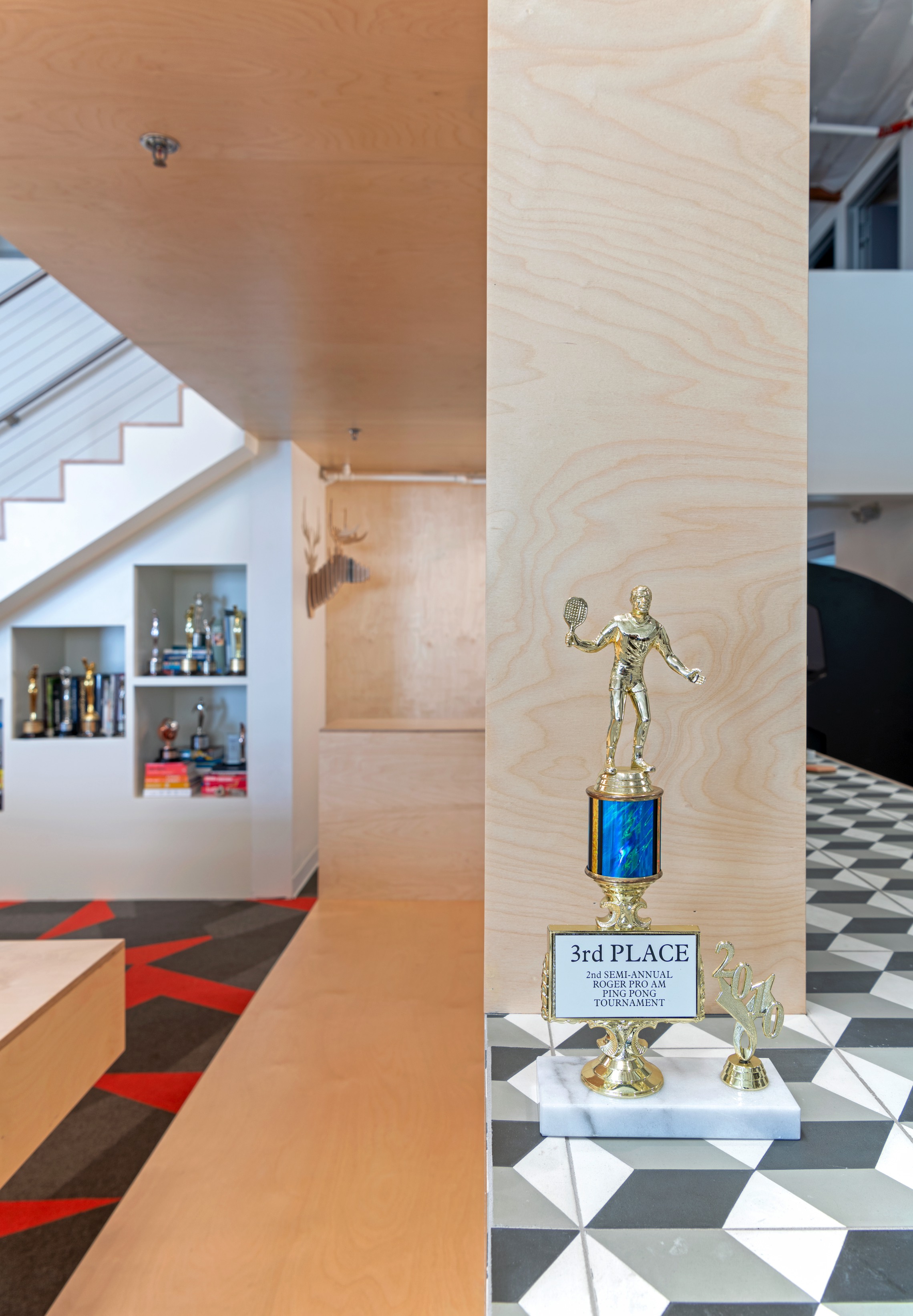
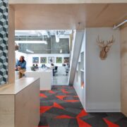
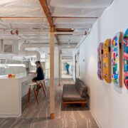
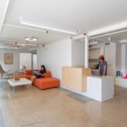
The Pit is an orthogonal multi-faceted armature and was custom designed as an open shell with laminated plywood and light gauge framing. The surrounding loop houses a reception area, a lunch/ work countertop that dovetails into a seating area, bleachers for visual artists facing the producers as well as an library and display shelving system.
The area was located in the center of the warehouse to spatially divide private and public areas, and mediate both the vertical and the horizontal. Within this loop is a central pantry accessible from both sides.
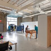
Adjacent to this area is a staging zone for photo shoots, sized for a green screen shoot mockup area. It was located adjacent to a glass garage door. This allows for heavy loading access, semi-open use and entertainment needs.
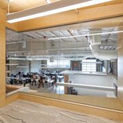
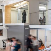
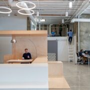
The mezzanine houses the post-production portion of the studio, including acoustic editing suites and recording areas.
A ship ladder allows occasional access to the rooftop. The restrooms also accommodated an accessible shower space, since many video creatives work nocturnal hours.
The materials used to create the majority of design elements are a combination of architectural grade plywood and lacquered board panels, all set on light gauge steel frames. The existing concrete main floor was buffed, polished and sealed. The mezzanine was engineered as a slender steel frame structure with thin profiles due to significant height constraints and clearance limitations.
A key challenge designing for this space was the creation of a diverse settings within a relatively modest floor space. Another major challenge was working within interior shell height limitations in order to surgically insert new foundations, framing and floorplates.
The design team looked upon the overall project as an opportunity to demonstrate the diverse set of skills architects and interior designers must bring to such projects and help benefit the larger built environment we operate within.
