A limited space highly efficient exploited
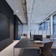
"bw LIVE is" a Munich event agency that out-grew its previous office premises. The owners found their ideal office space in Werk3, the former site of German food manufacturer Pfanni, which has been transformed into a creative hub. The site is in the fashionable east railway station district and the owners were instantly captivated by the charm of the building’s in- dustrial heritage and its 4.30 metre-high ceilings. The fact that the site was somewhat too small for the company’s requirements became a challenge for the interior architects instead. An area of 320 m2 was designated to house notonly 14 workplaces, two discrete offices and alarge conference room for the whole team, but also a spacious kitchen/dining area. Individu- al team members regularly take turns in cooking for the team and this practice has becomea firm part of the corporate culture. Another request was that the existing USM tables should be integrated in the design, and there was a strong wish for a reserved design as an antithesis to the company’s daily operations – the noisy entertainment business.
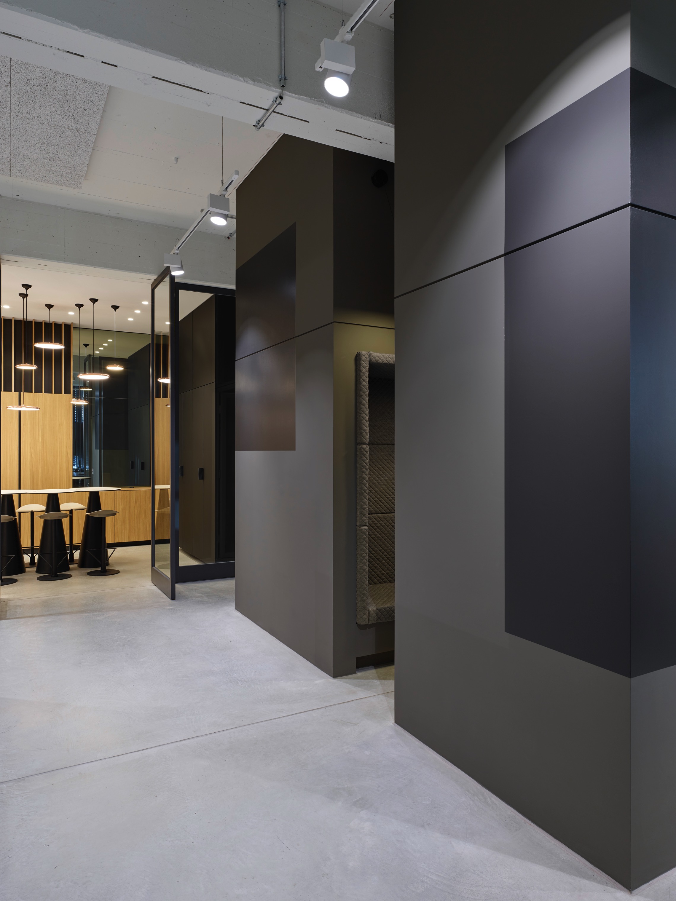
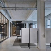
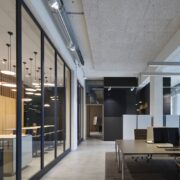
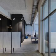
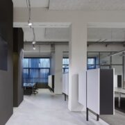
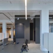
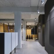
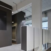
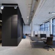
The office is presented in a strictly pared-backpalette of colours and materials. The muted colours and prevailing simplicity serve to un- derscore the effect of the spatial geometry with its overriding emphasis on the vertical. Three beams and a grid layout of pillars provide anatural floor plan, which was then abandoned in favour of maximum space efficiency. Howeverthe strongest break with the grid layout is almost invisible: along the central transversebeam, an almost square office with two cubes in front form a solid, floor-to-ceiling entity. Itsdark colour transforms the block into the visual centrepiece of the room.
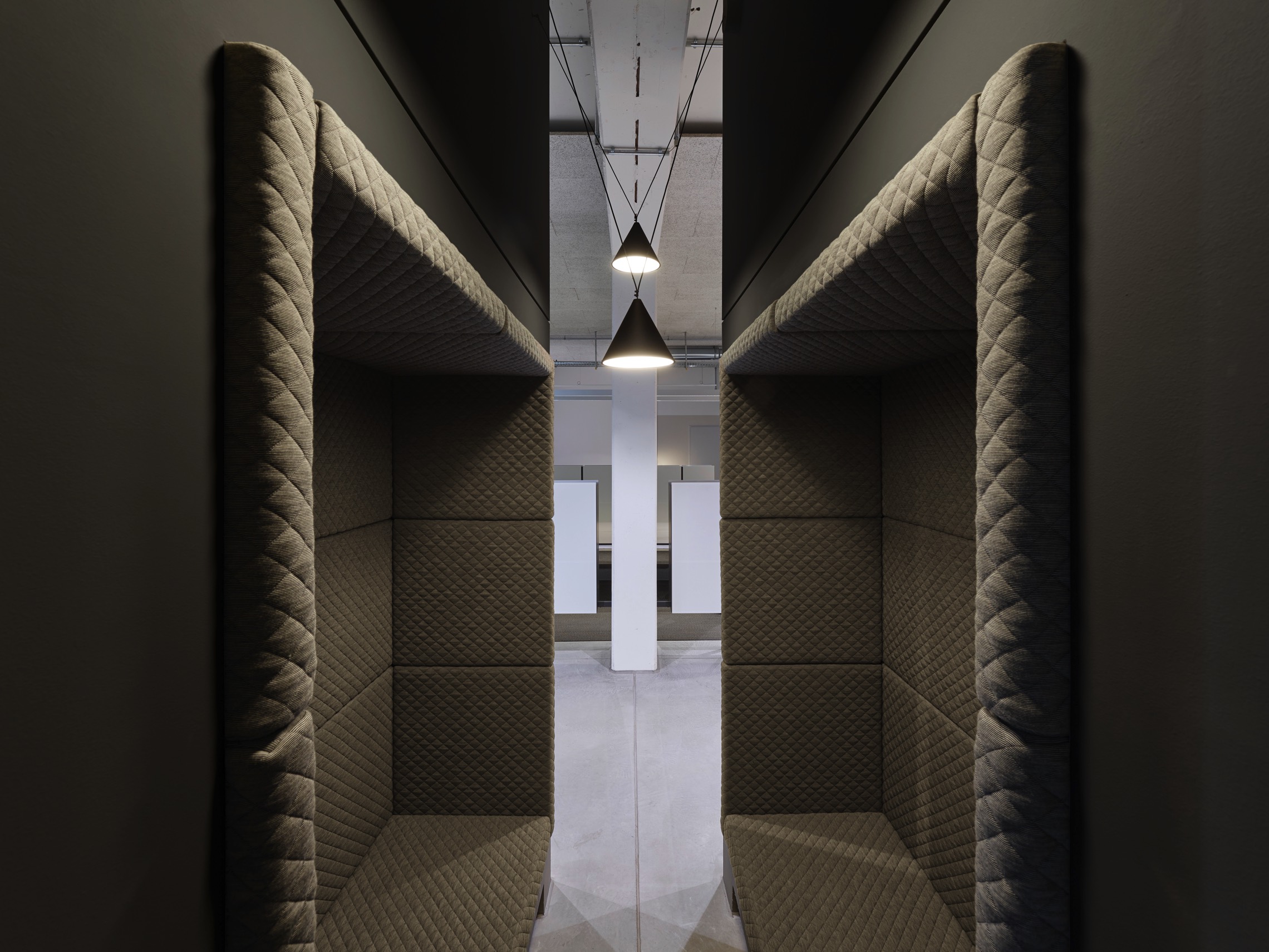
In order not to destroy this effect, all ventilation shafts and cable routes were meticulously reorganised to take the path of least visibility. The interior of the cubes conceals not only server, photocopier and archive, but also an alternative meeting space and retreat, carved out between high walls.
The seating niches are upholstered in a quilted diamond pattern, acoustically shielding the berths from the surrounding environment and creating a space for intimate discussion.
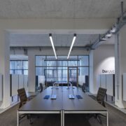
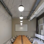
The conference room proper is directly behind this central block. The room is dominated by a 5 metre-long table top with a subtly elliptical shape. A reclaimed wood veneer gives the table its haptic properties. Above it hang Flos luminaires with their supply cables woven into three-dimensional hatched lines. Curtains allow the room to be darkened completely.
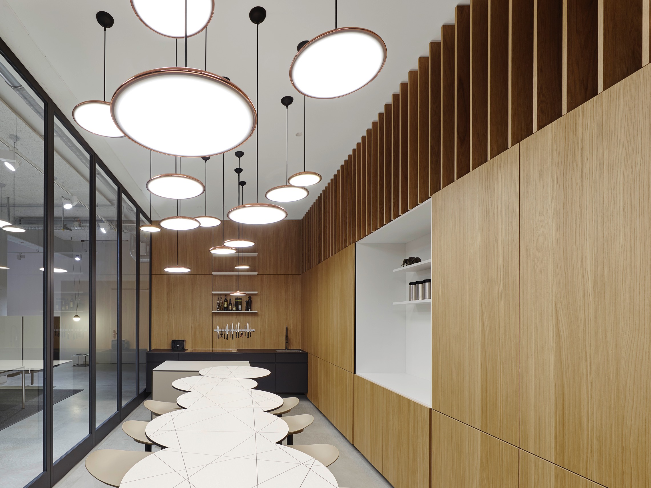
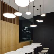
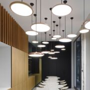
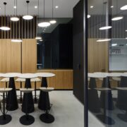
Adjacent to the conference room is the kitchen. An almost opulent effect is created by wooden panelled walls. Superimposed wooden lamellae give additional vertical emphasis and make the front of the wall unit appear light and airy. A major part of the kitchen technology is concealed behind closed doors. Only the coffee machine asserts a legitimate claim to a large niche, because of its status in the company. Cooking is done at a counter of Fenix special laminate.
The opposite wall unit is made from the same material; its matte surface transitions into a dark, mirrored corner. A high table was designed to seat every employee. Each of the seven individual elements is slightly offset from the next.
A pattern was been applied to the surface using HPL printing, allowing you to assemble the tables as you might a puzzle. The table dynamicis reflected in the ceiling of pendant luminairesabove. LED plates of two different diameters are suspended at varying heights, creating a cloud of light. The glass front to the kitchen opens up via large-leaf pivot doors.
A specially developed furniture system is used for storage throughout the space. Here too the storage space is developed along a vertical axis, which is underscored by narrow steel supports. The T-shaped units also refer to the encompassing load-bearing structures. The fronts of the units are perforated, giving them useful acoustic properties; the visible sides are executed in a darker colour. The system serves as a spatial divider in the open-plan areas and is adapted as a sideboard in the conference room.
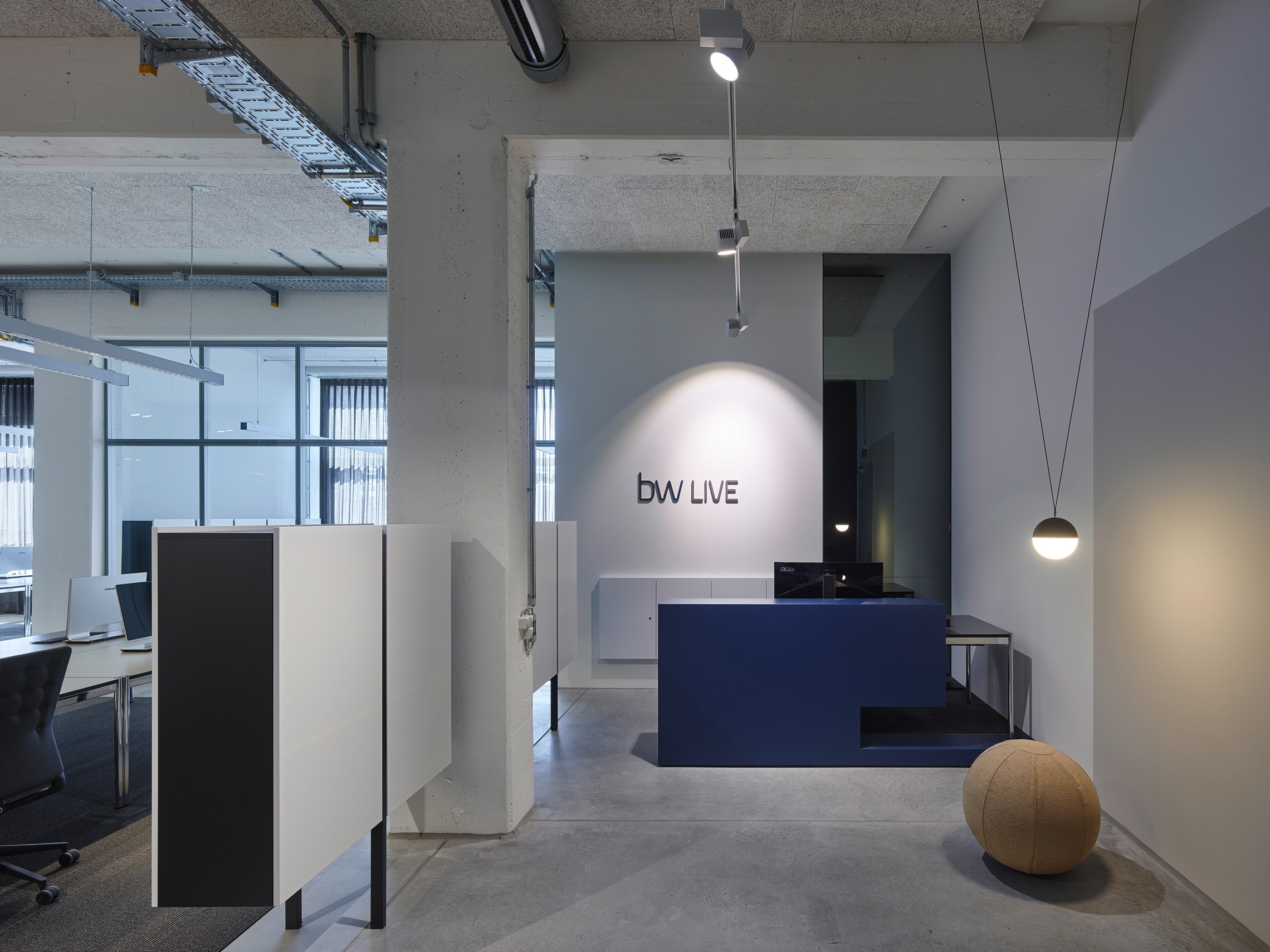
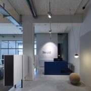
The limited space demands careful coordination of the different functional zones. Thus the corridor areas are consistently integrated into the space. The reception is denoted by a dark blue counter with a grey-tinted mirror behind.
Next to a low-hanging luminaire is a small waiting area.
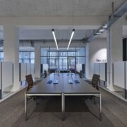
In line with the desired simplicity of the overallspatial impression, both floor and ceiling are inthe most part dedicated to function. Only the central workplace island has an underlay of carpeting to distinguish this area as a distinct unit. To acoustically counteract the predominance of visible concrete, a suspended ceiling of lightweight wood wool panels has been used. The spatial acoustics are further enhanced by curtains along the generous expanse of window.
The limited space on offer has been efficiently exploited in the bw LIVE office design. Coloursand materials fade into the background while a vertical spatial geometry takes centre stage. Opulence is only permitted where it promotes the corporate culture: in the kitchen where the whole team cooks and eats together.
Credits:
Design: Studio Alexander Fehre Innenarchitektur
Photographer: Photos by Studio Alexander Fehre Innenarchitektur
