A new working environment for a digital company
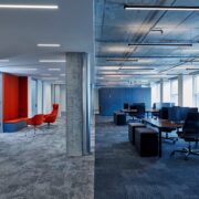
A new office space was developed for software developer Nexenio on the 6th floor of The Q, a luxury shopping centre in a prominent location in Berlin’s Mitte district. The block structure of the entire building consists of six building cores and the office spaces that stretch between them. An expansive, transparent office landscape was developed with a mix of open spaces, single and double offices and adjacent communications zones. The existing cell structure was dismantled for the redesign, with removal of existing walls and targeted exposure of the ceiling structure.
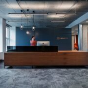
The office space consists of two sections that are connected by their own core corridor area. The main areas extend outwards from the central starting point formed by the reception and waiting areas. In accordance with the varied needs of the staff, the office was planned so different work could be carried out at classical workbenches in the open space, open or closed “quick meets”, in phone booths, the large conference room or flexible spaces with mobile furnishings.
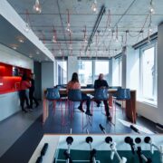
The five single and double offices are partly connected transparently to the workspace and partly accessed by means of a corridor oriented to the facade that acts as a spatial filter . By using glass elements and the principle of constantly opening and closing areas, transparent work is assured, while also maintaining discretion. The expansive traffic areas provide space for exchanges between staff members. The “quick meets” and upholstered seating niches distributed along the corridors serve as a withdrawal opportunity or meeting place for brief conversations.
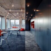
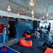
The two special communal areas – Bistro and Design Thinking – form the centrepieces of the office. They were oriented between the interior core and the facade and both have connections to their own terrace as part of the common zone. Both rooms are similarly characterised by a zone of low ceiling at the building core that contains the service units and foot traffic routes and an extensive lighting concept of 60 pendent fixtures with simple porcelain sockets in a 1x1 metre grid. A custom 15-metre-long built-in wall unit in “Design Thinking”, developed from the waiting and wardrobe furniture in the reception area, houses the library, coffee machine and storage for mobile furniture. The multi-use “Design Thinking” is available for workshops, brainstorming or presentations, but can also be used by staff for relaxation or recharging in a game of table tennis. The Bistro, with its lounge island and game area, is opposite and is used for both communal dining and informal meetings. The service kitchen and beverage storage are housed in a spatial extension of the Design Thinking wall unit.
The colours and surfaces of the office space received subdued design, which is applied in all areas. Differentiation of work and corridor areas takes place through the ceiling cladding, a lighting concept with recessed or suspended lights and changes in floor colour that identifies the interfaces between zones or separates them spacially. The dark grey tones of the floor covering and work surfaces in walnut define the open space, while the white ceiling and lighter carpet of the corridor area distinguish it from work areas. The orange, copper or red-brown colours from the company’s corporate identity colour scheme highlight recesses in built-in furniture, seating upholstery and wall panels in the withdrawal niches.
Meeting the requirements of the company’s daily business resulted in an office that permits dynamic work, thanks to its range of different work areas. As a neutral platform, it can be rearranged by the user and its openness allows it to be adjusted to the employees’ flexible work structures.
