A Place of Communication with High Design Standards.
For the Munich headquarters of hotel chain Motel One, we designed a conference and training centre, multiple office floors, a central lobby and a restaurant that is also open to the public. The aim was to identify a single design idiom to be used across all areas, which meshes with the Corporate Identity of Motel One while still possessing an autonomous identity.
Lobby
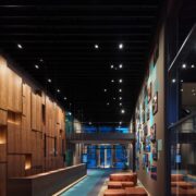
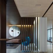
The Munich headquarters bring together the company’s head office and a regular hotel under one roof. The office space is complemented by a conference and staff training centre, as well as a public restaurant. All areas are accessed from a shared lobby. This high, two-storey space extends right through the building. Its entrances are located at opposite ends and the imposing space between is spanned by a turquoise runner on the floor and black-painted, metal lamellae on the ceiling. The reception stands at the centre of this elongated space, backed by an 8-metre-high, wooden relief wall. Opposite the reception is a brand wall and a soft seating landscape of leather cubes, providing a softer counterpart to the rectangular reception counter. Like the runner, the colour fields on the brand wall adopt the corporate colour of Motel One and combine it into a media collage of photographic and filmic hotel impressions. The long reception counter opposite is made from smoked oak, a material that is typically used in all Motel One hotels and signalises an exceptional quality of stay. The counter is illuminated from below, rendering it lightweight and almost floating. Behind the counter, a dynamic wall rises to the ceiling. Projecting wooden panels concealing useful storage space combined with recessed presentation niches give the wall an energetic feel. Motel One hotels typically feature different seating islands and the group with Arne Jacobsen’s famous egg chair has become something of a trademark of the chain. One egg chair grouping is positioned adjacent to each entrance to the lobby, clearly discernible from the outside through the glass façade.
The individual lobby elements come together to create an almost abstract living space, which conveys a strong image of hospitality and serves as a superordinate reception for all adjoining areas.
Head Office and One University
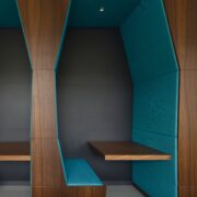
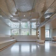
The office area comprises of three office floors and two additional floors that house the One University, the company’s dedicated training centre. The campus floors offer a variety of spaces for collective learning. With different sized conference rooms, alcoves and lounges, this area is all about communication. At the heart of the space is a large auditorium, a multifunctional space that is used for presentations and events, but is also the ideal spot for a shared break. The wide room has a friendly and open atmosphere. The light floor is made of mineral-coated screed and the walls and seating podiums are crafted from white-washed oak. A ceiling of ripple-effect, stainless steel tiles reflects the light like a body of water. At the same time, the perforations and sublayer of acoustic fleece ensure optimum spatial acoustics. The campus aura is open-minded: Bright, open-plan rooms encourage communication and learning is designed to be fun here.
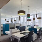
The open concept continues in the office areas. Here work benches are set around a central zone. Sideboards of different heights and colours separate the individual workstation islands. In interplay with a canopy of contrasting lights, variety and dynamism are brought to the office landscape.
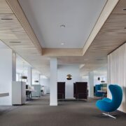
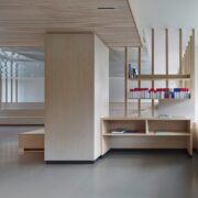
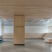
The central zones house conference rooms, small private rooms designed for concentrated work and copy stations. A wooden lamellae ceiling above the movement areas helps zone the space, as well as possessing excellent acoustic properties. A large whiteboard wall on the end walls of the room complete it; the wall and the area behind it are used individually by the units on the respective floors.
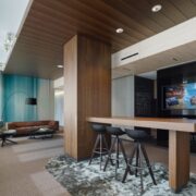
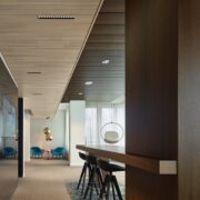
Motel One places great value on lounge areas – in its hotels and in the office. The generous zones for retreat are indicated by dark wooden panelling. Different types of seating from cosy to informal are located near the tea kitchen. The staff on each floor can exchange information on a large blackboard, whereas communication with other colleagues takes place via a media wall implemented with interactive intranet.
The work environment in the Munich headquarters of Motel One is specifically designed to connect with the hotel environment. In this way, colours, materials and furniture elements from the hotel’s Corporate Identity are implemented in the lobby and office areas. At the same time however, the company’s inner values are not forgotten: The sheer variety of communication spaces is paramount and is celebrated with the same high design standards as in the hotels themselves.
Credits:
Design: Ippolito Fleitz Group GmbH Identity Architects
TEAM
Gunter Fleitz, Peter Ippolito, You Seok Kirschenmann, Tim Lessmann, Yuliya Lytyuk, Emma Nishimoto, Mario Rodriguez, Enrique Sanz Segura, Tanja Ziegler
Lighting Design: pfarré lighting design
Photographer: Zooey Braun
