McDonald’s Innovation Center, Romeoville

Facts

Location:
Romeoville, USA
Client:
McDonald’s
Industry:
Food&Beverage
Year of completion:
2019
Size:
16,410 m²
Specials:
Innovation Space
Experts:
Studio O + A (Interior Design)

New Space for a Shop Where “New” Gets Hatched

Every MBA knows the value of a detailed business plan, but a successful business profits, as well,from its detours. The discovery you wouldn’t have made if you hadn’t left the main road is of special value to companies that have been on that road for decades. Many years ago McDonald’s built a detour into its creative infrastructure. This special facility for experimentation became a source of new products, new processes, new thinking that have kept the company at the top of its industry through a period of epochal change. After O+A partnered with McDonald’s on a new corporate headquarters in Chicago’s West Loop, it turned to the Innovation Center for a similarly fresh look at the spaces where fresh looking is the workday’s principal activity.

Romeoville, Illinois is a suburb of Chicago known principally as a shipping and warehousing hub. Since 2001 it has also been home to McDonald’s Innovation Center, a sprawling complex that serves as the company’s operational test facility. New equipment gets put through its paces here. Newkitchen processes are rehearsed and fine-tuned. It’s a space dedicated to keeping McDonald’s at the forefront of innovation, but the center itself hadn’t had a refresh in almost 20 years.

O+A’s first challenge was to pull out the improvised panels and black foam core that had turned the space into “a maze” and create the clear sightlines and uncluttered contexts that visionary work demands. But the barriers removed were not just physical. Over the years it had become the Center’scustom to keep kitchen and office operations separate and their respective staffs apart. The new Center encourages interaction in a shared café, gallery space and phone mezzanine and projects a welcoming brightness everywhere.

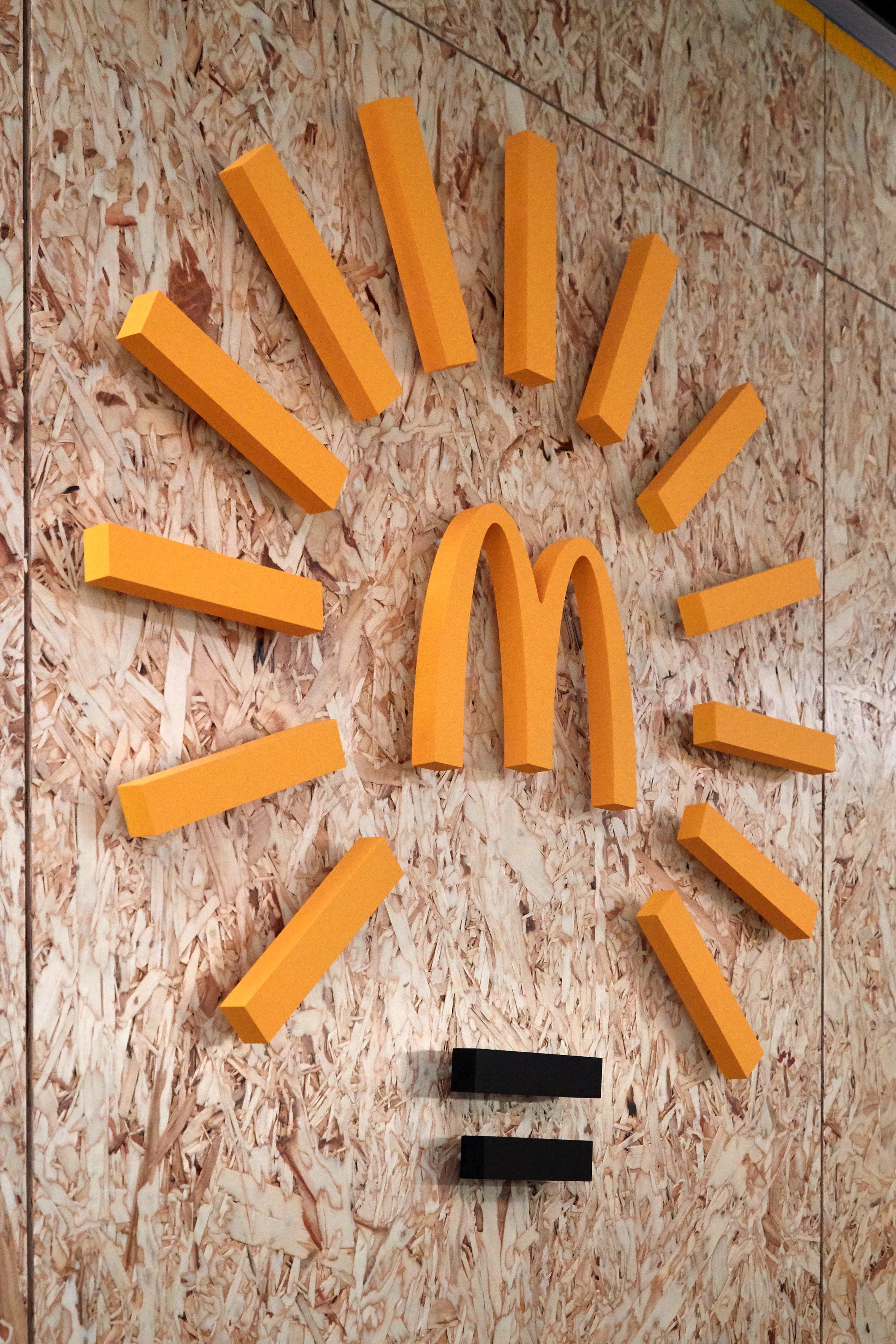
For all the ingenuity the Innovation Center has brought to McDonald’s global operation, until now it has never had its own brand logo. O+A graphic designer Paulina McFarland devised a symbol that answered the client’s preference for “a lightbulb,” while suggesting illumination specific to McDonald’s. Surely one of the most remarkable things about this Innovation Center is how successfully, over many years of practice, it has steered creative thinking through the golden arches, how it has made McDonald’s a consistent source of invention and an always relevant leader in its industry.