M Moser’s London office design, before and after COVID-19
In 2017 M Moser's London office moved to a new location to support its growth in the European market, accommodating a 50% increase in headcount over 3 years, alongside changing operational needs.
Creating a space that would reflect the brand, attract new talent, and build on a strong team culture were key objectives. The office was envisioned as a “living lab” to trial and test workplace solutions for clients’ future offices.
Prioritising employee wellbeing and sustainability from the outset, the office achieved WELL, LEED, and RESET Certification. However, after February 2020, there was a need to further raise the health standards and for the space to transform into a COVID-secure environment so that staff could return to in June.
In this project story, they discuss the original design and how it has been adapted to enable staff to return to the office in a safe and cost-effective manner.
Key highlights
- The pilot, prior to the office relocation, enabled the team to explore a variety of workplace strategies for the new interior design.
- Flexible working solutions have provided expansion of up to 50% occupancy over three years.
- The space has been adapted to address virus transmission and create a COVID-secure environment.
- The team are re-thinking how the space will be used for the remaining year’s lease, to balance staff working from home with group collaboration needs.
The workplace strategy pilot
Before relocating, the team piloted a series of spaces to explore ideas for the new workplace design. Over a six-month period, it became a place to test new collaboration settings.
With limited circulation due to a triangular floor plate, the previous office was reimagined as a “convivial workplace”. Some desks were replaced with a touch-down collaboration space, made inexpensively from temporary materials. Regularly moved around the floorplate to find the optimal location, the effectiveness of different configurations was tested.
A distinct shift in behaviour was observed, with natural cross-collaboration occurring across all seniorities and teams.
Reflecting brand identity and company culture
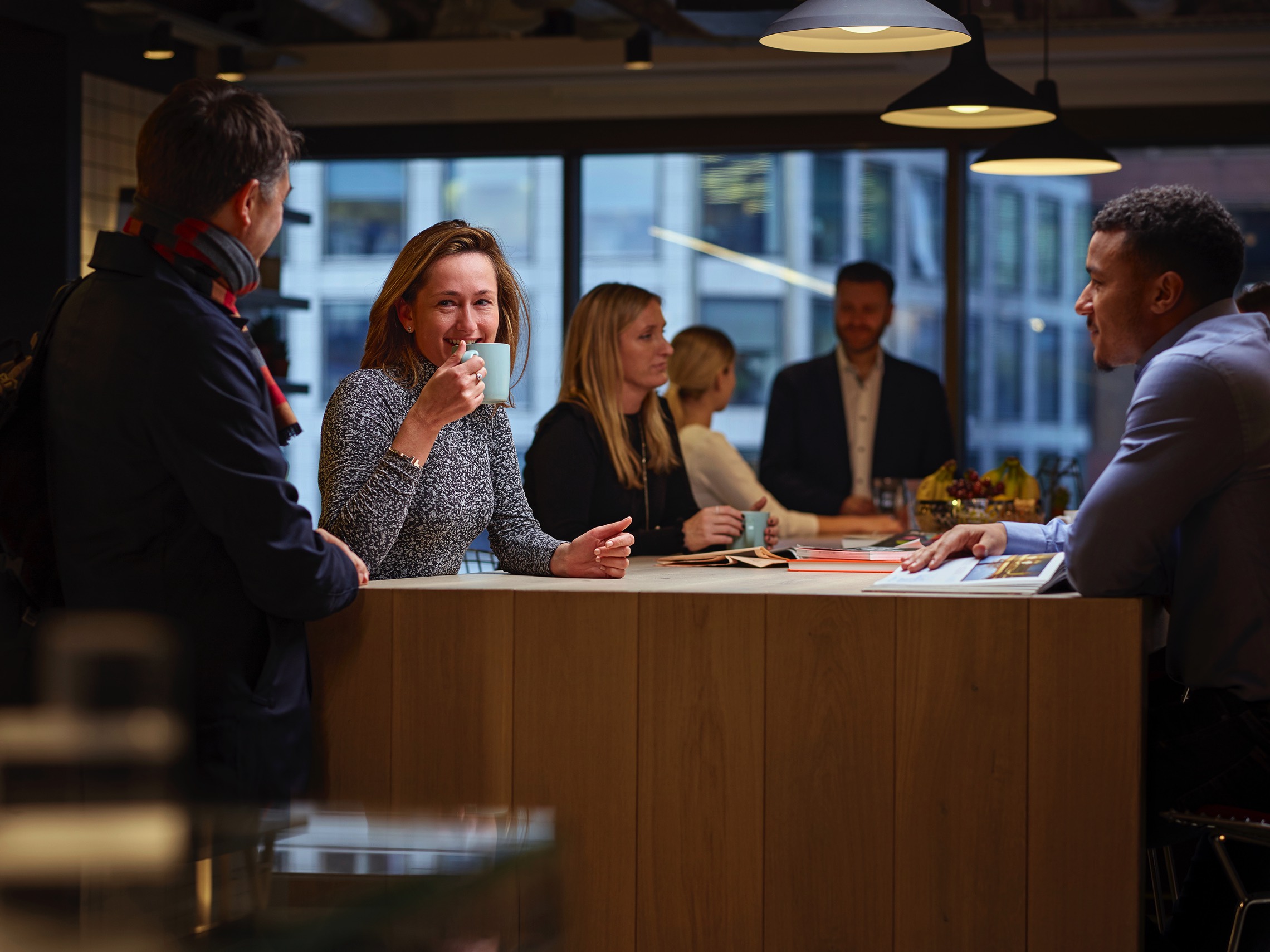
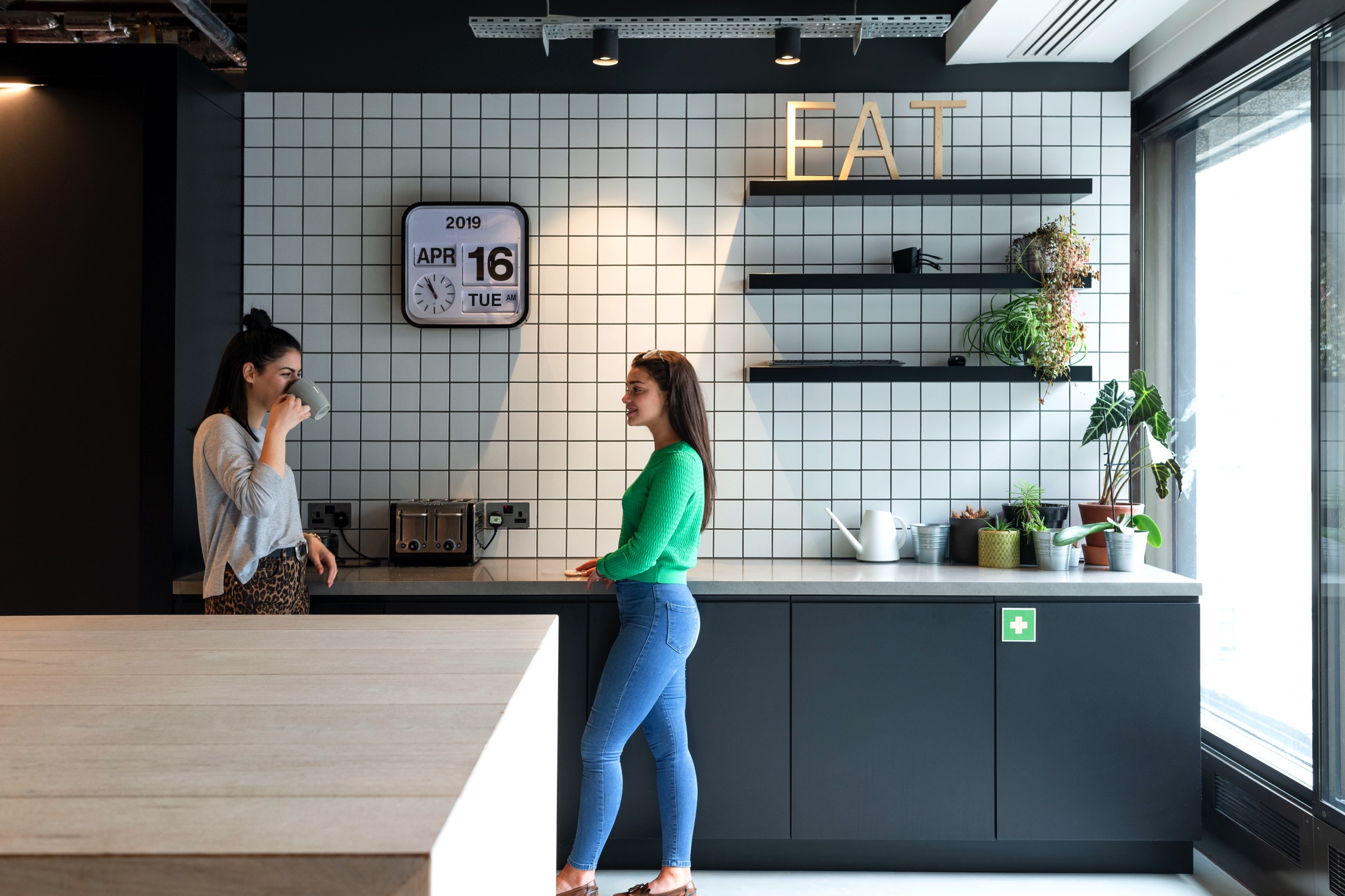
Visitors are welcomed into an energetic front-of-house, comprised of a social kitchen space and materials library. By choosing not to have a dedicated reception area, the workplace demonstrates its friendly nature and flat structure - where all staff are encouraged to greet guests. To minimise disruption to people working, the transition into the workspace is clearly defined by a portal.
Richard Fisher, Senior Associate - Design, shares “A standing-height communal area activates interaction. The social tea-point doubles up as a spacious event space, complete with a pull-down projector. It provides visibility across the open plan, encouraging an accessible culture and approach to work.”
Elevating brand advocacy
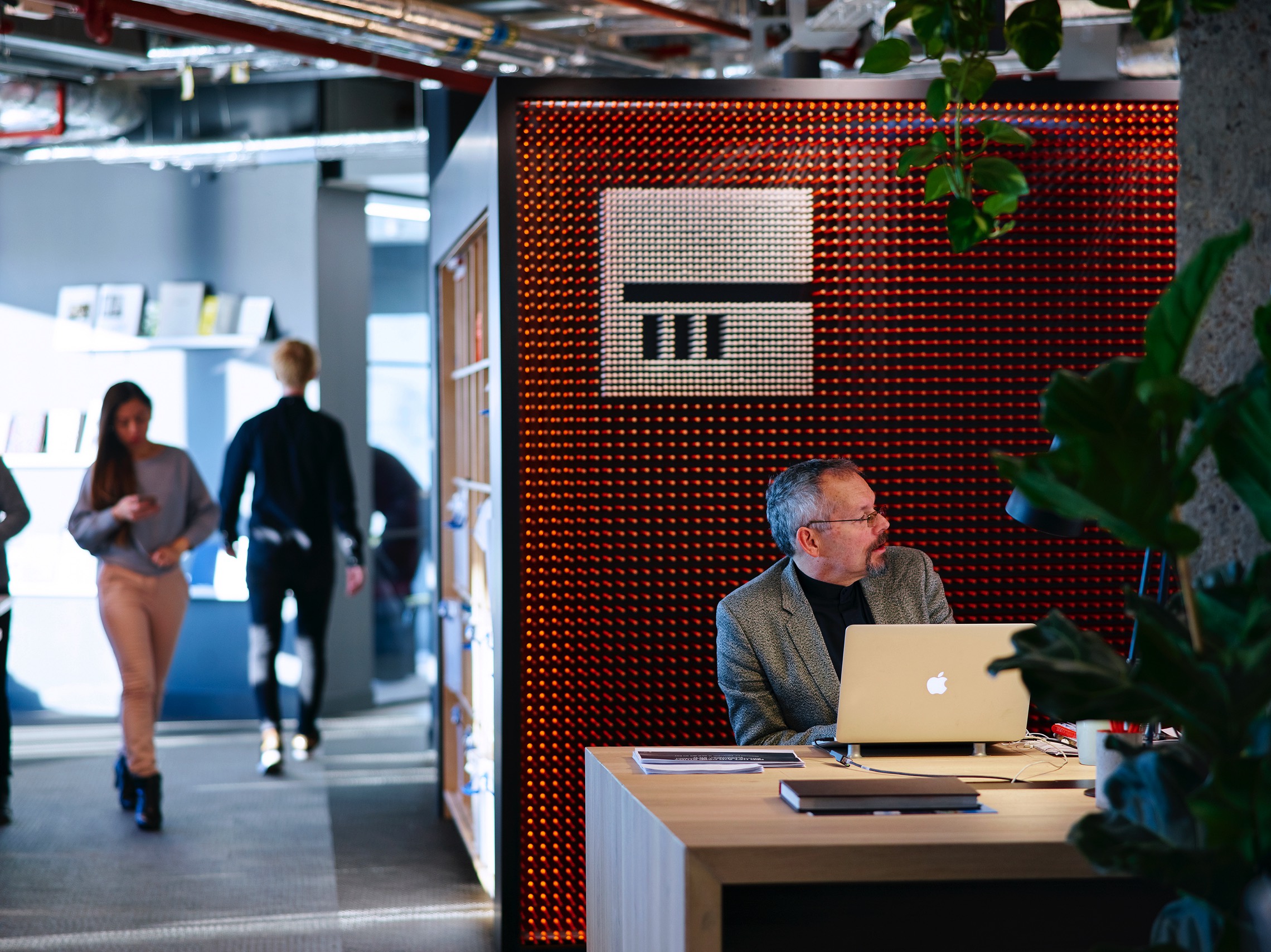
Transitioning through the archway that frames the main office, users experience a compelling 20,000 pencil art installation that reflects the visual identity of the brand.
“The London team spent just under two hours adding orange pencils to make their mark on the space. This memorable feature places culture at the heart of the workplace”, shares Charlie Millard, Head of Europe.
Re-entering the workplace after lockdown
Adopting a safety-first approach, the strategy team created a survey to understand employee concerns. The study identified individual health risks, equipment needs, home-working conditions and personal preferences.
The data helped to inform our re-entry strategy, resulting in a range of carefully considered health and safety measures and a gradual return to the office. Phase one involves 20% office occupancy, with 37% as part of phase two.
The motivation was to enable those who could not effectively work from home to safely return to the office. A risk profile was developed for each person, which helped to prioritise re-entry phasing and collaboration activity within the space.
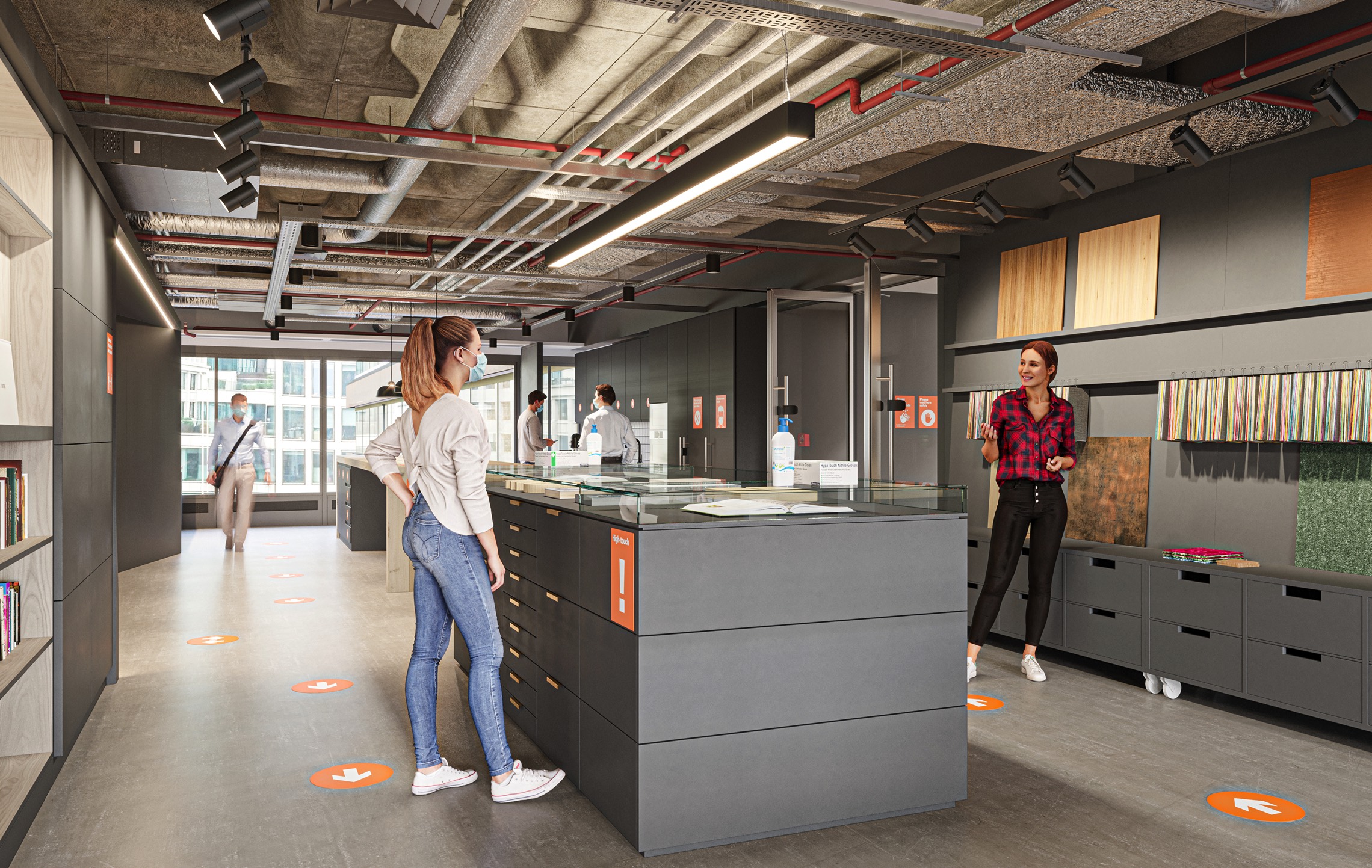
“To help people navigate the space, we developed a signage package that clearly marks all of the required behavioural changes. It guides circulation, informs staff on which areas can be used, and identifies any risks”, shares Frances Gain – Workplace Strategy - Europe.
View the 3D pano tour of the original office design with COVID-secure features
Designing COVID-secure spaces
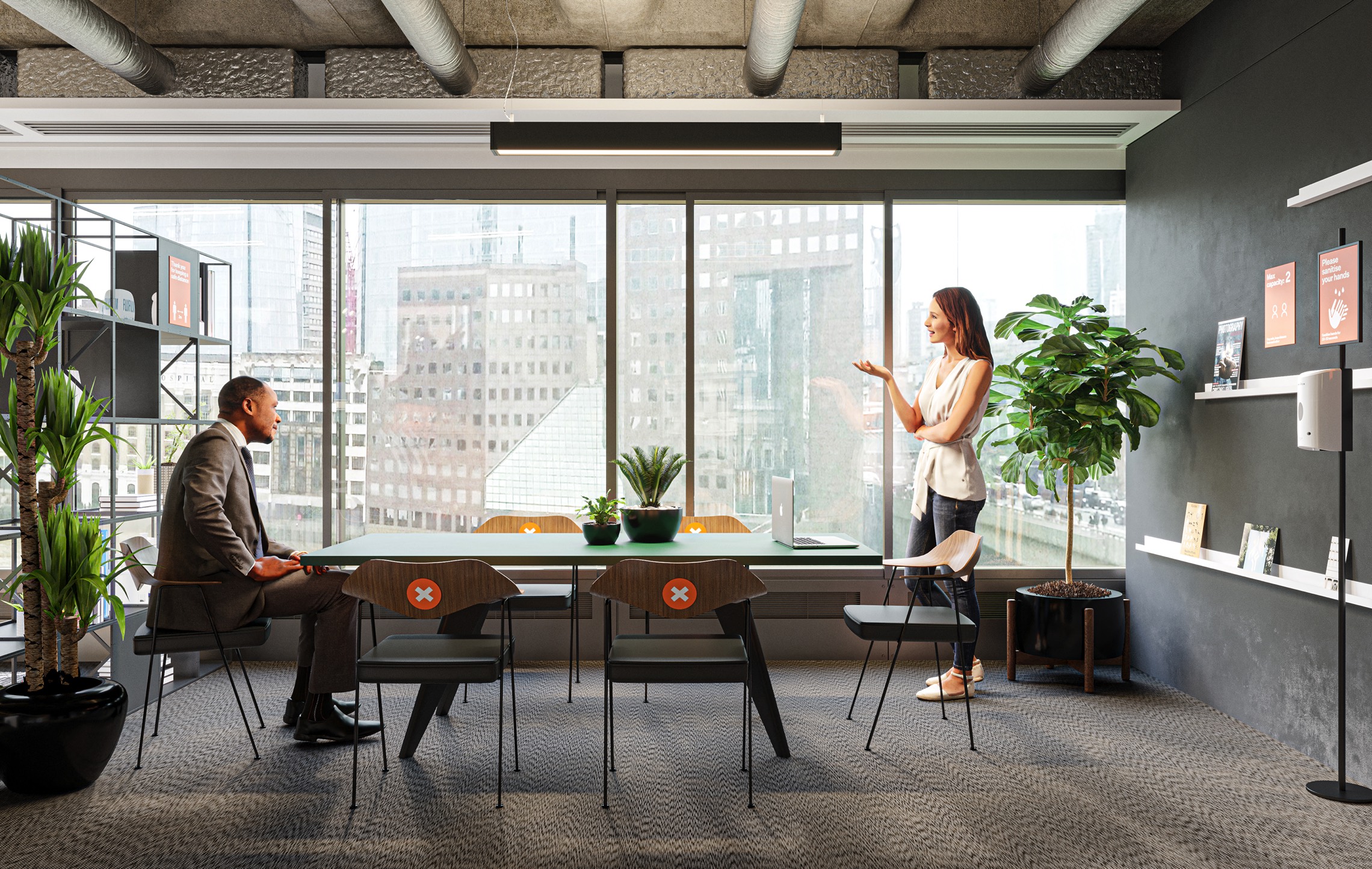
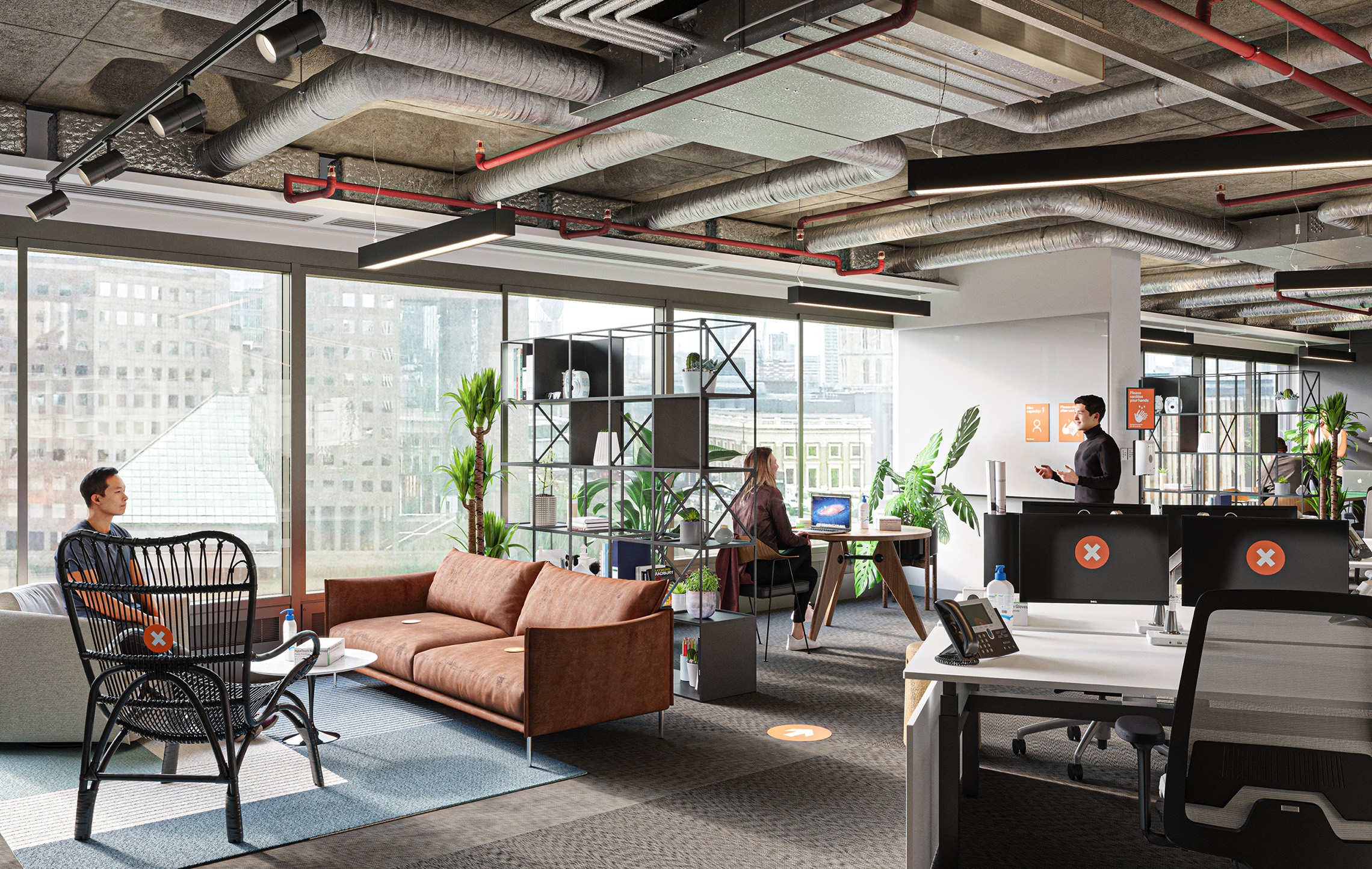
Creating a COVID-secure office has required adaptions to the workplace design and also changes in behaviour. Staff are required to adhere to 2m social distancing at all times and a clockwise circulation path minimises contact with others. In line with government guidelines, these measures are assessed on an ongoing basis.
Ultraviolet lamps installed into the AC units use UV-C radiation to reduce airborne infectious disease transmission. The HVAC system that previously focused on the supply of fresh air per person, is now set up to create positive-negative pressure differentials from clean to less clean areas.
Increased sanitation stations feature in “high touch” areas, including staff lockers, print areas, and video conferencing screens.
The enhanced use of digital platforms balances both internal collaboration and community engagement needs, especially important when integrating new staff with the wider team.
Re-thinking how the office is used in future
The team will trial new ways of using the space as lockdown eases. With one year of the lease remaining, extensive modifications are not a cost-effective solution, and further growth is limited by reduced occupancy levels. Instead, it will be important to define a clearer purpose for visiting the office.
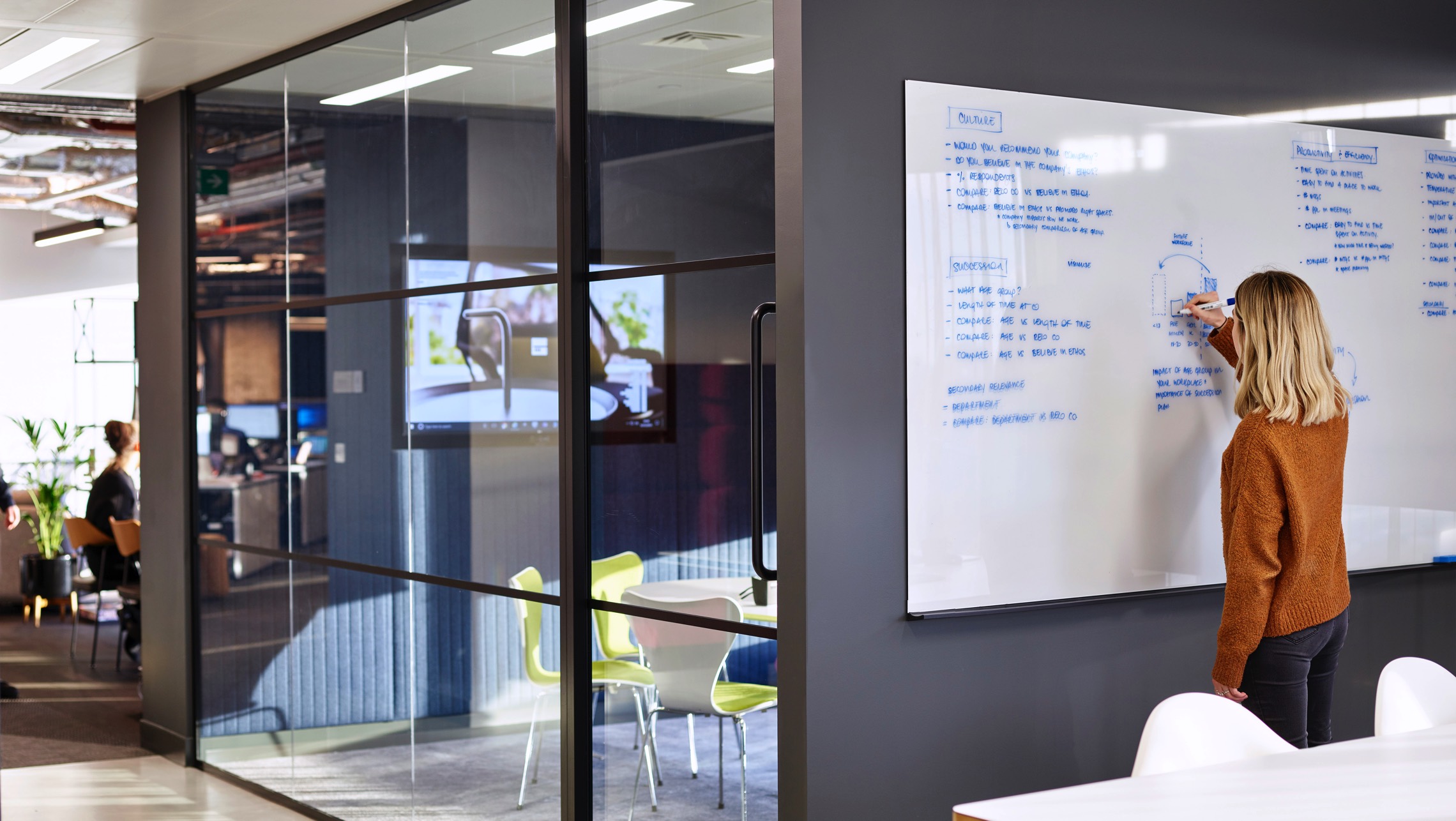
Expanded flexible working policies permit increased working from home in the future. The primary function of the office will shift towards collaboration and ideation. On the basis of this assumption, the requirement for desks will be permanently reduced, but employees will be able to flow in and out of the office as required.
