LiveRamp refines its workplace for greater unity and a clearer vision
After designing two new floors for LiveRamp’s San Francisco headquarters in the iconic Standard Oil Building, O+A came back at LiveRamp’s request to design a third. While the two previous floors were conceived to mirror each other in the way they juxtaposed highly finished contemporary design with the rawness of the building’s original infrastructure, the third reached for a larger continuity, bringing all three floors together in a single narrative of unity, clarity and vitality. The result is a new space that, with a few adjustments to the previous floors, gives LiveRamp a home for its rapid growth and a work environment its employees and customers can navigate with ease—and pride.
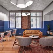
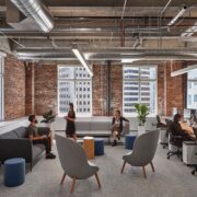
LiveRamp’s San Francisco headquarters has always enjoyed the advantages of its existing conditions. The tallest tower in San Francisco when it was built in 1922, the Standard Oil building continues to stand tall in design terms not least for its ability to frame modern spaces. Interior brick and big windows give to LiveRamp’s 21st century workplace a classic subtext of endurance and vitality. If information is the wealth generator of our age, it’s appropriate that a data company should now occupy a place once claimed by the wealth generator of another: Big Oil.
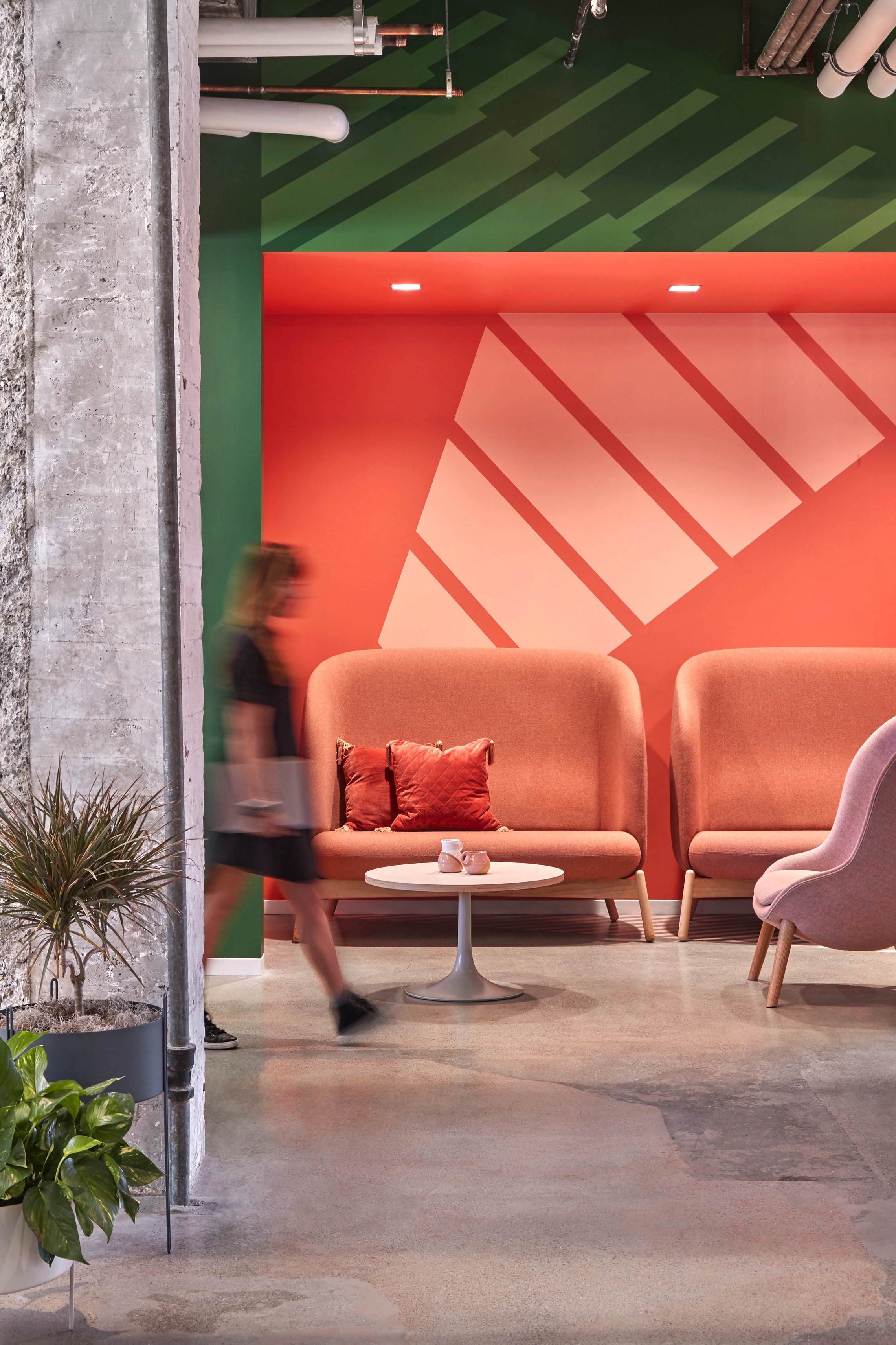
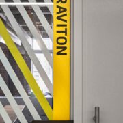
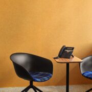
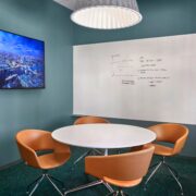
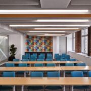
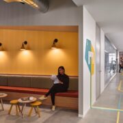
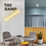
Working closely with LiveRamp’s team, O+A designers employed color as a practical orientation aid and more keenly as an expression of the company’s youthful spirit. Robust color and bold graphics were a client must. “We don’t usually have clients tell us, ‘I don’t want it to be boring,’” says O+A Design Director Joseph Rodriguez. LiveRamp took a specific interest in the refinements of O+A’s color choices: not a neon yellow; but something with an earthy tone to it. Not just any green, but a green with meaning particular to LiveRamp.
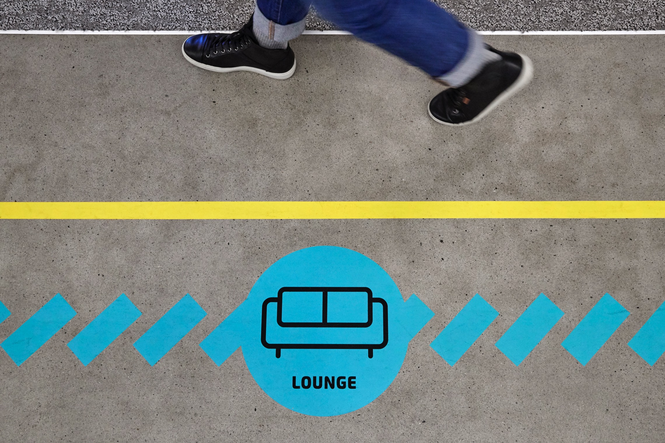
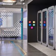
The U-shaped footprint of LiveRamp’s space consistently made wayfinding a challenge. O+A’s orientation solutions include an intuitive color scheme tied to the circadian rhythms of the day. The east wing of the office (where the sun rises) is cast in warm tones, while the west wing (where the sun sets and evening arrives) features cool colors. For those with no sense of geographical or solar direction, floor graphics make the way forward playfully literal.
When you design for a client’s growth over a series of floors and a period of years, what you learn about the design aligns with what the client learns about its business. O+A’s initial work for LiveRamp embraced the raw energy of the company’s beginnings and the “Swiss Army Knife” utility of its workplace philosophy. The new design provides a more fully integrated environment for a maturing, but still growing company. Better circulation, better space alignment, a more versatile range of work options—the new floor, in partnership with the previous, conveys the energy and optimism of a confident LiveRamp on its way to new discoveries—and a prosperous future.
