Creative Office Resilience
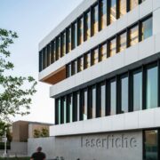
In 2018 Laserfiche, the foremost SaaS provider of intelligent content management and business process automation, commissioned Studio One Eleven to reflect the company’s vision of reimagining how technology can transform lives by designing a new state-of- the-art global headquarters. Created during the pandemic, the building not only represents the company’s place as a cornerstone of technology-focused enterprise in Long Beach, but also demon- strates that forward-thinking creative offices are more vibrant than ever: It embodies a future workplace that is more sustainable, flex- ible and efficient. The design team implemented ideas from Laser- fiche’s products into the design of the building, ultimately making work more efficient and enhancing quality of life for the company’s employees. While the digital first experience is at the forefront of their thought and the core of how the space is designed, it also cultivates a spirit of collaboration through a shared workspace dedicat- ed to a common purpose. This new hybrid workspace provides the best of both worlds.
Urban Context: An Office Corridor Turns Tech
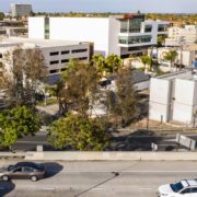
The development, located in Long Beach Boulevard’s Bixby Knolls neighborhood sits at the crossroads of creativity and technology. Comprising buildings designed by some of Long Beach’s most iconic architects – Edward Killingsworth and Hugh and Don Gibbs – the boulevard offers
a mélange of Mid-Century Modern small and large scaled office buildings amid the residential landscape. Near the 405 freeway and visible to 500,000 daily motorists, this previously undevelopable corner now anchors a burgeoning tech and creative corridor culminating in the new global home of Laserfiche. The building is the first significant new buildings on the corridor in forty years and is one of very few new-construction headquarters in the region.
The corridor was once part of the expansive Long Beach Oil Field a swath of land over five miles spanning from the City of Carson to the west through Long Beach and Signal Hill. The site was considered undevelopable until the client capped eight abandoned oil wells and removed sev- eral storage tanks.
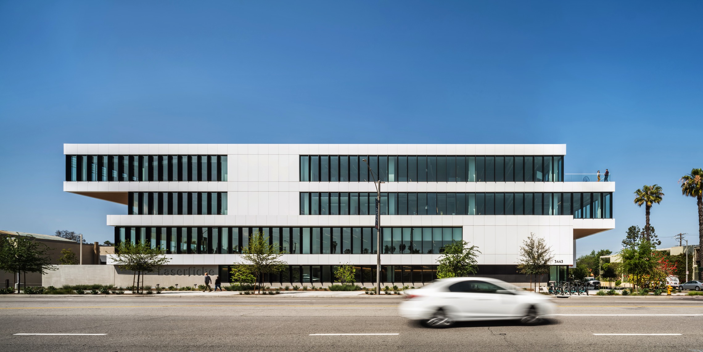
Architecturally, the new building responds to a “garden office” designed by Mid-Century Modern architect Ed Killingsworth. That iconic landmark
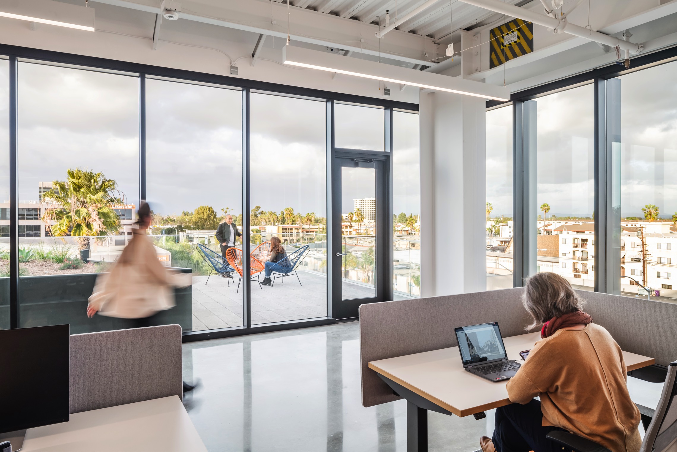
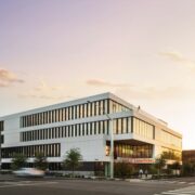
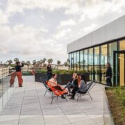
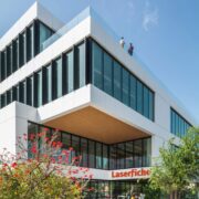
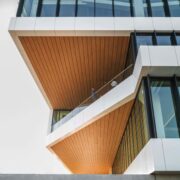
sits across the street from the new project, its scale and style a design reference point. In response the massing of the project is turned 90 de- grees and then stepped back at the upper floors to relate to the scale of the garden office. The upper floors then slide to shade the building on the south face and create decks on the north face for socializing and connecting to nature via treetops and mountain views.
Building Character
The building core consisting of stairs, elevators, restrooms and utility areas is consciously located on the west facade to minimize the need for windows resulting in a dramatic reduction of afternoon heat gain. Moving the core from the center of the building to the west- ern edge also created an expansive connected work area providing ultimate flexibility in the work environment.
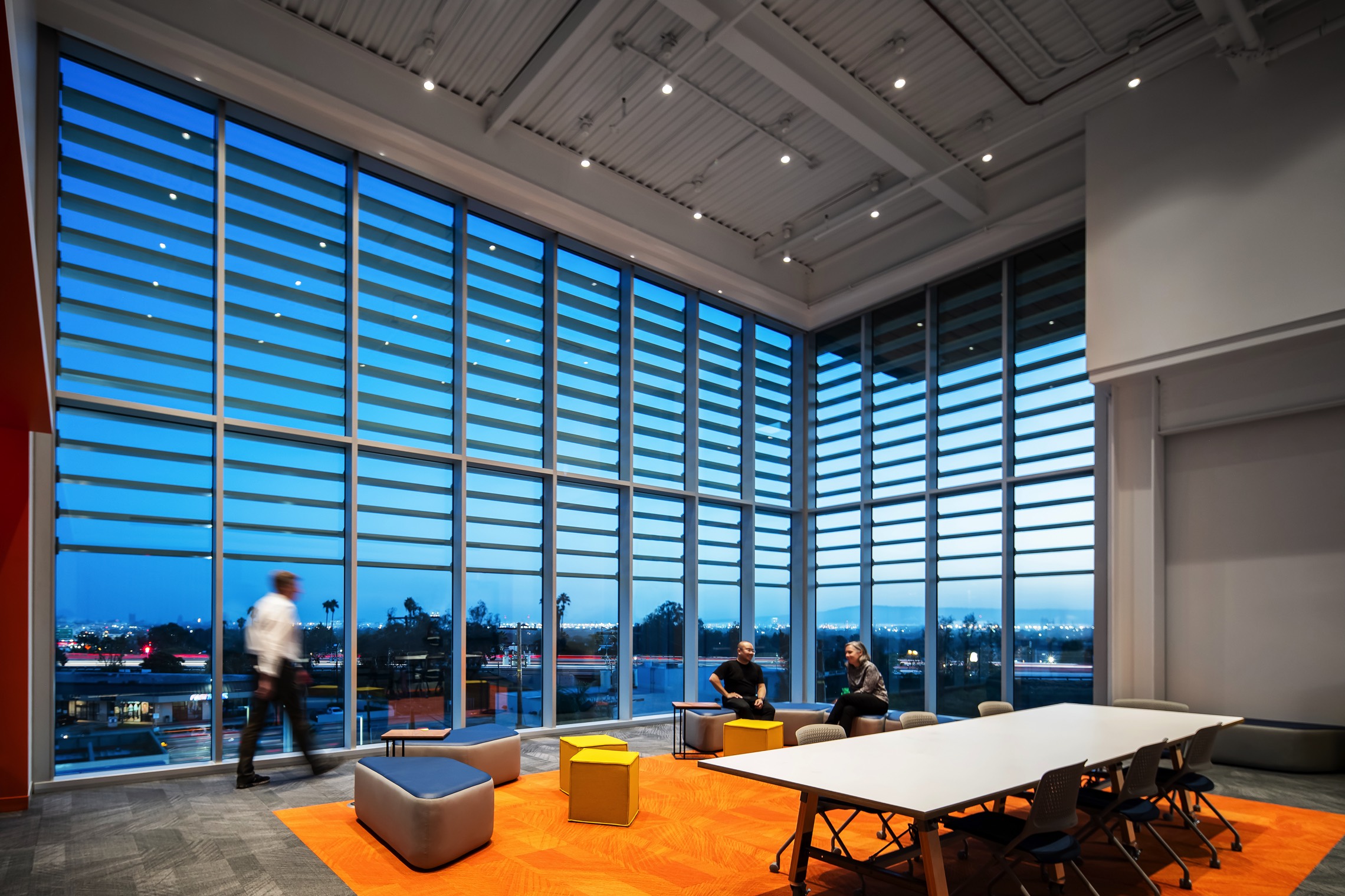
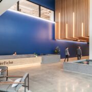
Two locations have dramatic double height spaces. One located at the entry provides for a two story “outdoor porch” and lobby with a tranquility pond with koi. The second location is at the “Skylab” positioned on the top floor with views of downtown Long Beach, the Pacific Ocean and Palos Verdes Penninsula. The Skylab is a flexible ideation space for employee teams and serves as a beacon to the 500,000 motorists traveling on the 405 Frwy daily.
Hybrid Interiors
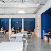
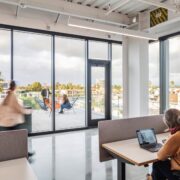
The expanded and updated headquarters facilitates innovation and collaboration for Laserfiche’s rapidly growing team and launches a new chapter in their 46-year legacy. As proponents of a healthy evolving workplace, the company has embraced a design that facilitates new ways of working that are versatile and flexible for a hybrid office. Each floor features individual work areas, large and small conference spaces and expansive flex areas that can physically change on daily basis with mobile furniture.to promote colloboration and an innovative setting.
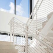
The conveniently located wide and naturally lit stairwells that connect all levels, are inviting passageways that encourage use to promote health and wellness. Staff proudly share they are able to attain their walking goals while at work.
Natural wood, stone and concrete paired with the brand color of dark blue and distinctive orange guide and define the palette to support various work environments available to all staff.
Sustainable Highlights
Laserfiche is targeting LEED Platinum Certification and WELL Gold Certification. The headquarters followed
the principles of biophilic design, to increase occupant connectivity to the natural environment. This is achieved with multiple outdoor areas, views to the ocean, mountains and dense tree canopy and the integration of natural light
The design considers water consumption and rainwater retention, as well as energy uses, air quality and ventilation. The building was designed to maximize access to natural light while reducing glare and heat absorption. Vertical
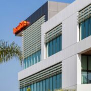
and horizontal fins increase energy efficiency and promote thermal comfort by providing solar shading to the building. All employees will have access to natural light at their workstation.
The 4-story parking garage includes 16 electronic vehicle charging stations, 19 carpool and two vanpool parking spots, plus a bike kitchen with repair tools and an air compressor for 52 bike parking spaces. As one of the nation’s most bike-friendly cities, employees are encouraged to bike to work in lieu of driving.
Shading and Daylighting
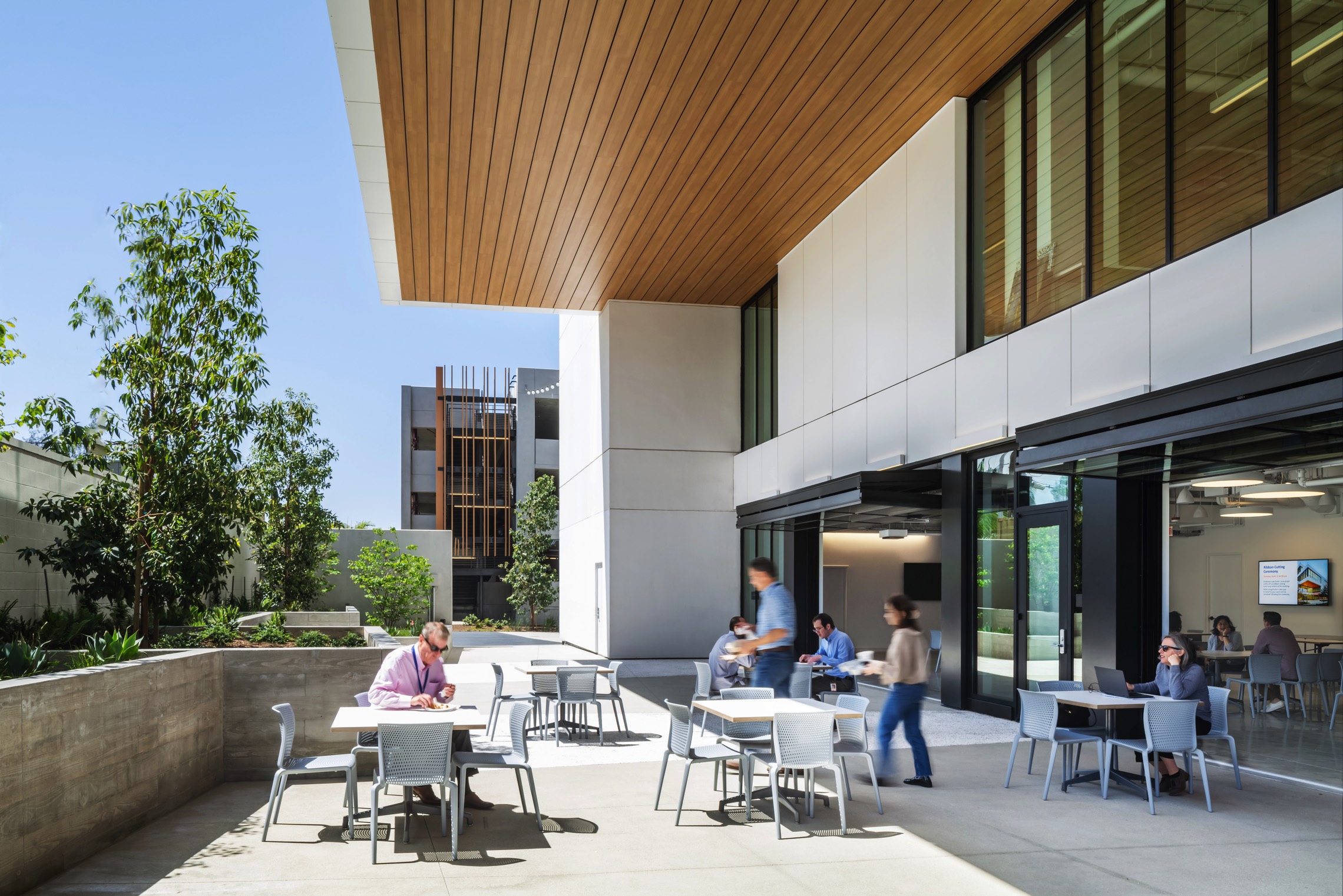
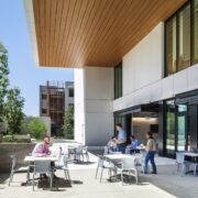
The shifted massing of the top floors allows for self-shading for the lower levels and outside dining garden for the southern façade of the building. Horizontal fins shield the glazing and its inhabitants from solar heat gain. On the eastern facade vertical fins were installed to also minimize heat gain while there are virtually no windows on the western facade in order to minimize heat gain.
This design increases sustainability by reducing the need for electric cooling while allowing the natural daylighting of floor-to-ceiling glass on three sides resulting in less artificial lighting loads. This cantilever approach creates a consistent cool, comfortable microclimate at the ground floor used for outdoor dining and a gathering space for company events.
Credits:
Interieur Design: Studio One Eleven
Fotos: Fotos freundlicherweise von Studio One Eleven zur Verfügung gestellt
