The Brief
Bean Buro took on the design of the expanded headquarters for the reputable travel technology company KLOOK in Hong Kong. The company is located in an office tower in the Central district and was undergoing rapid expansion to acquire more floor space for the growing team of employees. The expanded area is a whole floor of approx. 4,400sqft (410sqm), and would house a new reception, a boardroom, a set of meeting rooms, a CEO room, collaboration spaces, phone booths, and working neighbourhoods for 70+ employees. The new area would also future-proof expansions and departmental changes.
The Narrative
The design was inspired by the fascination of travel, the dynamic transportation, and magical destinations. Drawing references to aviation construction methods, the form of an aircraft was poetically translated into a stimulating working environment.
The materials effect also drew references to the artist Olafur Eliasson’s works in terms of colours and light, especially his permanent installation of a multicoloured glass walkway on the rooftop of a museum in Denmark titled ‘Your Rainbow Panorama’.

The Solution
The strategy was a sculptural plane-like volume to house all the meeting rooms together in the centre of the floor plan. It has a large incision in the middle to create a welcoming reception, a communal pantry, and a direct connection from the entrance to the city views of Central Hong Kong.
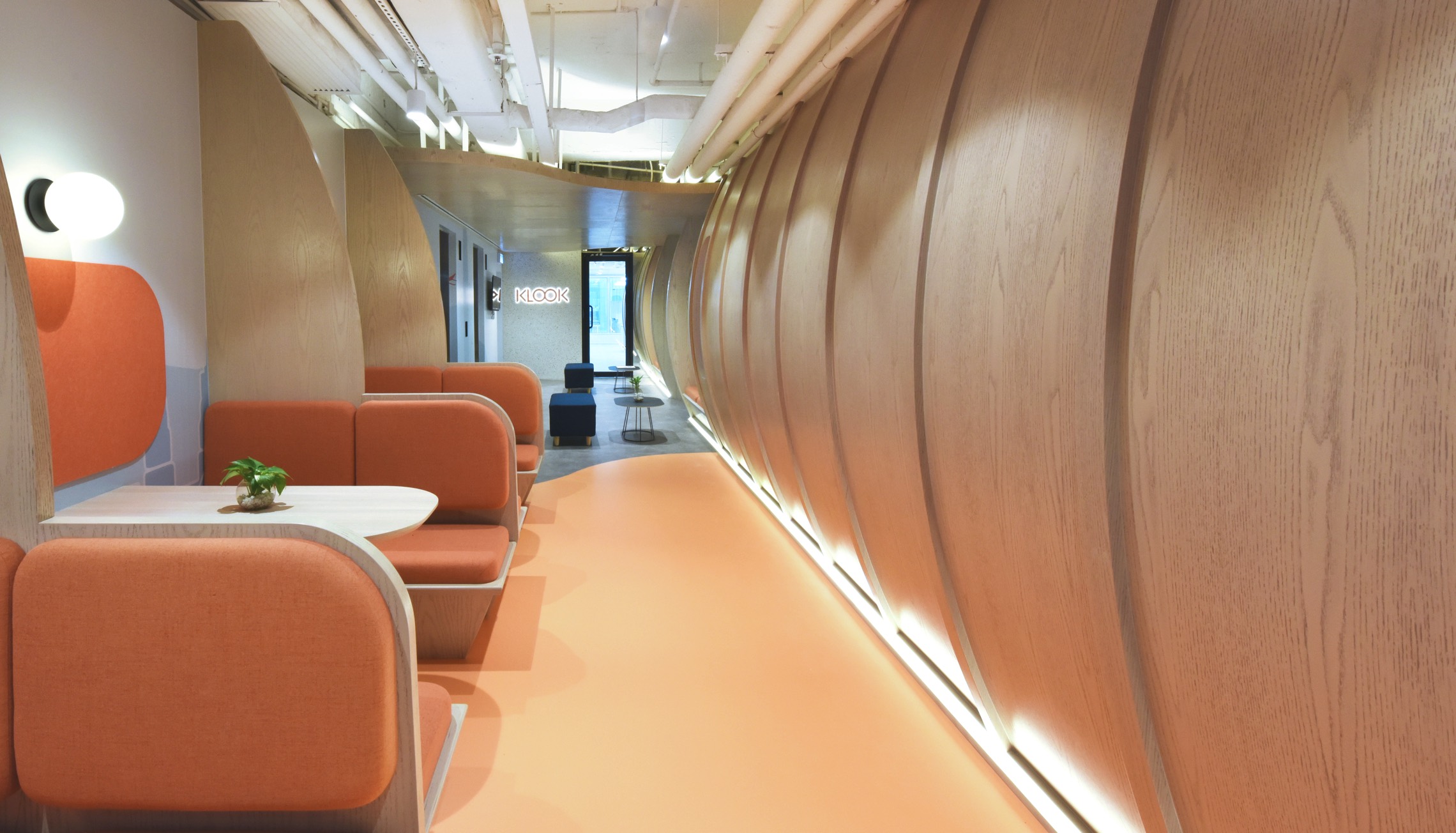
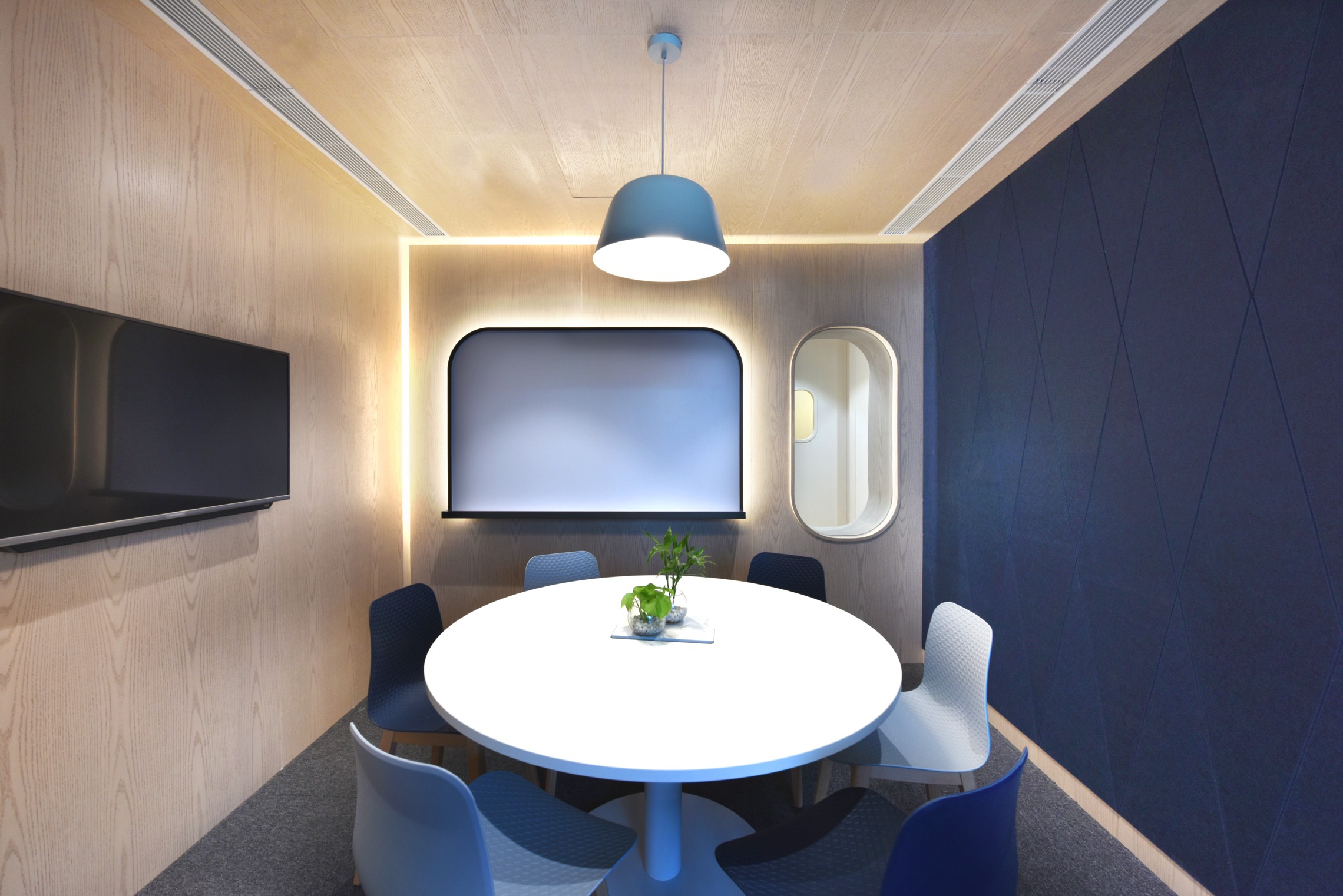
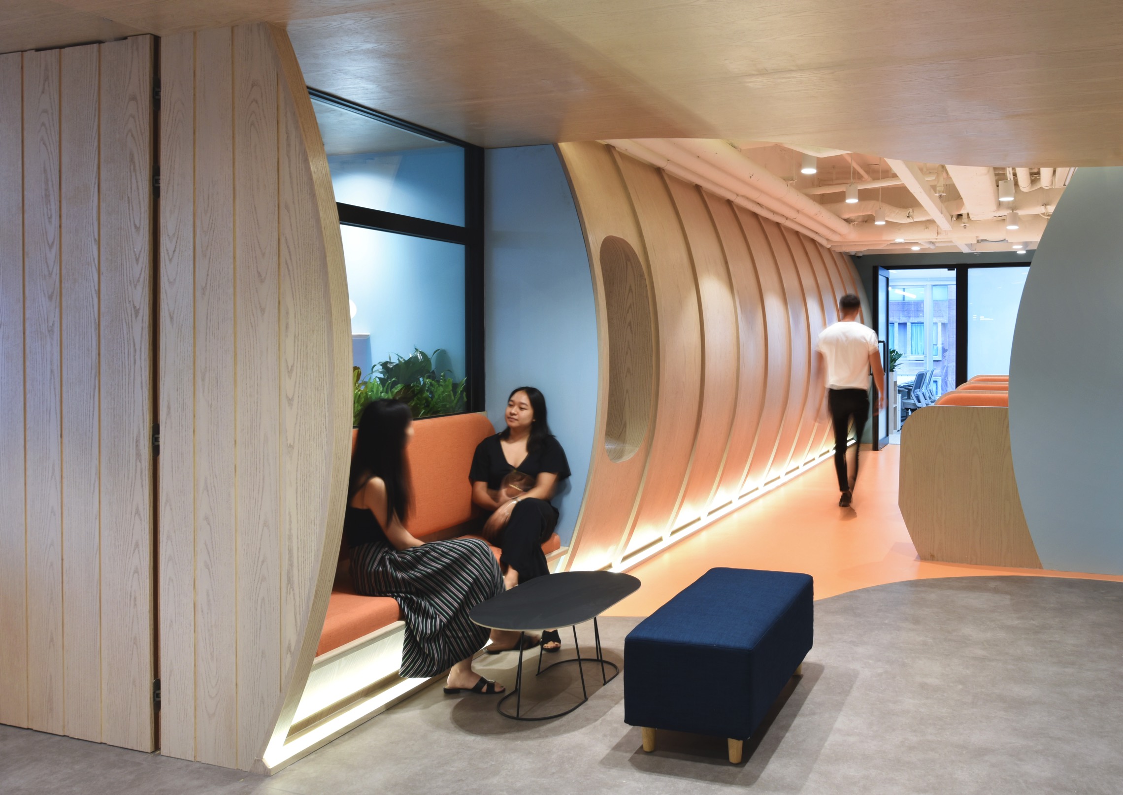
Upon arriving at the space, visitors are greeted by a long and curvy plane-like structure that subtly jog one’s memory of seeing the elevation of an aeroplane. Though a solid timber structure on the outside, it features a few aeroplane-like windows that provides glimpses of the activities inside it.

The reception area is also a pantry cafe, with various in-wall seats decorated with plants and artworks. The receptionist would sit casually at an island work bar, identified with a small company logo above it. Visitors and employees would pass through the reception to access the meeting facilities, or towards their work neighbourhoods.
The other side of this plane-like structure is constructed in dichroic glass — a translucent material that gives off different colours when viewed from different directions. It poetically blurs the boundary between inside and outside. The interstitial space between the plane-like volume and the building’s glass facade is a long corridor filled with natural daylight. An extended counter table is built along the glass wall to allow employees to sit facing the city views.
The immediate spaces created around the perimeter of the plane-like volume are informal work settings with casual furniture to promote a friendly atmosphere for the workplace.

The Materials
The company’s brand identity was interpreted as a spectrum of dynamic colours, timber and metal finishes to promote social interactions in this workplace design while preserving visual and acoustic privacy for focused working.
Inspired by aviation and industrial designs, the doors for the meeting rooms are made in ribbed corrugated metal, each with a cutout signage named after international airports.
The use of dichroic glass as the key feature in the central space creates a highly poetic experience; it simulates a sense of sunsetting at an airport ground. It creates a strong identity for the workplace that does not feel corporate or cold, but rather artistic and engaging.