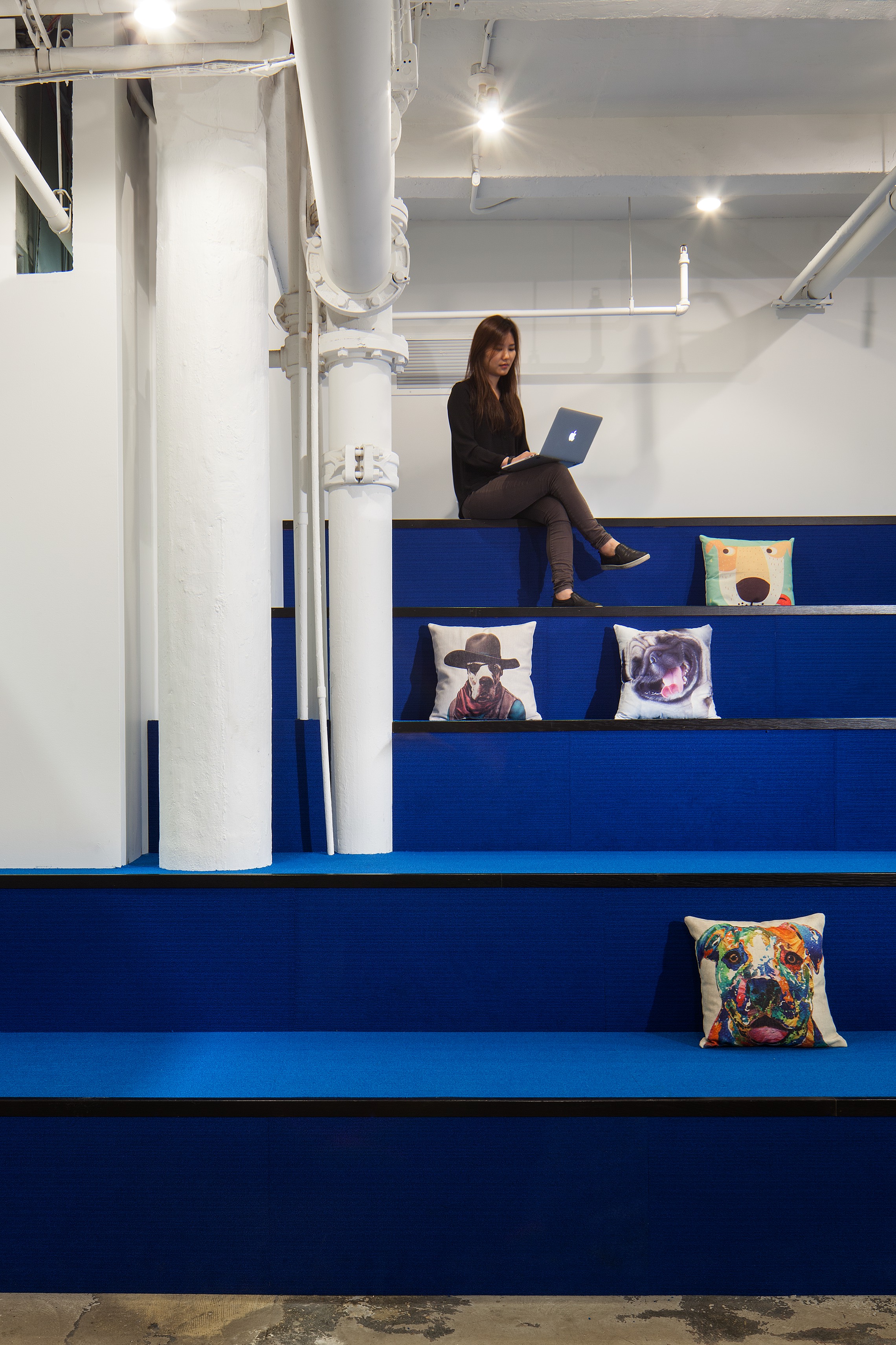
An office that promotes the dynamic working day.
What is the first impression of the office?
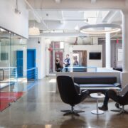
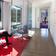
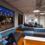
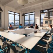
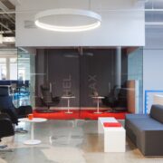
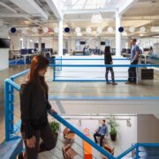
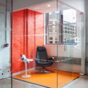
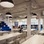
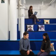
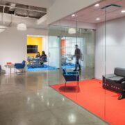
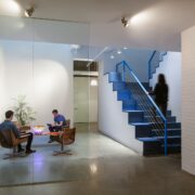
You enter into a reception with a low ceiling with a large double height waiting area below a skylight beyond. Turn a corner and you come to a short hallway of meeting rooms, beyond lies an open work area with phone booths and conference rooms and an expansive canteen/all hands space with a stage, projector and tiered seating. A large birch staircase leads you from reception up to the second floor, lit by a large skylight that shines down into the waiting area below. Upon reaching the top of the stairs, you arrive in the main workspace, with fully height adjustable workstations, a standup meeting room, phone rooms, a lounge, lockers & diner booths with reclaimed wood tops. A small pantry and bathrooms are hidden down a corridor. A long art-filled hallway leading away from the main work area connects an auxiliary wing full of lounge spaces, conference rooms, an additional pantry, and access to the roof deck with adjacent bar area.
What were the objectives for the space? What was the design intent?
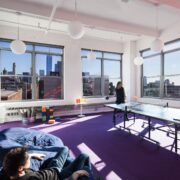
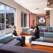
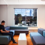
The previous occupant was very old school in their allocation of space and the hierarchy was strong. We wanted to flip that on its head so the “executive wing” became the conference wing. The walls hiding the employees from the view of any visitors were removed and the open office culture was celebrated. The CEO’s exclusive corner office, located far away from the main work floor and had a private bathroom and sweeping views of the Hudson and lower Manhattan was turned into the employee lounge and game room, with large sofas and bean bag chairs. Intent Media’s CEO prefers to sit with his team and the open office work areas are bright and spacious to accommodate that. Flanking them and easily accessible are standing counters along most windows - to highlight the amazing views - and numerous meeting spaces of various sizes. This is an office that encourages a dynamic workday, and went to great lengths to make both the individual work stations and the overall offices as flexible and accommodating as possible.
What features are unique from other workplaces you’ve worked on?
The size. The space is large and expansive, something very unique in New York. Additionally the auxiliary wing and roof deck with its unique tunnel-like hallway offered a rare opportunity to make the flow through the office full of little surprises.
How does the design speak to the Intent Media brand/mission?
Intent Media is a collaborative, hierarchy free, open, friendly company with management sitting with their teams and dogs
running beneath everyone’s feet. Transforming the previous space from an austere, hierarchical environment to suit Intent Media’s fun and friendly vibe was a blast.
What is the color palette for the space?
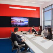
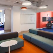
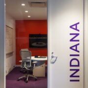
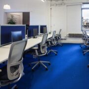
Color coding plays a large part in this project, illustrating effective wayfinding and space planning. Primary work zones are grounded by shades of calming blue, secondary, short term work zones are complemented with orange and red carpeting,
attributed to be great for creative and energetic activities. Tertiary zones such as the yoga, gaming studio have purple carpeting, conducive for active work.
How does the design address employee wellbeing?
Long pathways circuit through the office, encouraging employees to get up and move around. Abundant lounge spaces offer lots of different places to work to suit any mood or whim, plus lots and lots of natural light. Additionally every desk is height adjustable and every employee has a top-of-the line office chair. Acoustical panels separating the workstations localize sound (and clutter) and gives everyone an efficient home base for when they are not working in the collaborative or quiet areas.
Were any special considerations made in terms of design? Were there any restrictions?
We started this project by pitching the overall vision to management and employees at an all-hands session in the space. This opened up a lively conversation at all levels, and via a dedicated slack channel ideas poured in. We translated these ideas to spatial programmes via sketch renderings,which made the design process fun and inclusive but also very quick. The
management team was incredibly good at assigning people and resources to answer our requests, and that combined with a great project team meant the design intent went from sketches to built reality very fast.
Were any elements kept from the previous space?
Because the previous space was so austere, it was easy to expose the raw space below. Changing the lighting brought the space to life again, and allowed us to keep many of the high quality touches installed by the previous tenant. A few of
their architectural models and mockups were left in the space and we saved and hid them throughout the space.
Were there any challenges?
The space was long overdue for a renovation, so getting the infrastructure up to current standards was a lot of work., We had leaking ceilings and outdated sprinkler pipes in many areas, so the engineers shouldered a lot of work. From a design perspective, programming was difficult because the 10th floor is accessed from the 9th floor only, and the building's rooftop layout creates an unavoidable cul-de-sack.
What materials are you using? Any sustainable elements?
The architects used mostly LED lighting in the space and there are a couple of reclaimed wood touches here and there.
What about the artwork in the middle of the room?
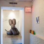
(Jeff Koons-esque balloon dog, “spray paint” wall art) The balloon dog was a gift from us to the client, it was something we just popped into the renderings from the very beginning (the client runs a dog friendly office and this is a crucial part of
their culture) and so when the inflatable dog came across our path, we thought it was too kismet to ignore. The spray art mural and several other smaller murals are done by the employees and emphasise the ‘this is your office - have fun with it’ approach at Intent Media.
Any custom elements?
The roof desk by Greenery NYC is a very clever and budget friendly solution that provides usable outdoor space without breaking the bank or messing with the roof structure or drainage. In combination with the hyper flexible Poppin lounge arrangement on the other side of the glass, this outdoor deck is one of the most cherished spaces in the office.
Is there any special technology incorporated into the design?
Raspberry Pi hack day inventions for access control and incorporation of Kisi keyless access.
What else should one know?
We think this project highlights almost everything we like to see in a modern office - and does so within the constraints of NYC real estate. Intent Media had a long list of requests all targeted at maximum employee happiness (they are on Crain’s best offices 5 years running!) and with clever navigation of budgets and creative reuse of spaces we fulfilled them all.
- Thomas Jensen, Kimberly Pelkofsky, Brigid Bjorklund, Young Jun
