Sustainable innovative working environments are increasingly being asked. The sensory perception of the users is central. Climate, odor, sound, acoustics, light, usage of color and materials (tactile) are the aspects that contribute to a pleasant work and living environment. A healthy office space must be comfortable, controllable, understandable and meaningful to the employee. If this is in the right balance, it will reduce stress and ensures the well-being of the employee.
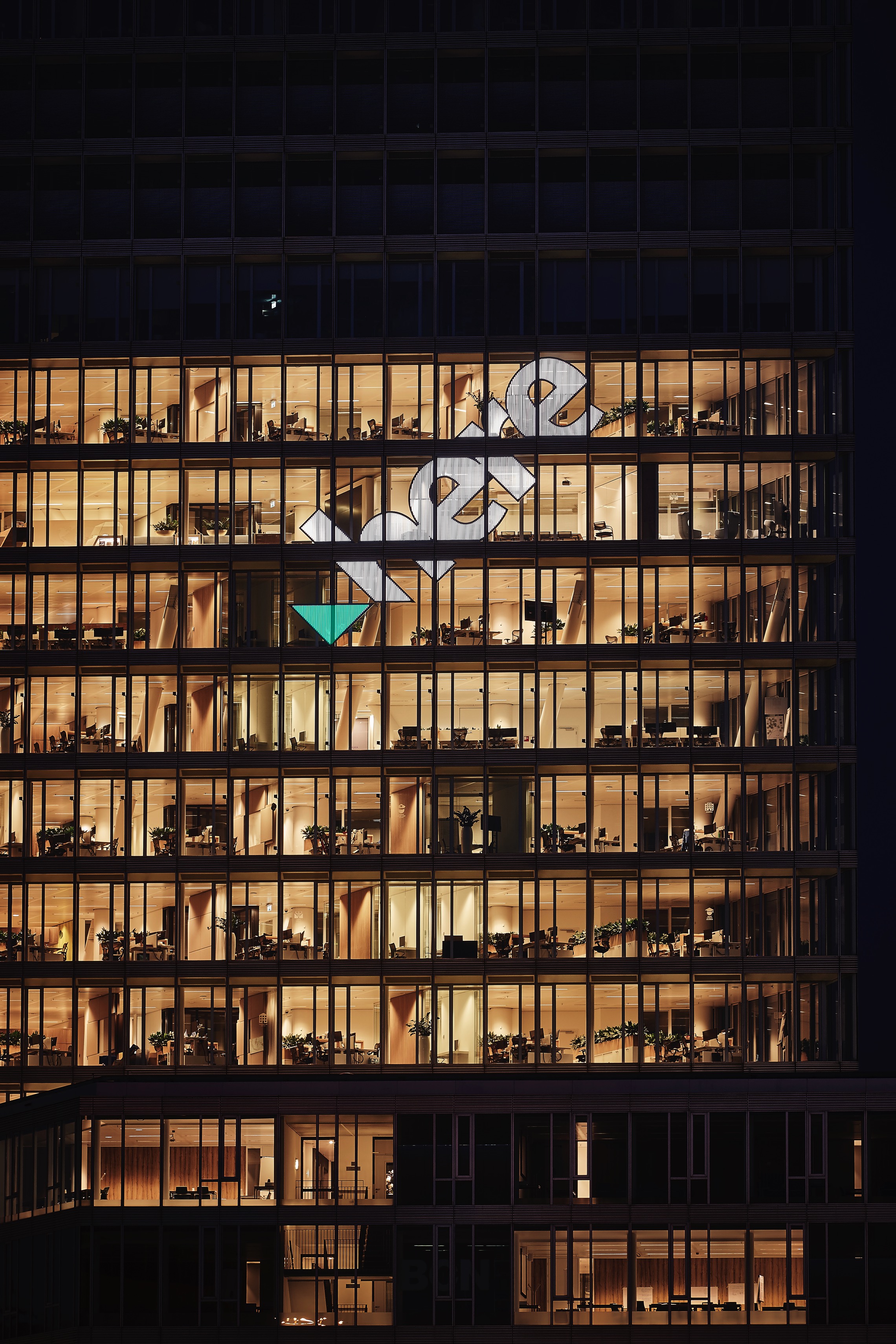
Since May 2016, HERE is as the leading company in the field of navigation and cartography resident on the levels 5 to 13 of the Kennedy Tower in Eindhoven’s city centre. HERE is a company co-owned by German automotive companies Audi, BMW, and Daimler. Here is a multi- faceted business in the provision of mapping data, technologies and services to the automotive, consumer and enterprise sectors. The technology of Here is based on a cloud-computing model, in which location data and services are stored on remote servers so that users have access to it regardless of which device they use. The 22-storyed and completely glazed building doesn’t have its own catering trade due to its central location near the railway station.

With regard to this matter, it was of special importance for M+R interior architecture to create, on the 750-square meter level, places for informal meetings aside from 350 workspaces. Another main emphasis of the design lies on the visual appearance. Each level’s design is thematically and individually determined – each one follows the central theme of the navigation. For this reason, each level is named after a region and the various areas and conference rooms after countries or country - specific characteristics. The solely designed range of colors became consequently part of the corporate identity of HERE Global. The intentionally chosen range of colors
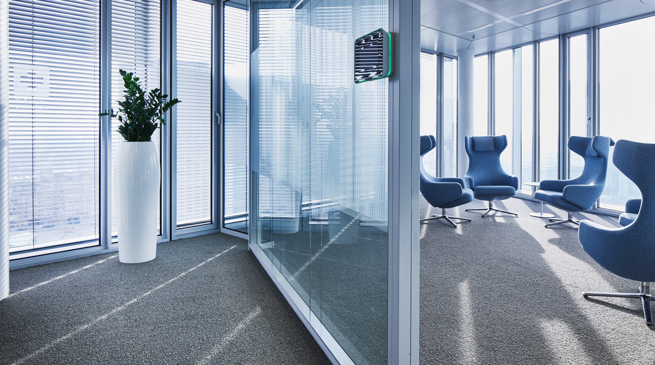
and materials is supposed to have a stimulating and pleasant effect, to appeal to the senses and to create an amenity of value at the same time. Acoustic partition walls guarantee calm sound surroundings and a balanced air conditioning concept rounds the coherent general layout for a pleasant work environment off.

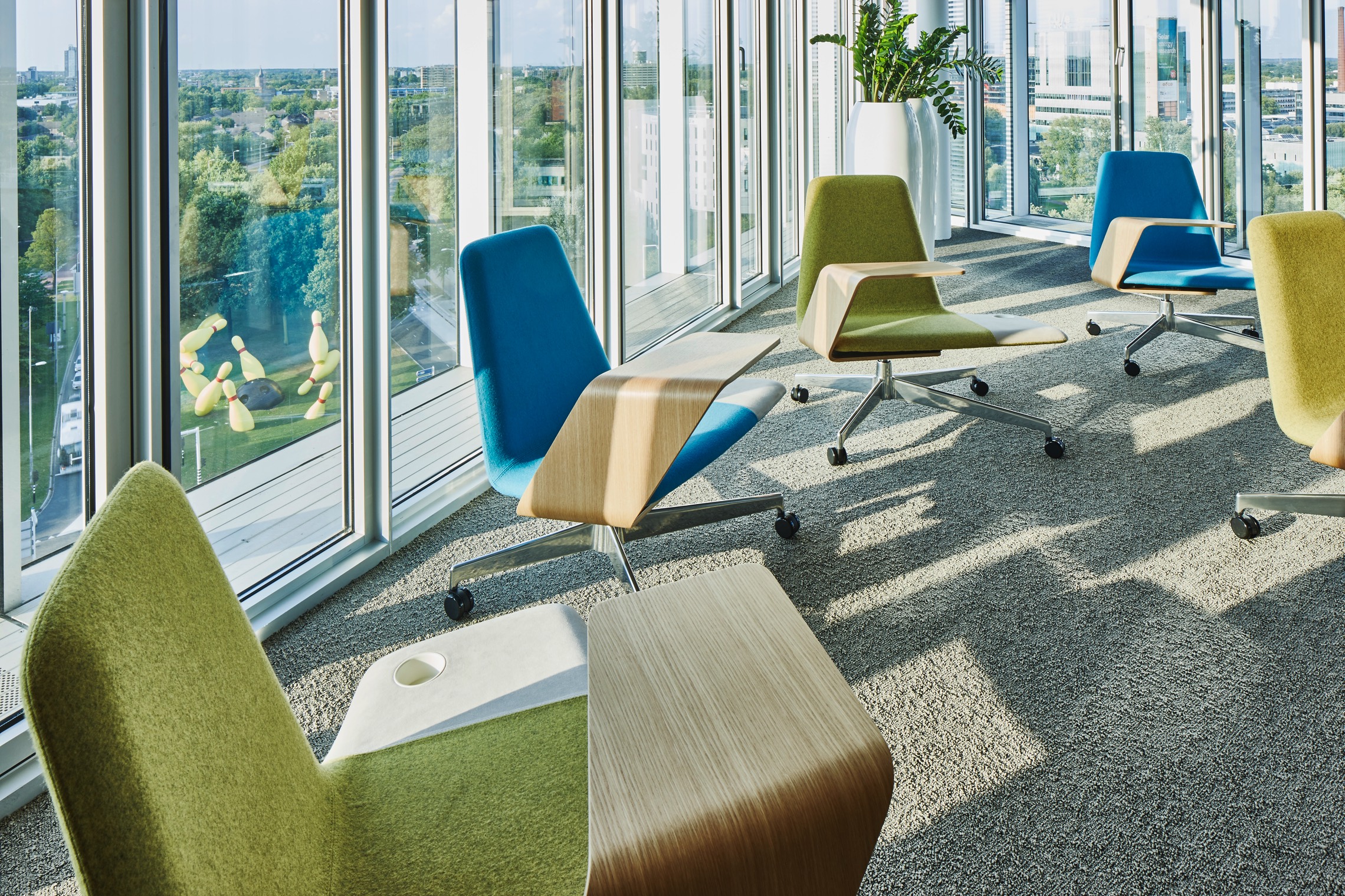
M+R interior architecture primarily aims at creating a comfortable, characteristic, adjustable and comprehensible work environment. On each level, one can find a collectively usable area for informal meetings, collective brainstorming sessions, mutual exchange and the sharing of specialized knowledge.
A cafeteria providing hot and cold drinks as well as healthy meals borders on these areas. By providing seats close to the façade the floor plan gets eased, since individual workspaces are situated along the façade, meeting points are located in the levels’ center: lounge areas for breaks, collective rooms, the cafeteria as well as open group and conference rooms.

Each level is on account of its concise steel pillars differently designed. Between the workspaces there are either rooms for independent works in silence or presentations. This particular design provides a varied sequence of rooms offering rest areas and areas for private retreat.