INITIAL SITUATION
The Elisenhof Munich – built in 1984 according to plans by the Munich architect Herbert Kochta and revitalized in 2013 – has always been a mixed-use property with a large number of office spaces and retail outlets on the basement, ground floor and 1st floor. After purchasing the property, the Office Group was commissioned by an institutional investor to carry out the Office Group Retail Check, a proven and comprehensive asset analysis product, and to convert and expand rented areas according to the ideas of the tenants.
LOCATION
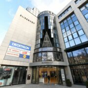
The building of the Elisenhof Munich is centrally located in the state capital opposite the main train station on the area between Prielmayerstrasse, Luisenstrasse, Elisenstrasse and Luitpoldstrasse.
The building is structured as a block development, a seven-storey main body with its three inner courtyards. The building has a side length of approx. 95 m and a building depth of approx. 82 m. In the immediate vicinity is diagonally opposite of the Elisenhof the Munich Main Station (HBF) in the west, the old botanical garden in the north and opposite the palace of justice in the east and the Karstadt in the south. No renovation was necessary on the building facade. The interior areas were redesigned and the routing in the mall was optimized.
PROJECT CHALLENGES
The particular challenge was that the conversion measures had to take place during the operating hours of the local shops, but above all of the various offices and medical practices located in the Elisenhof, in order to successfully complete the project on schedule and economically. What made it special was that no noisy work could be carried out between 9 a.m. and 5 p.m., so that demolition and shell construction work often had to be postponed into the night.
SPECIAL CONVERSION MEASURES
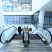
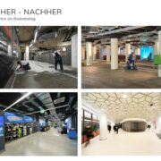
The mall passage on the ground floor was already closed in January 2020 after the former anchor tenant Adler moved out. In order to start the demolition measures on the ground floor and 1st floor for the new anchor tenant Decathlon, accessibility to the mall passage in the 1st basement had to be guaranteed throughout the construction period. This is where the Müller and Lidl stores have their main entrances. The challenge lay in the construction logistics, the strategic construction process planning and the complex scheduling coordination of the various trades. Because the unrestricted accessibility of the shops had to be guaranteed and the public access area of the main station via the stairs and escalators to Prielmayerstraße could not be restricted. Accordingly, a large part of the demolition of the old stock was carried out at night and partly at the weekend. The demolition of the existing flooring and screed of the mall passage took place in mid-March 2020 in one night. So already on next day, customers could use the mall passage again without restrictions.
SCREED LAYING
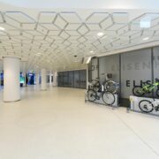
One of the most complex tasks was the introduction of a new screed and a terrazzo in the mall passage and the entrances in front of Müller and Lidl. By means of a so-called quick screed, around 250 square meters of screed could be laid on a Sunday in May and customers could walk on it again just 24 hours later. A week later – over Pentecost – the approx. 2 cm thick terrazzo covering was laid over the entire area and sanded, sealed and impregnated in five consecutive nights.
SUSPENDED CEILING
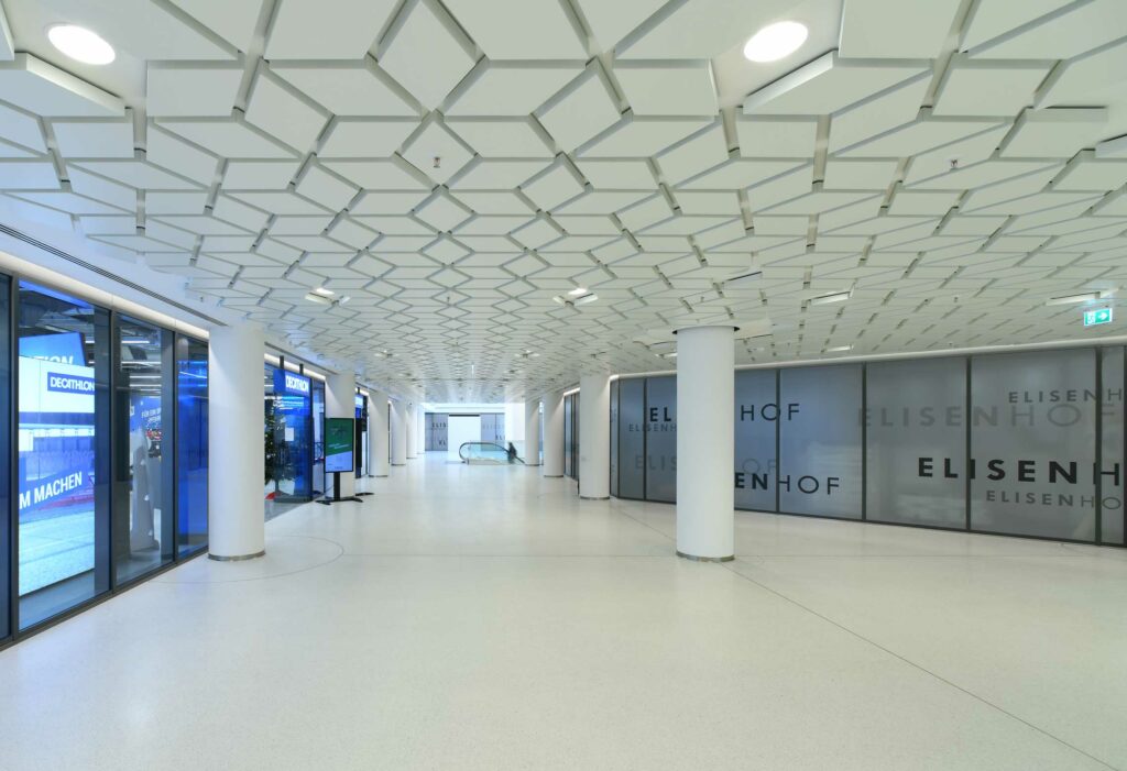
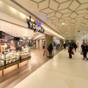
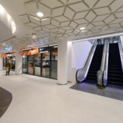
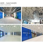
Another challenging construction project in the mall passage in the 1st basement was the creation of the suspended ceiling with decorative diamond-shaped metal coffers. This also included the precise adjustment of all the necessary building services installations, such as sprinklers, smoke detectors and recessed lights to the position of the diamonds. In addition to the coordination complexity of the individual trades, the premise here was also to carry out the construction work outside of business hours if possible.
LED VIDEO WALLS
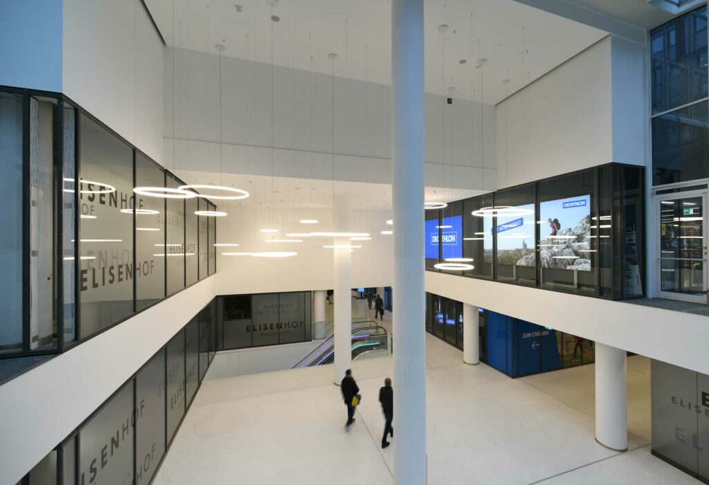
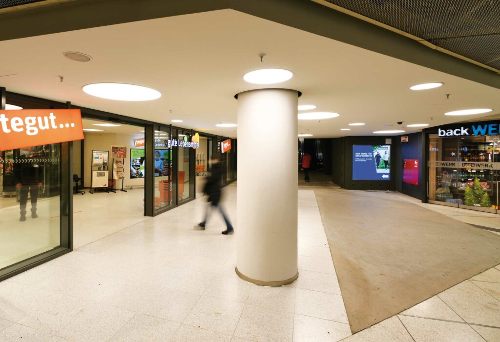
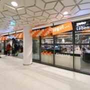
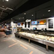
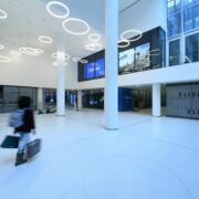
The forecourt in front of the Tegut grocery store marks the start of the new mall passage on the first basement floor. This room was deliberately designed to be bright and flooded with light in order to make itself felt in the depths of the cloister floor of Munich Central Station. In addition to the asymmetrical, playful installation of large round built-in lights and the light natural stone covering, two LED video walls installed behind a showcase-like glass facade form a special highlight. The LED video walls consist of a video wall. This is primarily intended to inform passers-by at the main train station and potential customers of the Elisenhof about the resident tenants such as Decathlon and Tegut. Due to the bright environment, the content shown on the video walls is slightly reflected. This creates special light scenarios on the surfaces of the floor and ceiling and highlights the access to the new mall passage on the 1st basement level.
SHOP FACADES
For the shop facades, the decision was made to use a tent-grey mullion and transom facade. This coloring optimally underlines the modern interior design and the spatial perception in the width effect in relation to the light surfaces of the floor and ceiling.
DIAMOND CEILING
The ceiling design was one of the focal points in the planning process. The client had the vision of a striking and unique ceiling structure with recognition value in connection with style elements from the botanical garden. The Munich botanical garden next to the Elisenhof served as inspiration. The model of a modern abstraction of a garden with trees became the central design theme. After several design variants, the decision was made to arrange hexagons, each of them were divided into three rhombuses. The rhombuses symbolize abstract leaves and are also formally based on the Bavarian state coat of arms, the white and blue heart shield. The aim was to create a kind of canopy of leaves in a recurring grid of rhombuses. This arrangement also made it possible to plan and coordinate the technical installations such as built-in lights, loudspeakers, smoke detectors and sprinklers precisely with the rhombuses. In close In cooperation with the Baierl + Demmelhuber company, the details for the diamonds and their attachment to the ceiling were subsequently developed. Accordingly, these diamonds were suspended from the actual ceiling and fixed invisibly and individually fixed to the ceiling based on precise measurements and a template. This resulted in a unique ceiling design that does not exist in this form in any other object in the world and is unique.
TERRAZZO MALLPASSAGEN
Terrazzo is the name of a floor covering that has been known since ancient times. Colour-selected additives are mixed with water, pigments and binding agents such as lime and cement and applied to the subfloor like a screed. After curing, the grout is ground, polished and impregnated to provide a tough and durable finish. The Elisenhof opted for an approx. 2 cm thick light terrazzo made from Carrara marble aggregates from Italy and a light gray pigmented binding agent from the Pupeter company. The floor is easy to care for and resistant to external influences. In addition, it was laid almost seamlessly and creates a homogeneous and harmonious appearance. A light and homogeneous floor was deliberately chosen in order to compensate for the low ceiling heights in the mall passages and to optically expand the space. The living character of the ceiling made it all more important to calm the floor and give it a uniform effect.
DESIGN CONCRETE
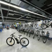
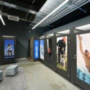
The tenant Decathlon opted for a more industrial look in his two-storey sales room. With regard to this, the interior concept had provided for all ceiling installations, such as ventilation ducts, cable routes, etc. to remain visible. A homogeneous, mineral soil was specified in the tenant building description. This should also have a corresponding load-bearing capacity and abrasion resistance. It was decided to choose an approx. 8 cm thick design concrete screed that was laid almost seamlessly. The design concrete surface was treated in several steps. The fresh concrete surface was mechanically power-smoothed. The rough surface of the concrete was smoothed, compacted and made more resistant to damage. The surface was then polished again and impregnated accordingly. The result is a high-quality concrete floor of the highest quality and craftsmanship, which gives the sales areas a homogeneous character awarded.
STEEL STAIRS
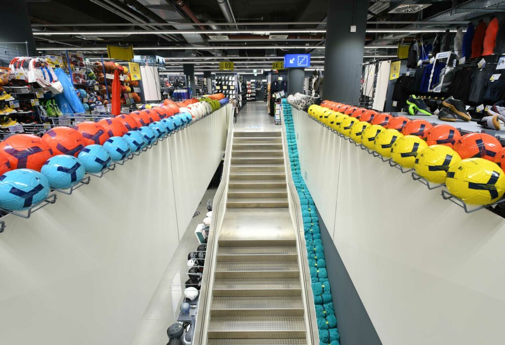
A particular highlight of the Decathlon rental space is the free-standing, single-flight steel staircase with an intermediate landing. This was given a massive steel balustrade made of 15 mm thick sheet steel painted white and a staircase made of corrugated aluminum sheet steps. Precisely planned butt joints in the sheet steel balustrade show a diamond-shaped analogy to the diamond-shaped ceiling of the surrounding mall passage. The theme of the white painted homogeneous sheet steel balustrades was reused accordingly for the fall protection above the steel staircase and escalator on the first floor of the sales area.
