An Open Space Concept with Attractive Antitheses
Bruce B./Emmy B. is a prestigious design agency specialising in communication design and events. Its clients include leading German car manufacturers. Bruce B./Emmy B. and Ippolito Fleitz Group have cooperated on projects for many years now. Both agencies began searching for new office premises in 2008, although initially they were not looking together. Ippolito Fleitz was the first to find a place in the Augustenstraße. When the two managing directors of Bruce B./Emmy B. came to visit the new premises, they not only spontaneously decided to join in the same building, they also commissioned Ippolito Fleitz to design a new interior for their agency.
The Augustenstraße is located in a lively district of West Stuttgart. It is one of the most densely populated residential areas in Germany, with an equally high density of large and small offices. The five-storey building at Augustenstraße 87 dates from the Wilhelminian period and was built to house an industrial laundry. After suffering heavy bombing damage during the war, it was reconstructed and remodelled; an extension was added to the original L-shape to form a rectangular block. After the war, the building was used as a production facility for control technology, before its refurbishment as an office building in the late 1990s. Bruce B. /Emmy B. moved into an almost 500 m² space on the third floor, which is clustered around a central stairwell.
Ippolito fleitz´s aim in designing a suitable interior for this agency was to faithfully translate what epitomises its work into architecture. Objects and design elements initially appear to be in diametric opposition, yet strike a harmonious balance throughout. They are emblematic for the wish of Bruce B./Emmy B. to respond to their clients with an open, strategic mindset and an excellent command of antithetical thinking.
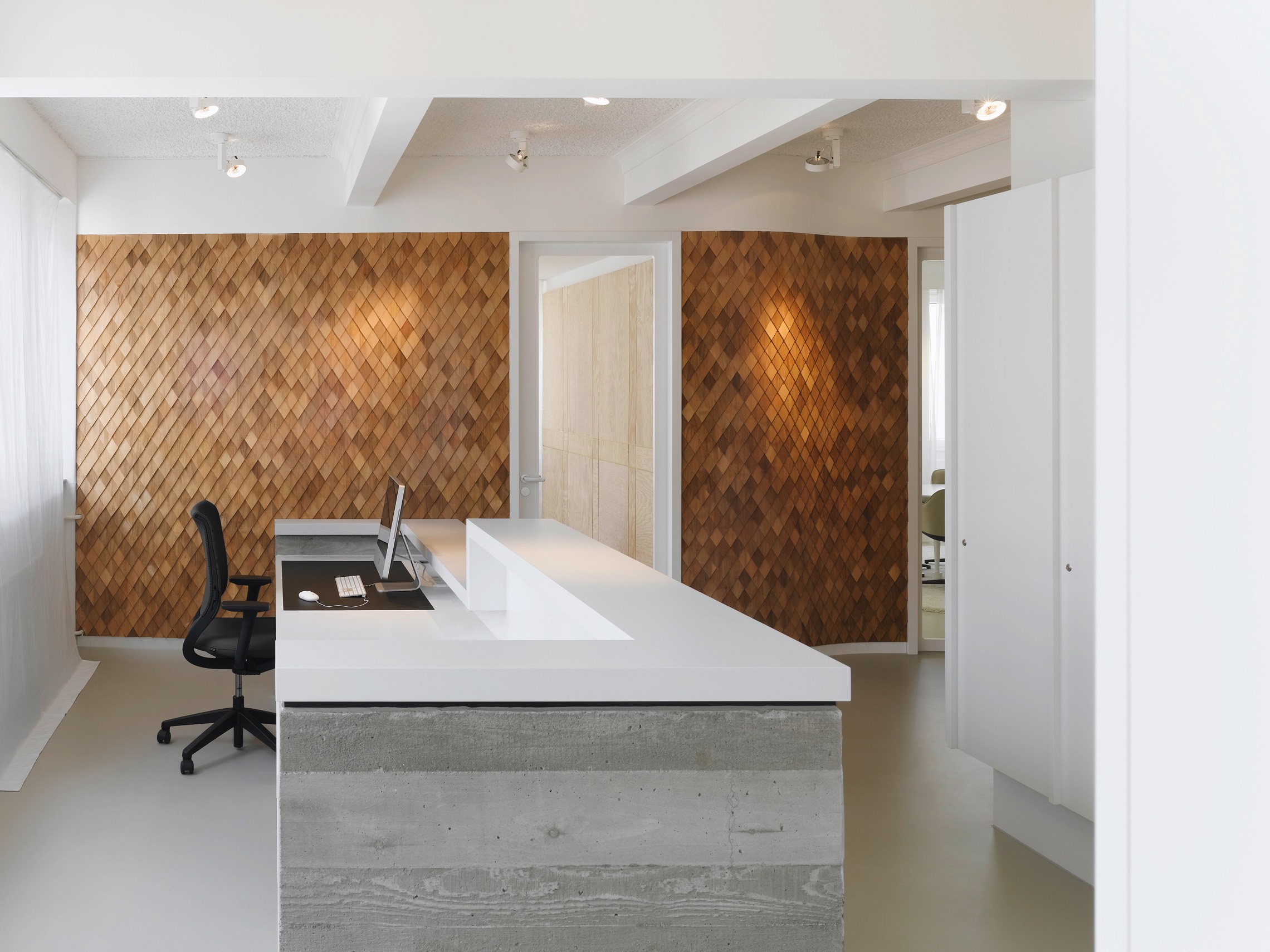
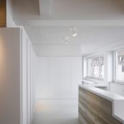
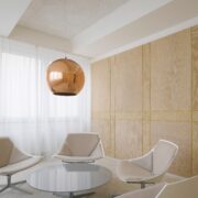
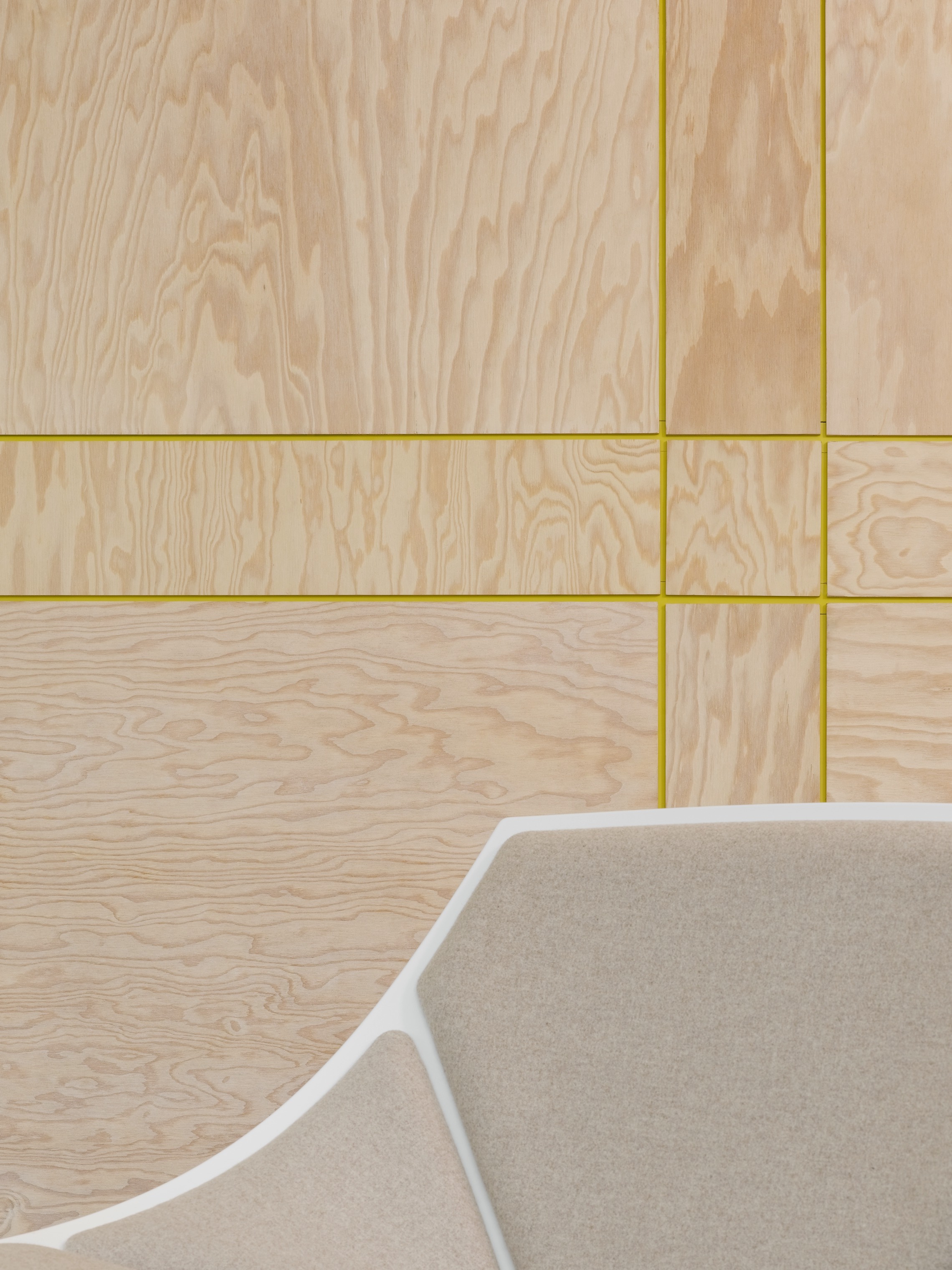
Antitheses attract the visitor’s attention from the very first moment of entering the agency, beginning with the shape of the reception desk. It is crafted in exposed concrete, which displays an added materiality in the form of the visible structure of the wooden plank mould. The concrete form is topped by a white, lacquered surface. Antithetical details are also present in the adjoining conference rooms – usually the second point of call for the agency’s clients. The walls of the smaller conference room are panelled with maritime pine boards. Narrow yellow grooves refine their appearance, which would normally invoke simple packing crates, transforming them into attractive room panelling. The large conference room next door is dominated by a long conference table with randomly spaced table legs breaking up the sober impression it would otherwise have made. Directing your gaze towards the ceiling of the reception area and conference rooms allows you to take in another unusual detail: Stucco elements have been added to the ceiling joists, recalling the cosiness of an old apartment building in the very midst of this industrial landscape.
Another pair of diametric opposites accompanies you throughout the entire space: The smooth perfection of the seamless epoxy resin floor contrasts strongly with the almost physical effect of the extremely granular acoustic plaster on the ceiling.
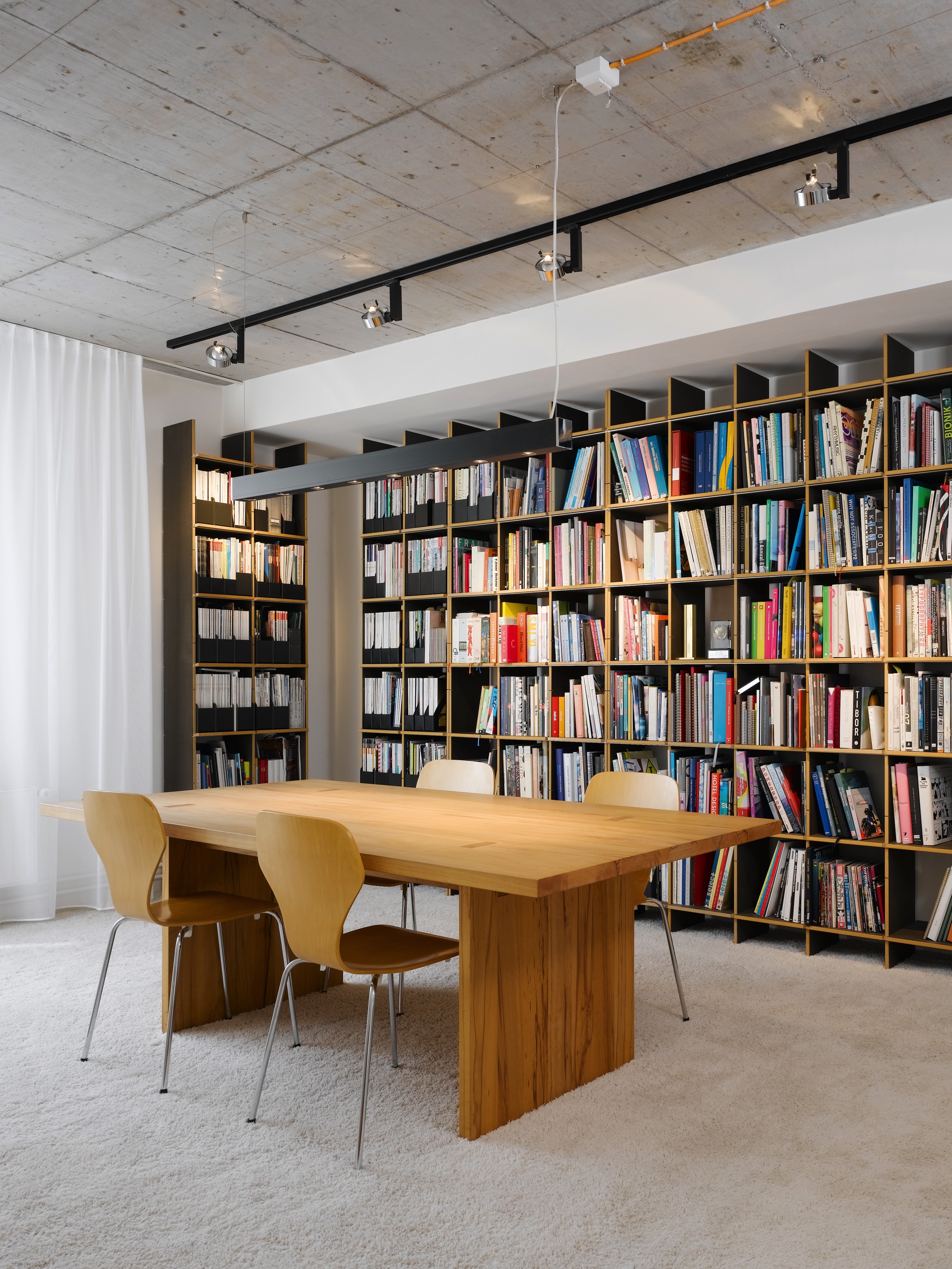
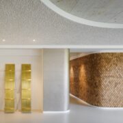
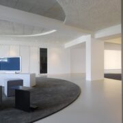
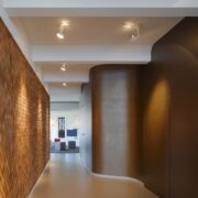
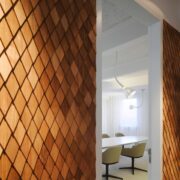
The corridor that leaves the reception area and skirts the conference rooms is particularly striking. It is decorated with wooden shingles on one side and executed in a golden colour on the other. Home and glamour are thematic here: This is a place where the client can feel at home and understood, and this is where he sets off on a shared voyage with the agency, which ultimately will end in success. The corridor leads to the next room, which is currently being used as a lounge and a place to host media presentations. The agency also has the opportunity to expand by simply adding seven more workplaces in this space. An exposed concrete circle is cut out in the ceiling of the lounge, visually circumscribing the space even more. The rear area houses the library, a tea kitchen and the back office.
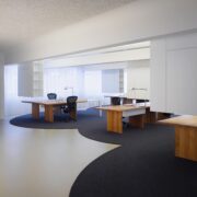
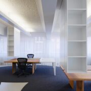
The atelier itself is an open room stretching across 250 m². A characteristic element of the space are the original ceiling joists, which were homogenised and connected with the ceiling by means of a cavetto. Indirect lighting in the interstitial spaces creates a diffused light that is ideal for work.
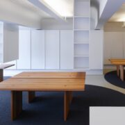
Shelving units hanging from the ceiling are aligned with the ceiling joists. These designate the workstations and demarcate them to one side. The workspaces themselves are solid oak tables, most of which the client already had at his disposal; several workstations were extended by white, mounted tables. The table and furnishings create individual units with plenty of free space in between. Two to three of these units are grouped together to form islands, which are further located within the space as a whole. The resultant effect is a mix of open-plan office and circumscribed cubicles. This layout is emphasised by the underlying circles of carpet that reinforce the island groupings, allocating clear zones which you can enter and exit.
Credits:
Design: Ippolito Fleitz Group GmbH Identity Architects
TEAM
Peter Ippolito, Gunter Fleitz, Mathias Mödinger, Serpil Erden, Alexander Aßmann
Photographer: Zooey Braun
