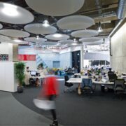
The "second home" with a collaborative working atmosphere.
align, interior architects and designers and specialists in original workplace thinking, have created a dynamic, 19,000 sq ft, three-storey suite of offices for fast-growing brand and packaging design specialists BrandOpus; a finalist scheme in the Small/Medium Commercial Project of the Year category of the 2015 MIX Magazine Mixology Awards.
The project, located within the former Freemantle TV Studios at number one Stephen Street, was a pre-let space as part of the 1-2 Stephen Street development in London’s west end by Derwent London. align were introduced to the client at a very early stage at the invitation of agents Pilcher Hershman and project manager Ines Stanley of Interactive Space, both of whom had previously worked with align on an office project for Dentsu in Fitzrovia.
‘BrandOpus hadn’t been in their previous offices for very long’, explained align Director and Co-founder Nigel Tresise, ‘but were experiencing a period of rapid growth and needed a much more ambitious space for their projected expansion. And they were absolutely right - the company had 37 staff at the briefing stage and nearly 90 by the time they moved in. Their new space now has capacity for around 140 people.’
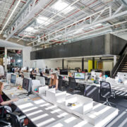
Significant time at the beginning of the two-and-a-half-year project was spent working out how to optimise the space available for BrandOpus’s needs. The configuration of the ground floor studio spaces could be seen as quite fragmented and align needed to work closely with the BrandOpus team looking at the optimal flow and journey for both staff and for visitors. ‘
The potential was for a studio space over three levels’ Nigel Tresise commented, ‘which meant taking the double-height ground floor space, together with three purpose-built mezzanine sections and also a smaller footprint area on the lower-ground floor, which made use of a former car-parking area. Staff could work together primarily in the ground floor studio and mezzanine spaces in zoned, delineated but still fundamentally open-plan areas, whilst visitors would be guided directly from the entrance to a lower-ground floor reception area and a network of individual social and client-facing meeting spaces.’
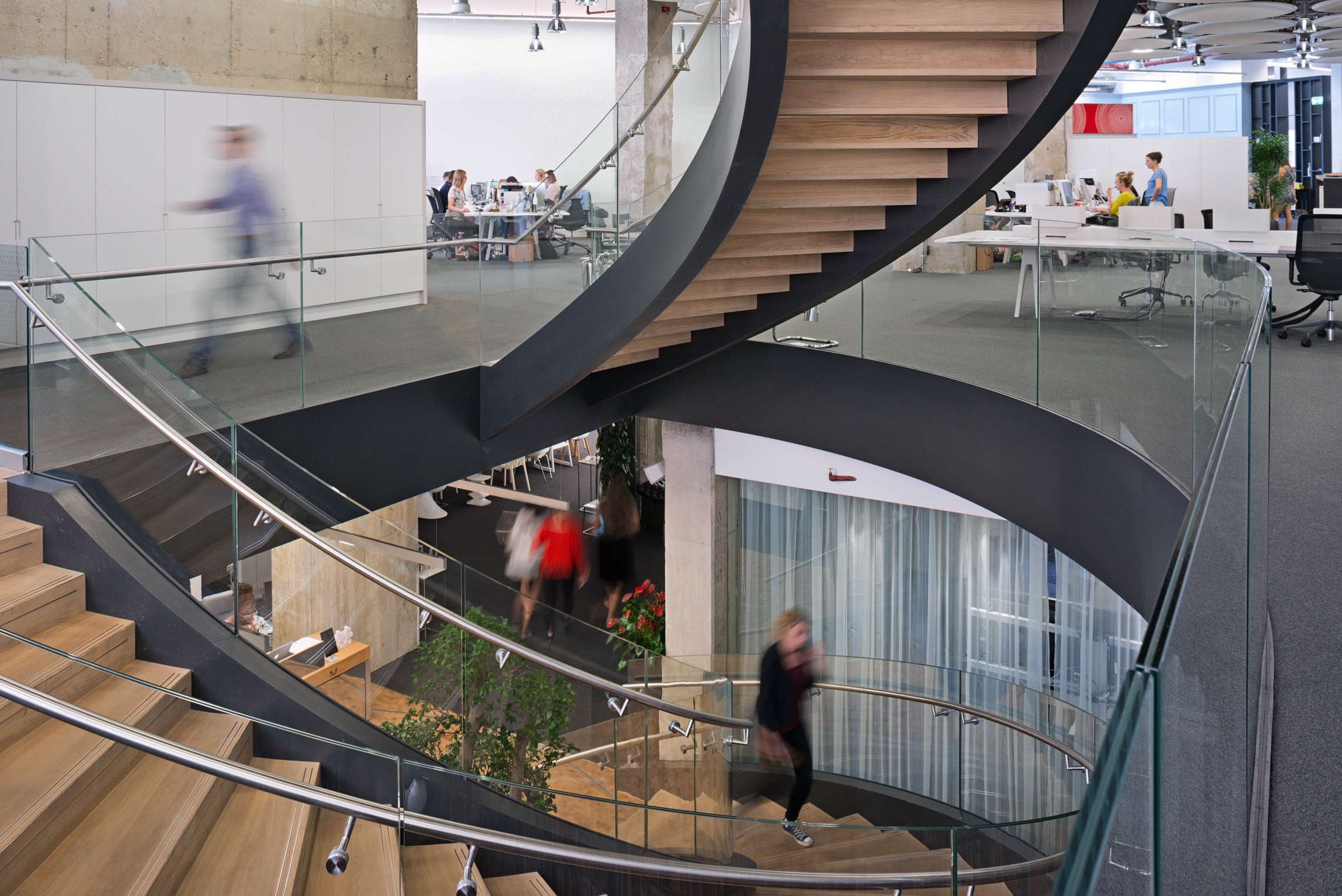
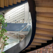
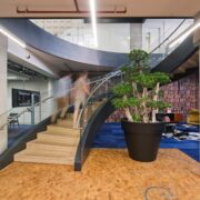
align’s work around flow and journeys led to a series of collaborative workshops with the Derwent team (including Orms Architects and Arup) to finesse the original CAT A scheme to match the requirements of BrandOpus. Changes included a re-located main entrance, which was created in order to lead visitors more naturally to the reception area and also to follow the natural sweep of the road. Another major structural change was the idea of punching a huge circulation void into the floor just inside the new entrance in order to create a very clear flow down to the lower ground floor (and up to the mezzanine levels). The void would be visible from the 6m-high glazed exterior and would feature a new lift, along with a spectacular new curving stair, conceived by align and inspired by the Fibonacci sequence. This was then implemented by Orms Architects, using the same blackened steel as used throughout the base build, together with oak treads, a glass balustrade and stainless steel handrail. This allowed for slow and comfortable access to the lower-ground area and also allowed for a real sense of grandeur and arrival, as well as ensuring that plenty of natural light could percolate through into this windowless storey.
‘This was a really interesting space to work with’ commented Nigel Tresise. ’The ground floor studios were quite fragmented and the lower ground floor had no natural light, but we did have nearly 6m storey height to play with. Luckily, Derwent London were brilliantly accommodating and open to suggestion in terms of creating the best possible CAT A space for the BrandOpus tenant scheme, which, as well as the new entrance and connecting staircase, included the removal of a major concrete beam on the ground floor and the adjustment of one of the mezzanine areas to allow better views down onto the ground floor.’
Once the interior architectural space plan had been resolved, the align team moved onto the development of the design concept from the brief given by BrandOpus, which was to create a true ‘home from home’, with a collaborative atmosphere: a space which didn’t feel like a traditional office and where creativity and the easy flow of people, information and communication were promoted.
‘It was a great brief to work with’, commented align Director and Co-founder Gurvinder Khurana. ‘At align, we’re great believers in getting the best out of all the creative partnerships we enter into and so it was agreed that a couple of creatives from BrandOpus would join us for regular workshop sessions throughout the project, so that real ownership was shared between all us and was properly rooted in the company’s brand values and culture.’
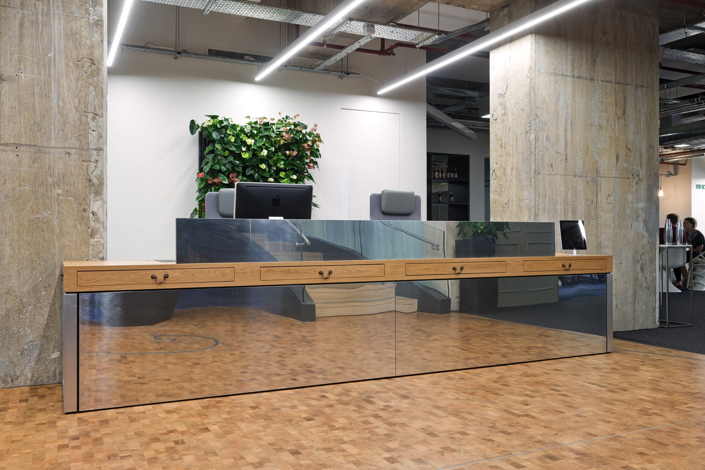
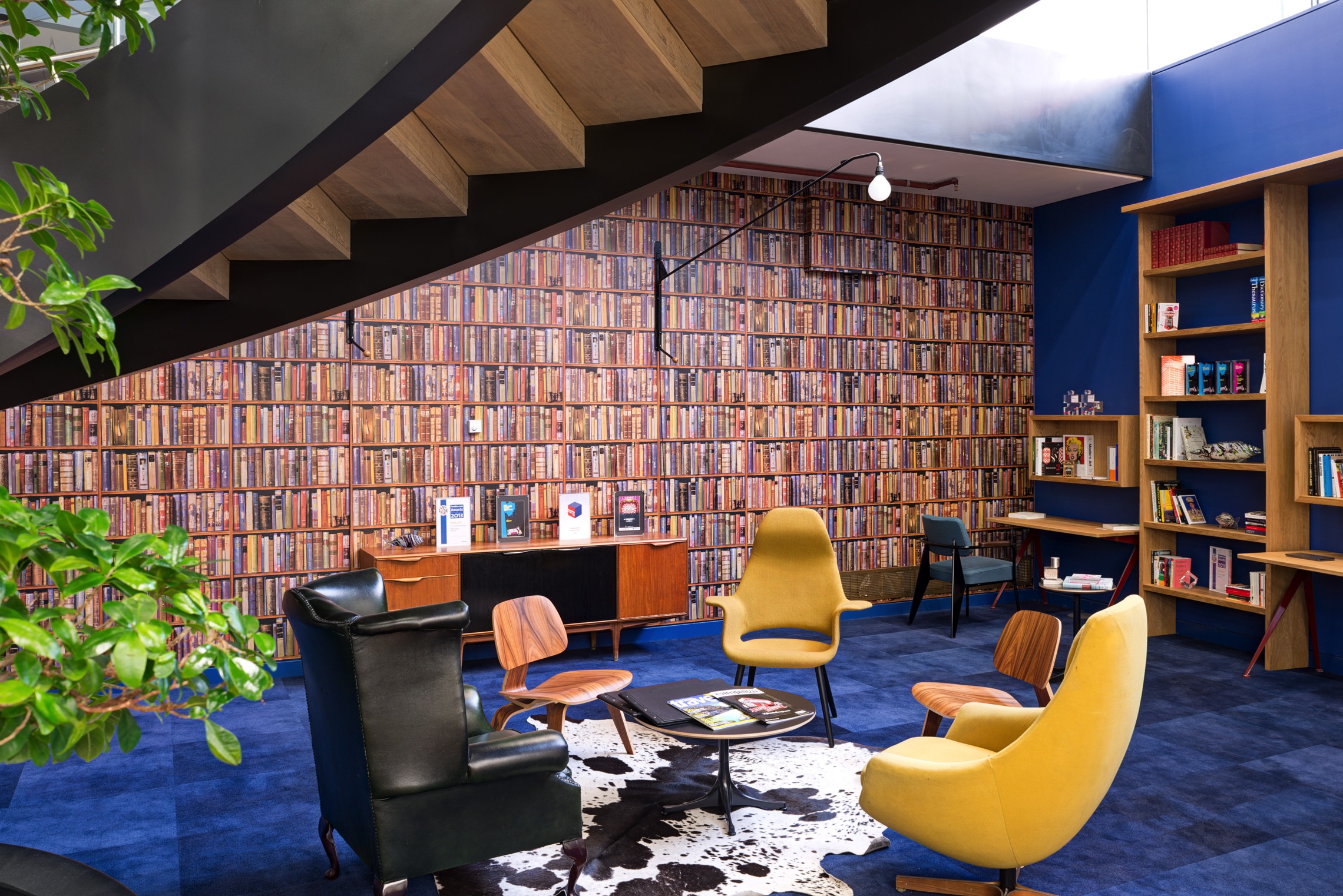
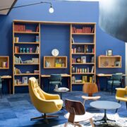
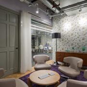
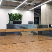
The domestic vernacular really kicks in on the lower ground floor – for clients as well as staff. As visitors descend, they are greeted at reception by BrandOpus staff from a bespoke, mirrored silver desk, with a series of shallow timber drawers along the top to echo a domestic piece of furniture. Scale is played with throughout, with a slight Alice-in-Wonderland feel and includes a gigantic ‘house plant’ at the foot of the stair, where the final spiral of the Fibonacci is detailed in polished stainless steel and inlaid into the oak, micro-parquet end-block flooring. The surrounding arrival area is in a vivid blue carpet tile and features an eclectic mixture of furniture, from leather wingback seating to classic Vitra chairs, arranged around a cow-hide rug. The back wall features library-book wallpaper by Rockett St George, whilst a bespoke wall storage unit houses three desk spaces for staff or visitors to sit, work or read at.
‘We reflected a domestic approach on this level in many ways’, Gurvinder Khurana continued, ‘partly through furniture, which ranges from specified and inherited pieces to ‘found’ and bespoke items, with everything from Vitra design classics to reclaimed credenzas from ebay - and partly through a comprehensive lighting scheme’
As part of the negotiation with the Derwent team, align omitted all the original CAT A lighting in the lower ground floor and designed a new lighting scheme from scratch to suit the multi-functional central spaces and intimate meeting rooms. The low-energy lighting for the lower ground floor includes discreet, square lighting ‘boxes’; Naked Plumen lights from Rockett St George; white Flos standard lights, including one half-set into the wall and a single, 22m-long linear LED light, which runs around much of the adjoining spaces between rooms.
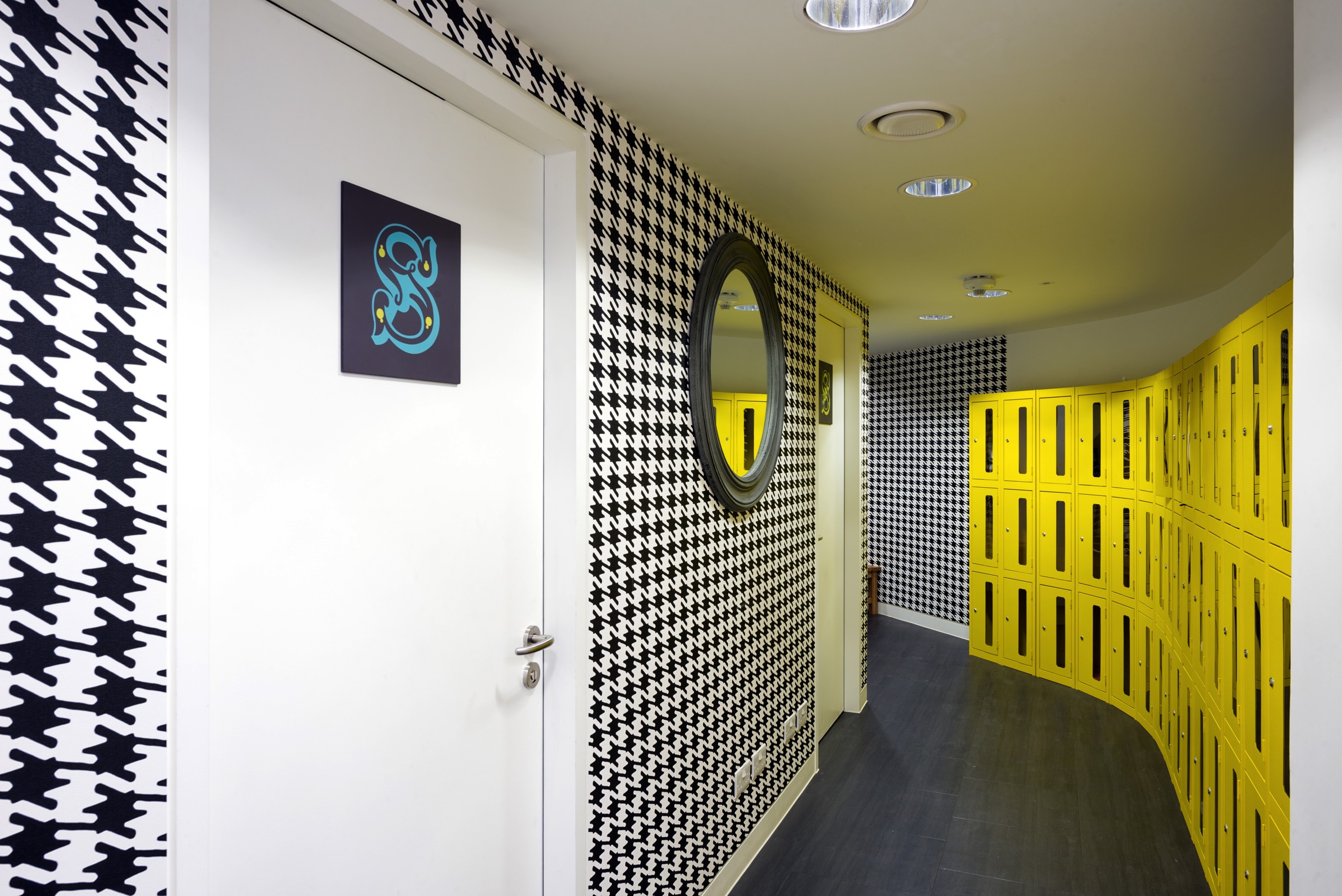
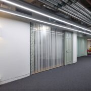
Meeting room names also reflect the ‘home from home’ theme and include The Study, Lounge, Snug, Drawing Room (essentially a board room space), Dining Room, Kitchen, Library and Conservatory. All feature hand-painted signs on the bespoke, domestic-style doors with black, faceted doorknobs by Pushka. Optional voile drapes allow for privacy when clients are sharing confidential product information. Whilst there are landlord toilets on all three floors, align were asked to add a further two in order to include dedicated (rather than shared) showers with the inclusion of a dressing area. It was a key requirement for team members to have a well thought-out dressing area with full-length back and front display mirrors for staff wanting to dress up and go straight on to a work event or awards ceremony. Bright yellow lockers in the corridor outside allow for switching between flats and heels, whilst giant dogtooth-print wallpaper by Tektura adds extra interest.
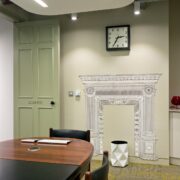
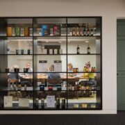
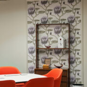
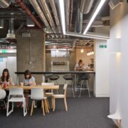
The Library space features a bespoke credenza, plus alcoves and glass shelving for display, whilst The Snug has a vertical LED light core as well as concealed lighting that washes over the Cole & Sons hummingbird wallpaper, along with a reclaimed sideboard, decorated with vintage, coloured glass objects (used in many places on this floor to reinforce the domestic aesthetic) and a display of individual seed packets set around the television screen. The Drawing Room has a two-sided glazed unit linking it to The Library for product display. The Study features a panelled wall-covering and a Vitra meeting table and chairs, as well as a reclaimed wall unit, whilst The Lounge features a 2D graphic of a fireplace, developed in-house by the BrandOpus team; the result of one of the early team design workshops. The Kitchen is unstaffed and is for staff to use to prepare food as they wish, with a huge-scale table directly outside for communal lunching. A magnetic dry-wipe board for staff messages also sits alongside – as does a pool table.
‘The Conservatory has particularly really great features’, Gurvinder commented. ‘As well a green and yellow volcano carpet from Chroma, the wall-covering is a hand-printed Italian wallpaper based on jungle animals, where different elements show up as you change the colour of the lighting (via an iPhone App). You might see tigers with green light, for example, or elephants with blue!’
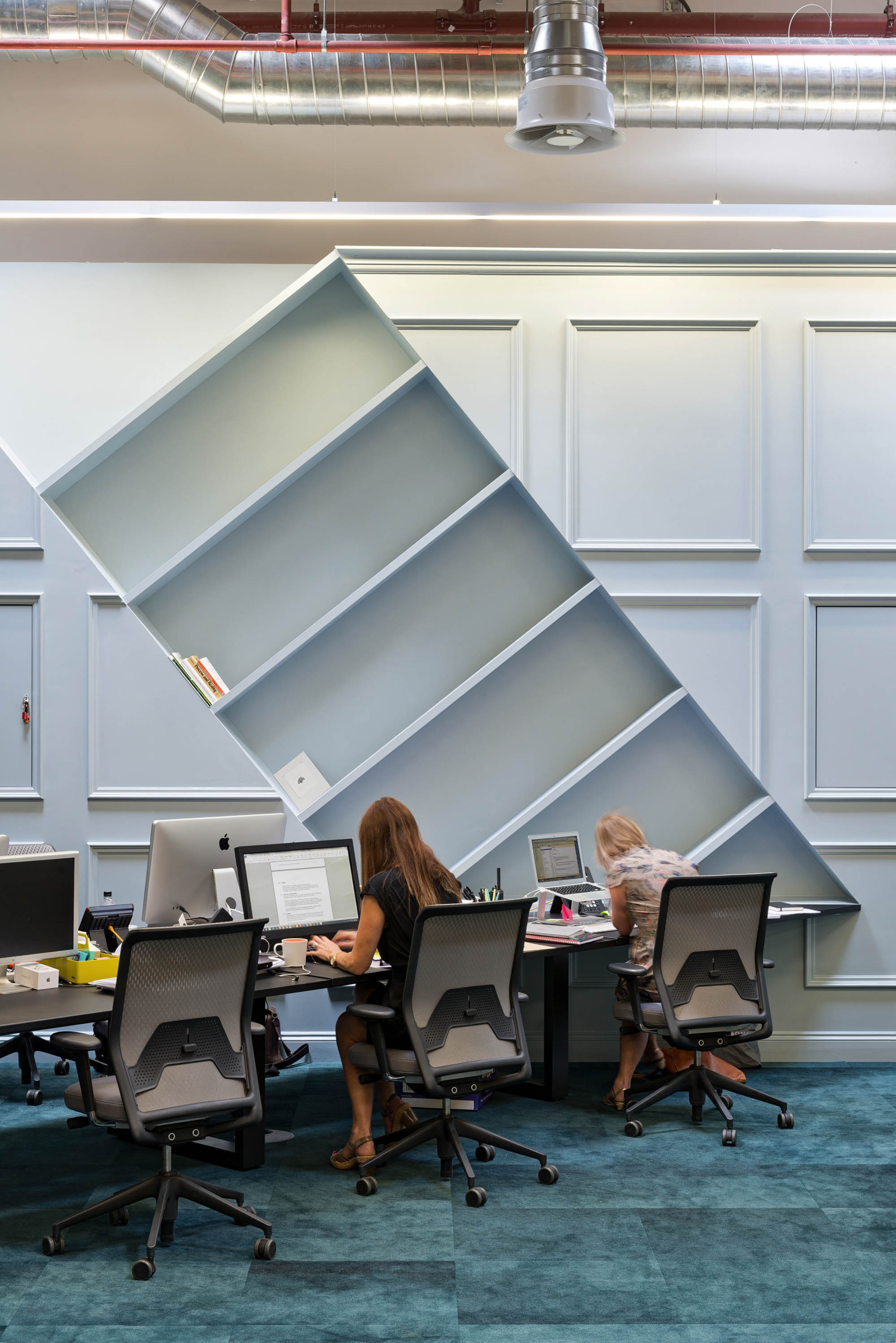
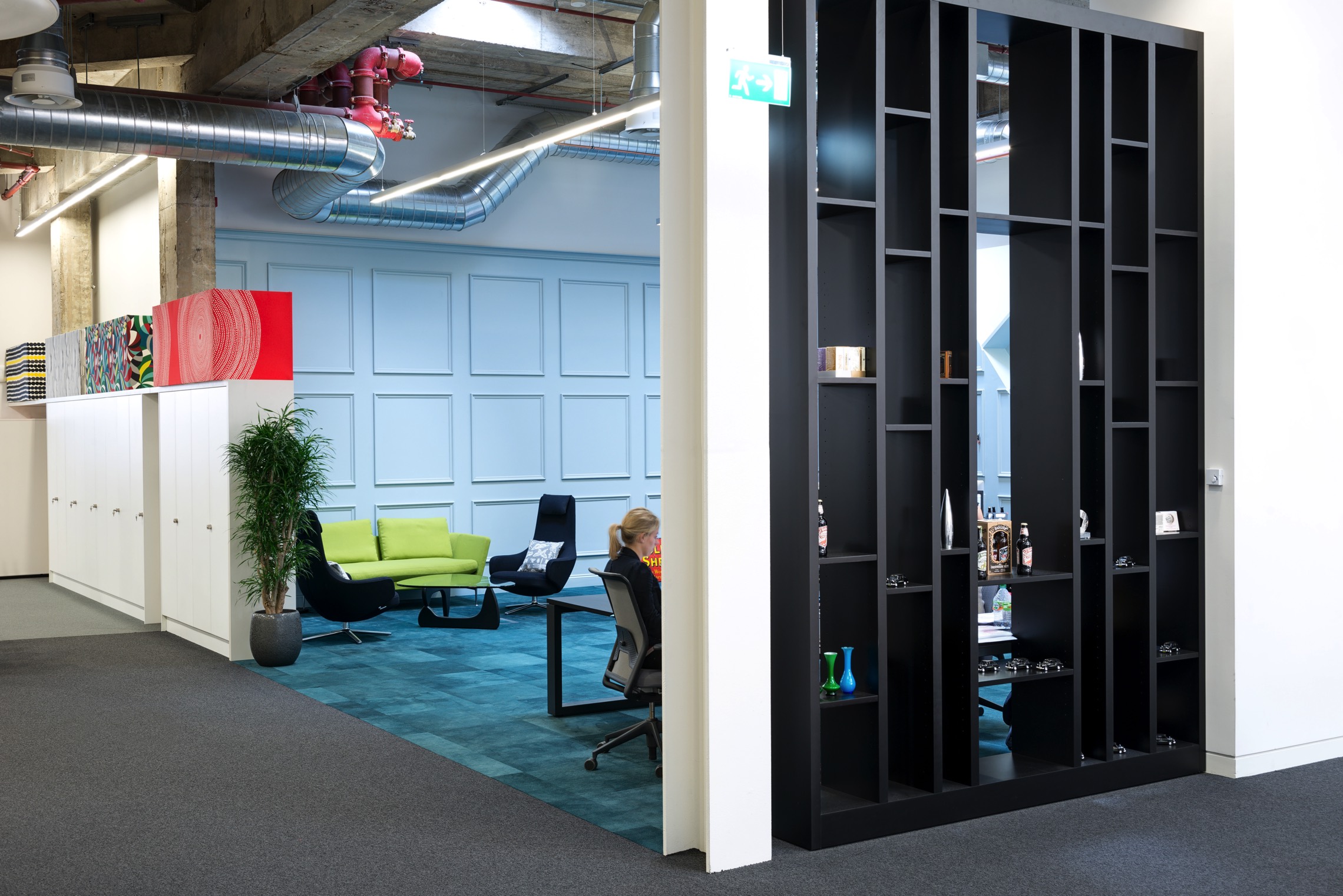
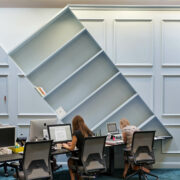
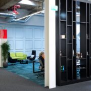
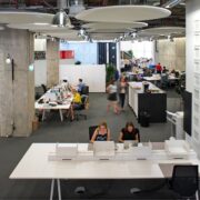
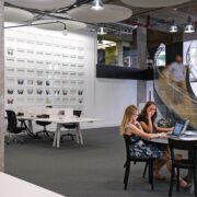
In the ground floor studio spaces, task desking and seating throughout is by Vitra, with the directors’/partners’ area set to one side and given a different design treatment, including baby blue wall panelling inspired by gentlemen’s clubs (which also conceals personal storage space) and a bespoke, absurdist book-case at a 45° angle, as if mirroring the desk it adjoins. This area is given further semi-privacy by a bespoke black joinery screen which provides display space for numerous awards and products along the wall that adjoins the open-plan space.
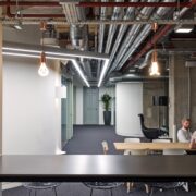
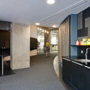
Black magnetic formica is in place all around the studio for displaying work, so that staff can also bring colour to the space though their work. The idea is that this band leads people through the studio spaces, subtly connecting them and therefore the teams within. Work review sessions can be then held almost anywhere and can be as impromptu as desired. Mobile caddies (parked centrally on the ground floor) allow for sample products and packaging to be easily on hand as people work. Where the black continues through the link space into Studio 3 (as per the plan numbering), it becomes fragmented and broken at the tea point by beautiful 3D black and gold tiles, chosen for their abstract map-like references. In this area too, where riser doors were necessary to conceal services or an electrical cupboard, align installed a series of reclaimed woven stainless steel wall panels (sourced at Retrouvius from a former restaurant site) making them effectively disappear.
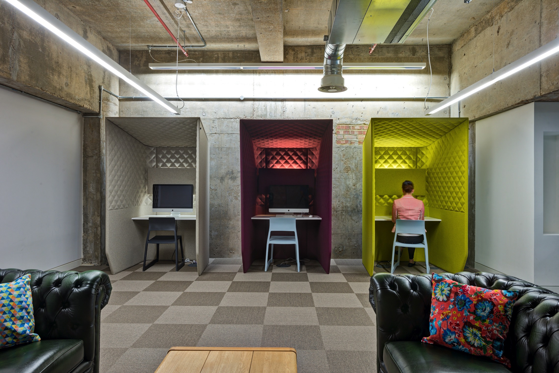
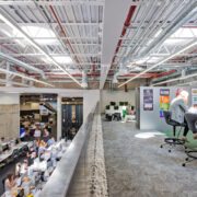
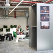
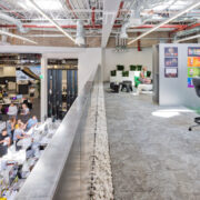
The floor finishes scheme throughout the project was conceived to delineate separate areas but also to remain interesting. Whilst a dark grey Desso carpet serves as a great neutral and hard-wearing base for the ground-floor area, with a lighter grey complementary shade for circulation areas, the directors’ section features a teal carpet tile by Shaw Contracts, whilst the production studio carpet has a striking geometric pattern. Black rubber is used around the tea point areas, both for delineation and for practicality, whilst up on the mezzanine, an ‘urban garden’ feel sees a tri-partite treatment, including a trough of washed pebbles, ceding to a wider concrete strip and then a strip of green carpet, with a display of plants at the far end of the space. A second mezzanine area, used for video-conferencing (and featuring three individual booths in fawn, burgundy and chartreuse) features grey chequerboard, close-weave seagrass carpet tiles. The mezzanine spaces were conceived from the outset as alternative working areas, designed to reflect the many different ways people work best, from being at a table, sitting on a sofa or relaxing on bean bag – or else taking a call in one of the conferencing booths. There is no shortage of options, just like a real home.
‘The building envelope, with retained rough concrete walls and exposed services, was perfect for adding colour highlights’ Gurvinder Khurana added. ‘Often this was achieved via flooring, but also using other focal points, such as a series of giant textile frames, which stand on top of storage outside the directors’ area and catch the eye, whilst also offering a little extra privacy.’
When it came to the company’s own visual identity, BrandOpus realised this was an opportunity for significant brand evolution and unveiled a new identity just two and a half months before moving in!
‘This wasn’t a problem in any way’, Gurvinder commented, ‘in spite of how tight that might sound for a new element to be introduced. At street-level branding, there were strict guidelines in place already for low-key brand applications. BrandOpus in any case asked for privacy, because of the commercially-confidential nature of a lot of their work. The external glass façade therefore has a manifestation which moves from opaque up to complete transparency at head height, with a thin grey line returning from the top of it, across the door and leading just to the company name.’
The new branding icon took the form of a butterfly, representing metamorphosis and change, integrated with the two faces of the Greek god Janus as the butterfly’s wings, suggesting a company that looks two ways – both back to where it has been and forward to future plans.
‘Because the new icon was so easily integrated’ Gurvinder Khurana said, ‘we could effectively let the butterfly alight anywhere and so incorporated a dark-sprayed version onto a stripped-back concrete wall just on the ground floor, tilted at an angle of 10° and visible from the street – and another onto the ends of the reception desk in silver.’
BrandOpus also had an idea for another butterfly installation on a ground floor wall, just above the circulation void: a 120-strong picture-frame installation with a cut-out butterfly within each. Staff are challenged to personalise each frame with their own BrandOpus-inspired visual memory or image to sit behind the cut-out, with the whole installation gradually filling up over time.
We are delighted with our new studio and I am so pleased that it has turned out to be everything we imagined and more. Thank you for the time and effort that has gone into getting us in. This place is truly amazing. We are extremely proud of it and I am certain that it is going to have a significant impact of the future growth of BrandOpus.’ - Paul Taylor, Executive Creative Director and Partner of BrandOpus
