From old to new
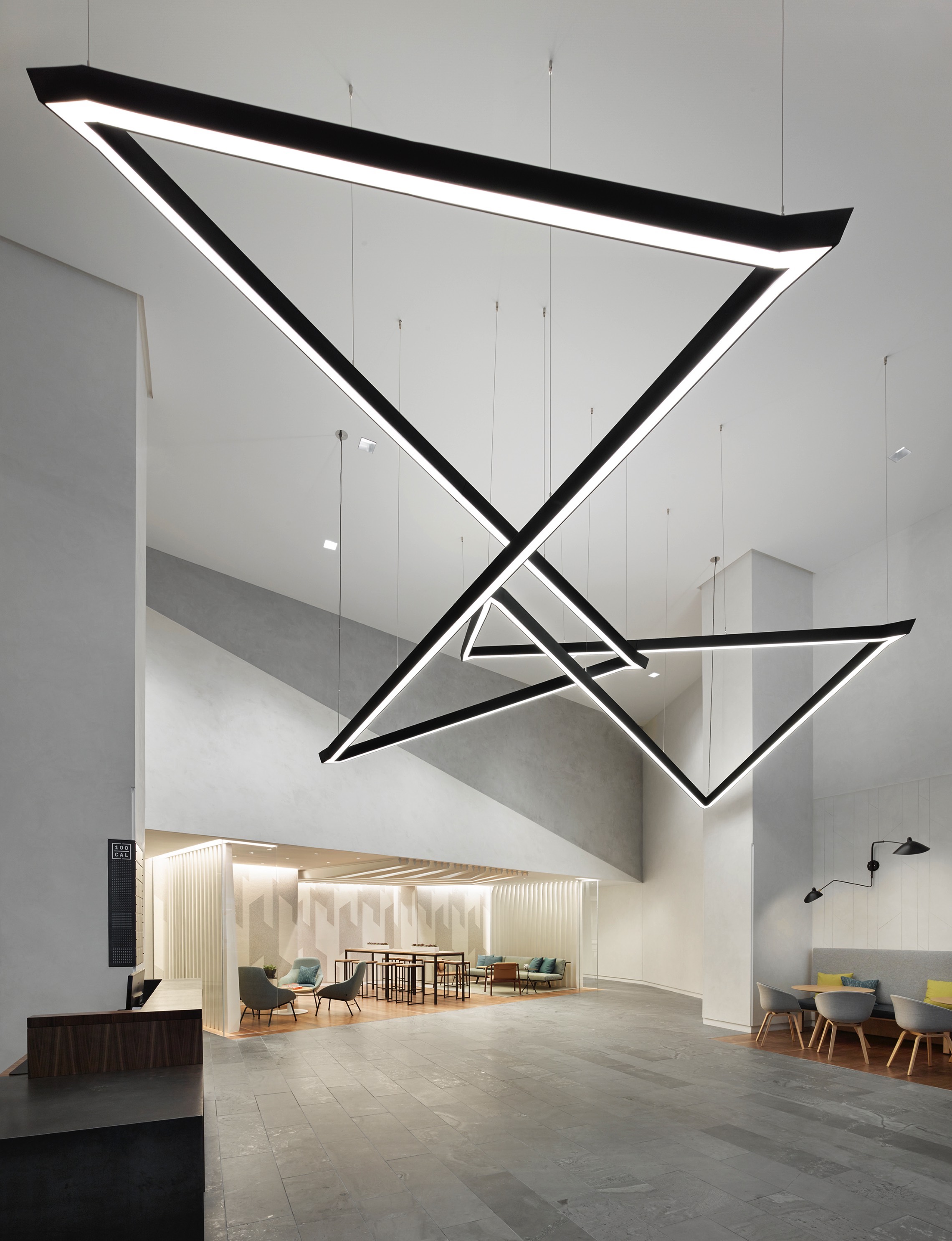
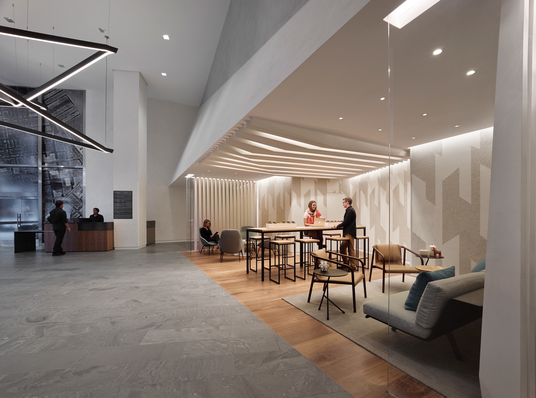
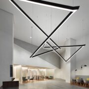
Blitz’s lobby renovation for the multi-tenant office building 100 California Street in San Francisco, CA, transforms the traditional waiting area into a vibrant building amenity that serves as a destination for tenants to work, meet, or socialize. The designers studied the site extensively to determine natural traffic flows and building access routes to develop a plan for the renovation. To create a more welcoming experience for tenants and visitors, thesecurity checkpoint has been relocated and redefined from the role of “guard” to “concierge” to provide users assistance as they access the building. A custom-designed light fixture is the focal point of the entire lobby and providesa sculptural element in the space. Several flexible and active workspaces create miniature “living rooms” to offer adynamic, multi-use area. The former basement has been renovated into an End-of-Trip (EOT) center to support alternative ways of travelling to work.
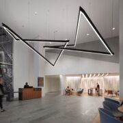
Upon entry, a 16-foot-diameter custom light fixture of two interlocking linear elements serves as the lobby’s signature design feature. The black steel-encased fixture, with sharp angular expressions, was created to feel like a 3D sketch in space. Many iterations of the design helped further reduce the element until it demonstrated lightness and fluidity.
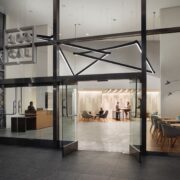
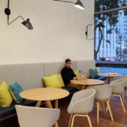
On one side of the window line, a banquette bench, round wood tables, and light-grey fabric arm chairs provide seating for small groups or singular, independent work. On the other side is a streamlined, cold-rolled steel and walnut desk designated as a concierge area for visitors. Flooring composed of honed English stone and walnut, as well as walls made of impact-resistant custom-scored lime plaster, provide warmth to the bright and airy lobby.
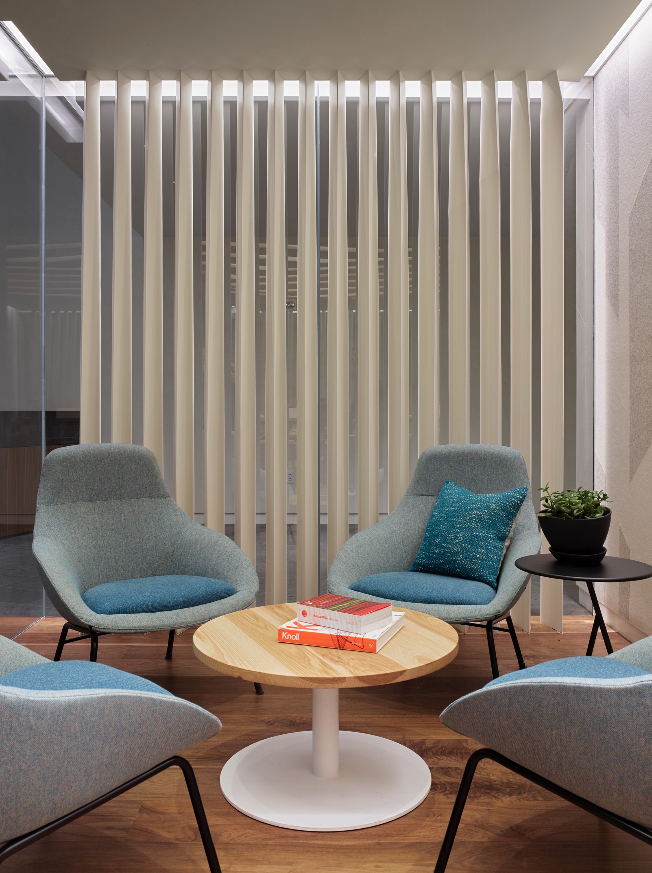
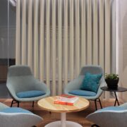
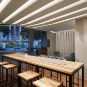
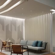
At the rear of the lobby is a flexible space with three vignettes, featuring residential-inspired furnishings, to provide a variety of sitting and meeting postures. Seating arrangements consisting of a sofa and arm chairs, lounge chairs and a coffee table, and bar-height work table and stools offer a range of comfort. A 30-foot-deep angular ceiling soffit, with custom-folded steel fins, forms a dramatic LED light canopy to draw the eye upward and visually expand the ceiling height. The steel fins are also used as vertical wall partitions on both ends of the seating area to engage visitors from multiple vantage points within the lobby. Abstract graphic-print wallcoverings and wood flooring demarcate the work/meeting space.
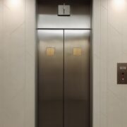
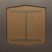
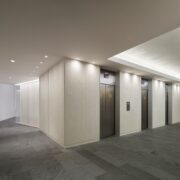
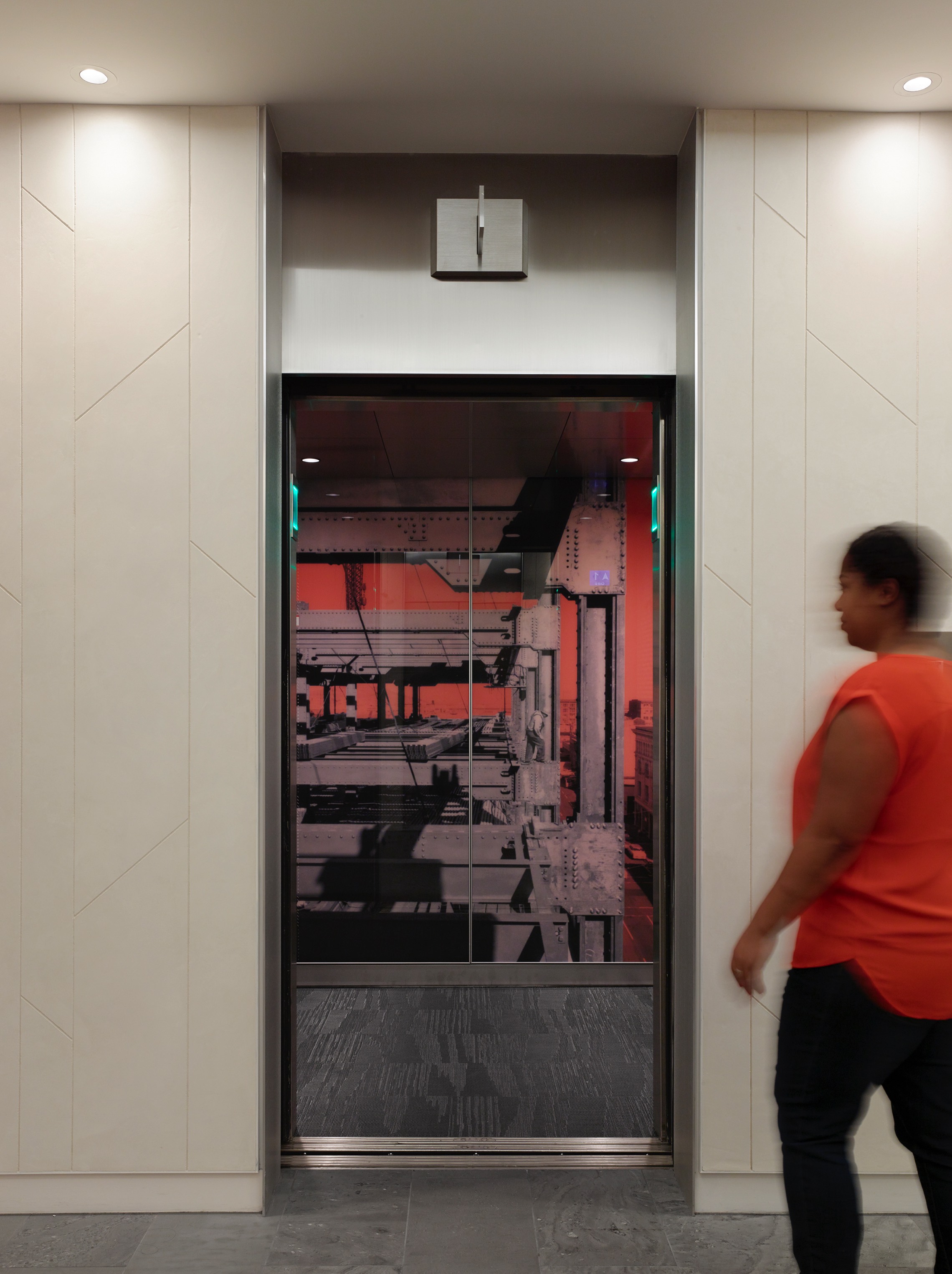
To honor the building’s past as a symbol of the Postwar American steel industry, the designers were inspired to bring a sense of optimism back within the context of the new tech industry that defines the Bay Area. During demolition, the original Bethlehem Steel logo was found embedded into the stainless-steel doors of the elevators. The designers and owner chose to retain the logo as a historical symbol and highlight it as part of the renovation. While investigating the site, Blitz also uncovered original photographs and drawings of the building. The historic photos have been duplicated into full-height posters on the back wall inside each elevator cab.
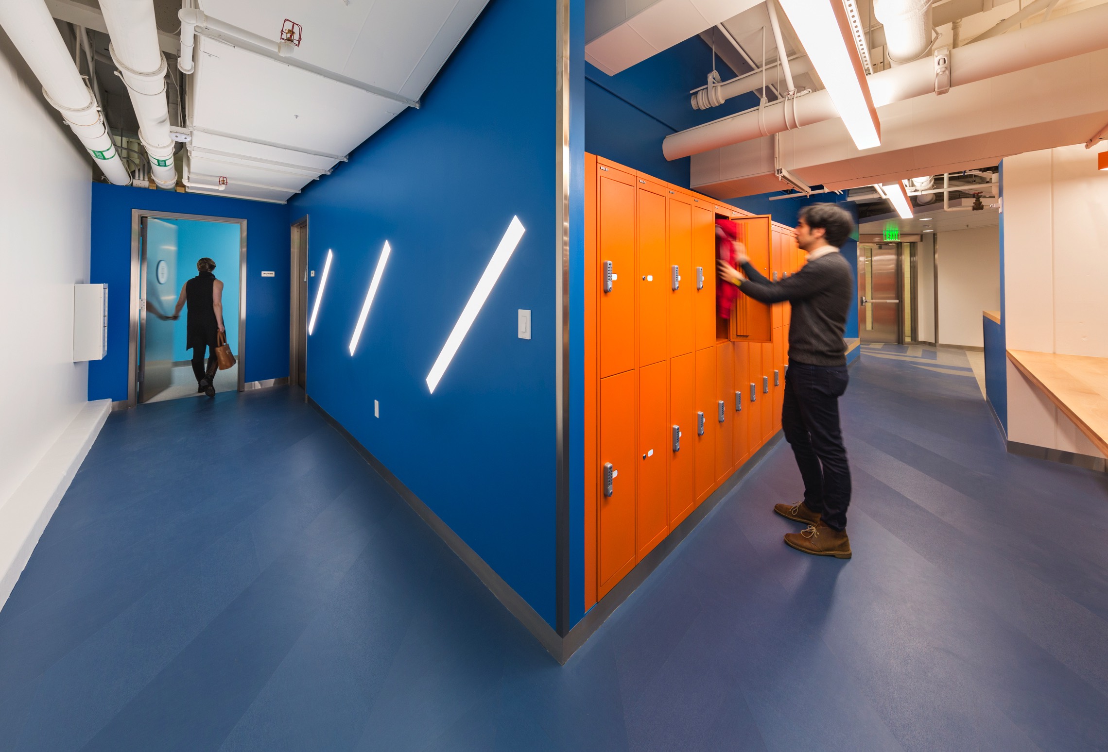
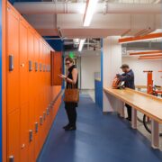
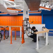
Blitz transformed the previously un-used basement into the new EOT center, a building amenity with bike parking, a freestanding repair station, showers, lockers, and seating. The designers worked with Bikes Make Life Better to analyze existing amenities throughout the city, such as bike lanes and repair shops, as part of early programming research. Paint in blue and orange, light fixtures with orange side panels, and LEDs diagonally inserted into the entry wall create a bright and welcoming area.
