Evolution Design is one of the world’s most innovative, renowned and successful companies in office design. Based in Zürich and London, this multiple award-winning architecture and design company was founded in 2004 by Stefan Camenzind. We talked to Stefan and Evolution Design’s creative director Tanya Ruegg about what office spaces have to deliver to provide workers with the best possible support and why it can sometimes be worthwhile spreading your butter thickly.
Ms Ruegg, Mr Camenzind, what can a business do to offer the most attractive office environment possible?
Tanya Ruegg: Aside from the functional needs, it’s important to make sure that employees identify in a deeper sense with their place of work. If I say, “Staff should feel at home”, I don’t mean that offices should be as comfortable as when you’re lounging about on a couch in your living room. Employees should feel recognized, nurtured and that they’re in the ‘right’ place, that they’re part of a community that shares common values and goals.
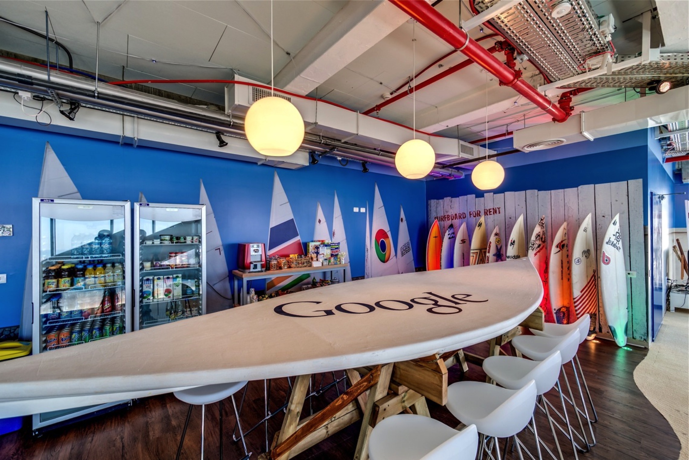
Google, for example, is a bit more lively and playful in that regard than other businesses, but those aspects are the same everywhere.
Stefan Camenzind: Studies have shown that employees don’t just work to earn money, but that they also strive for purpose. And when they find it in their working lives they become more efficient, productive, motivated and often less prone to taking sick leave than when that’s not the case. So there are good reasons from a financial perspective to offer employees the feeling that they belong to a company and that they’re working with people whose values they share. That’s the reason why standards in office design have risen compared to ten or twenty years ago.
In this context, how would you describe the qualities that make Evolution Design special?
Camenzind: We always try to work in a user-specific way. One should feel the impact of the company, and at the same time the users should sense themselves, too. That’s our specialty and that can express itself in very different ways from one project to the next. Our work might be a bit more colorful than others, or use a more diverse range of materials. But that’s only because it’s a human need to spend all those years of one’s working life in lively rooms rather than in sterile, dull ones. We recognize that most people value access to different atmospheres and forms of haptic input, and that runs through all our projects. Our unique approach is to reflect ubiquitous human needs, if you like. We try to create a system in which each employee can react to their own individual needs in an optimal way. In our view, that offers the ideal foundations for an environment where employees feel satisfied and valued. If that’s the case, then those people can give their best for their employer. In our view, it’s all about recognizing employees as people.
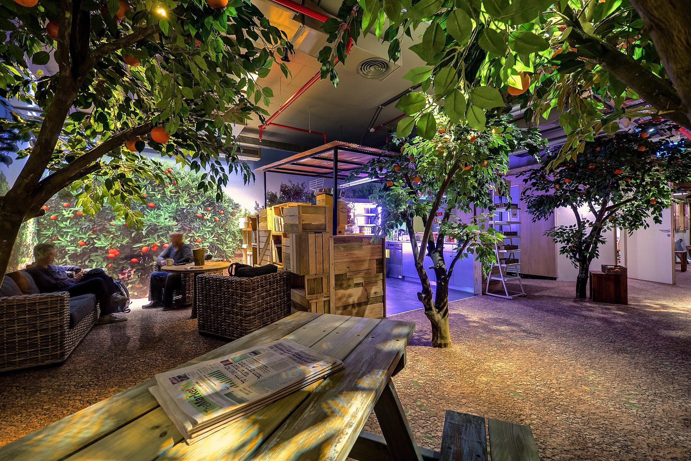
Ruegg: Of course, it’s never just about the office space. Next to the planning aspects, all our projects include aspects relating to communication, planning, HR, change and IT. All of these are crucial to the project’s success. We consider these elements together. Sometimes we create different workspace environments, even in situations where that wouldn’t be necessary according to the activity-based working approach where, say, all the employees do the same thing, such as in a call center. But humans need variety and carry in them the desire to make choices. As an example, for one client we designed different environments with exactly the same facilities for accomplishing the same task. The employees can decide if they want to work in a fishing village atmosphere, a floral environment or somewhere that reminds them of a Starbucks.
What are the core needs shared by most employees independent of what they do?
Camenzind: For human beings, the most important thing is self-determination. In everyday life, we decide where we drink a cup of coffee or read a newspaper. Until recently, that wasn’t possible in the office. How many different environments should be created for a given business depends on the concrete needs. Sometimes it’s two, sometimes it’s eight. There are no hard-and-fast rules.
For us, it’s important to see people in a holistic way and to offer them an environment that reflects not only their functional but also their social and emotional needs.
The needs of the employees then depend on the effective needs.
How do you establish what the concrete needs of the employees are?
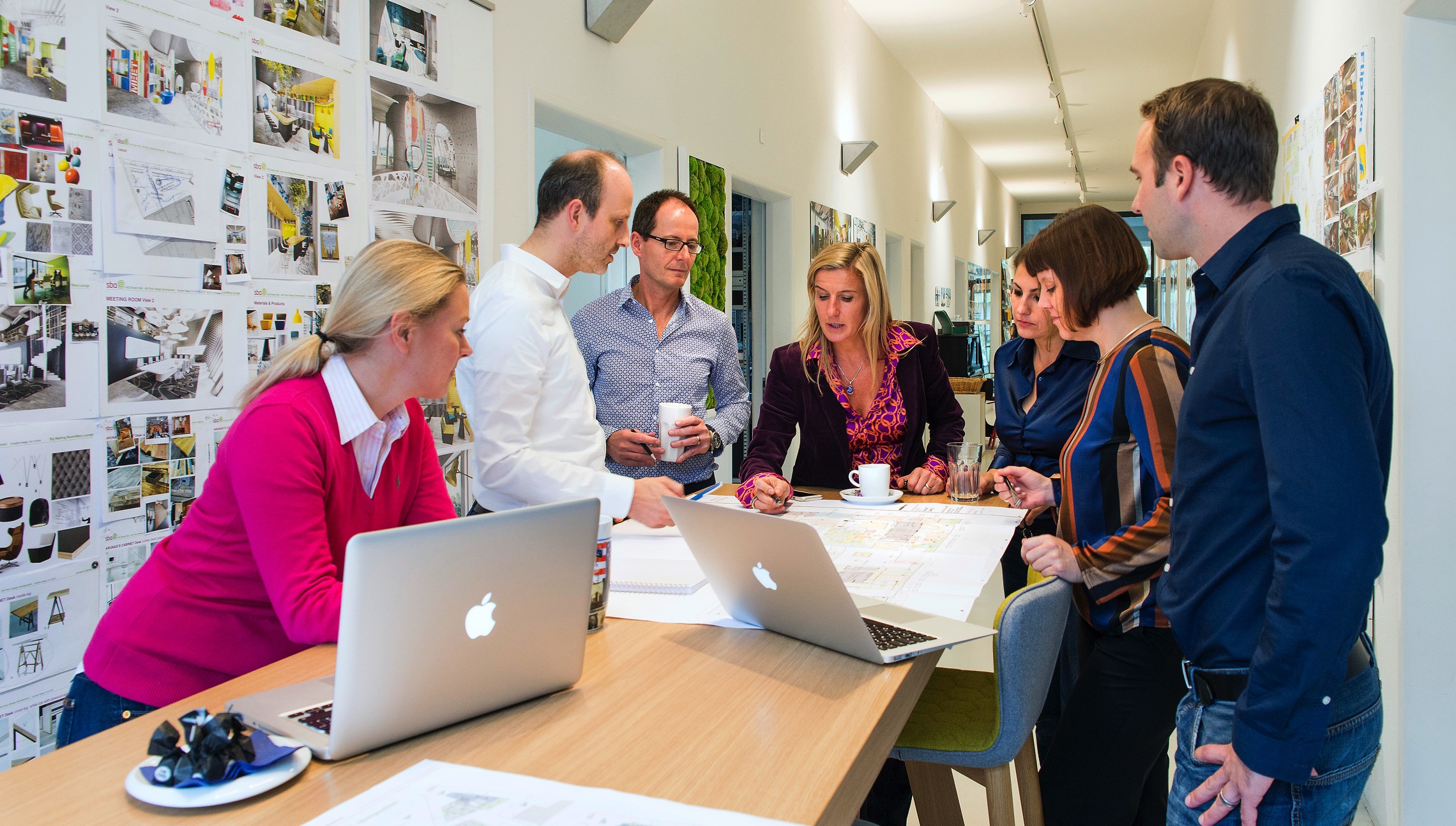
Ruegg: We do this through intensive surveys of the employees and comprehensive work style analyses. Here, we ask the question: What does a person need to be productive in what they do?
It’s vital to really understand the employee and then to take them with us on this journey. The project will not succeed if the employees don’t support it. You might know the adage: “Planning is sometimes quick, but people are slower.”
Given all these holistic approaches, what role do cost factors play?
Camenzind: They are, of course, very important. We don’t work in a vacuum. That’s why it’s vital to perform a precise analysis to determine which elements can deliver the greatest degree of satisfaction and best convey a sense that people are valued. Desks, tables, floor coverings and partitions are important, of course. But they aren’t always the decisive criteria for the employees. As an example, it might be far more effective in a 60,000 m² space to provide two or three insanely expensive coffee machines each consisting of fifty components than installing the most expensive, aesthetically pleasing partitions with glass corners. Sometimes it can be worthwhile to use your resources at specific points, to not spread the butter evenly across the bread but to spread it extra thick at certain points, so to speak.
One of your clients is Google, who commissioned you to design interiors for their Zürich, Tel Aviv and Dublin sites. What factors are common to, and what factors differentiate, the work environments across these locations?
Ruegg: As well as these very large sites, which are more like campuses in scope, we also designed Google offices in Moscow, Oslo and Stockholm. You can recognize the corporate philosophy of Google as a globally active company across all six sites. At the same time, you can also feel and experience a special character specific to each location.
How do you ascertain those regional differences?
Ruegg: The themes for the location-specific aspects of the design weren’t laid down by us. Instead, they came from consultations with the users. We then translated these themes into architectural language. The solutions we found don’t represent us as architects, rather they represent the users we surveyed.
What, specifically, are those location-specific design aspects?
Ruegg: Let’s take Google’s site in Tel Aviv as an example. The users there wanted each floor to show a certain facet of the country, but always in a way that connects to personal and emotional components that influence the people that work there. On the floor that represents Tel Aviv itself, we tried in an abstract way to give the theme of happiness a face. Tel Aviv is a happy city.
Moscow is a very different example. The people there didn’t have much interest in identifying with present-day Russia. Instead, people chose scenes and characters from stories that they knew from their childhood, such as the tales written by Pushkin. The walls include motifs such as fairy tale forests, witches, mythical oak trees, talking cats or the Russian version of Winnie the Pooh, which looks different to how I remember it from my childhood.
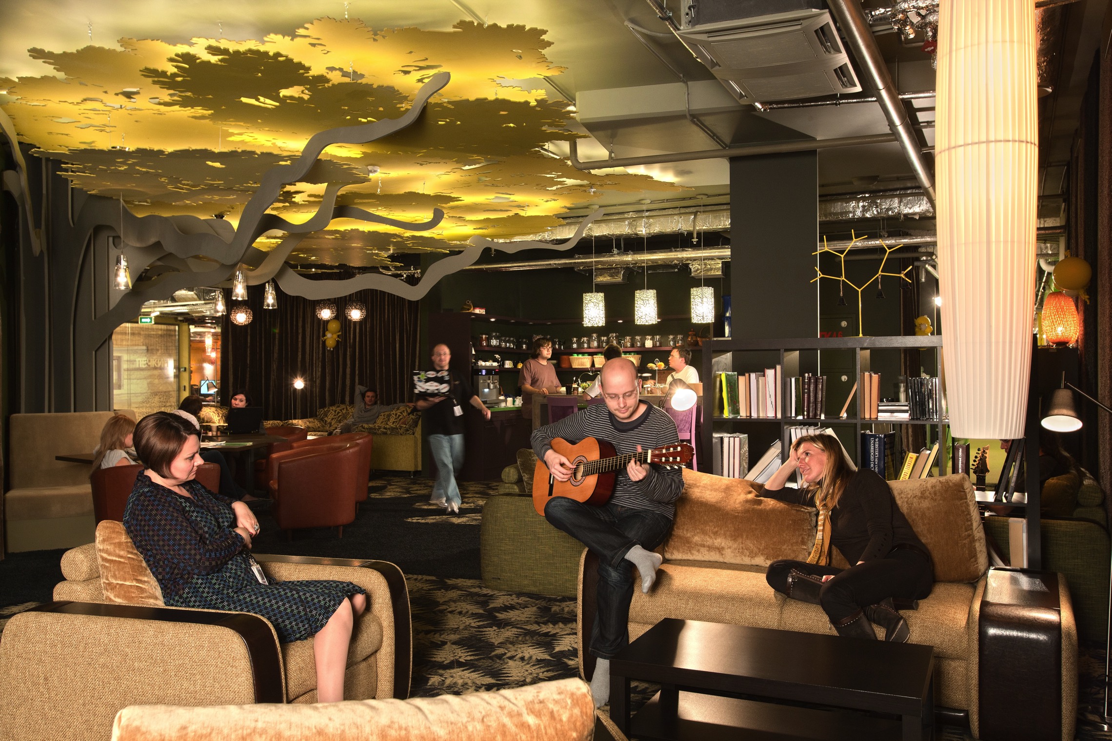
Camenzind: Coming from Central Europe, it was interesting for us to see how present certain characters from Russian stories are in the daily lives of adults, for example in the costume industry. These stories are part of Russian culture. We made the previously mentioned oak tree to the focal congregation point, a place where people can meet up and chat. That was a fascinating aspect of working with Google. Next to the functional aspect and conveying Google’s culture, which is the same at all its sites, this was a way of showing newcomers (Google staff move between sites relatively often) something about the special character of that location.
It’s a blazingly hot summer day in Zürich. Could you please describe to me the room from which you’re talking to me right now?
Camenzind: It's a bright, lounge-like meeting room. There are comfortable chairs and a standing desk. It makes the heat relatively bearable.
What does the working environment at Evolution Design look like?
Ruegg: We work in rooms that are well-lit and friendly but also simple and functional. We want to capture the essence of other business cultures and then translate those into architecture and an appropriate narrative. To that end, we need to surround ourselves with white walls without any decorative elements that might distract us, to prevent us from transferring the moods and atmosphere here to our clients.
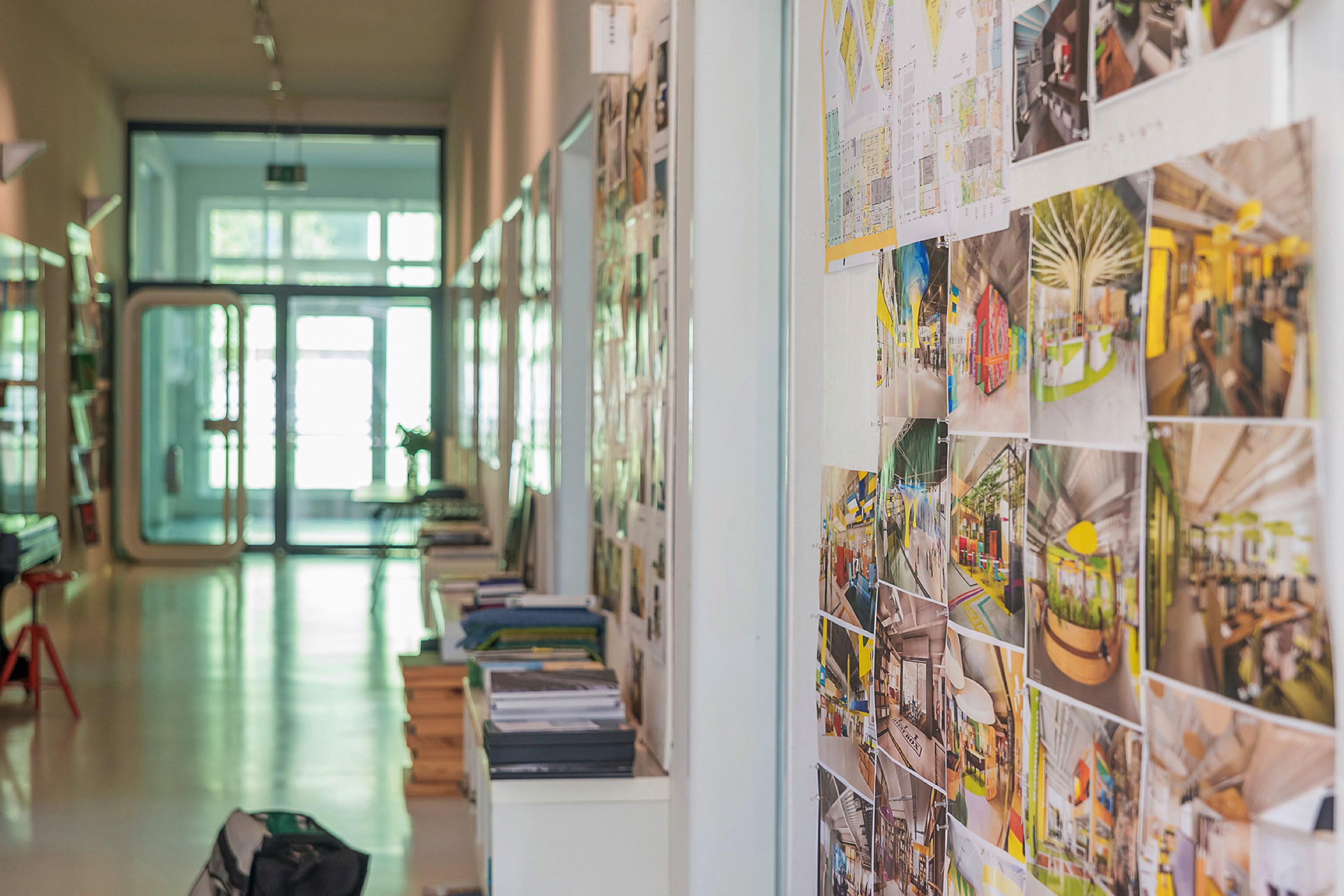
Camenzind: But we’re still surrounded by temporary splashes of vivid color because we always build a scale version of the design for each project.
In our company, by the way, everyone can come and go when they want. We have deadlines and appointments, of course. But our staff decide for themselves where and when they work. In terms of the design of our own office, our aspiration is that our people have the feeling that they can work best here on-site and that that’s the reason they’re often here. Most of what we do is accomplished in team work. But anyone who needs to go elsewhere for some quiet or inspiration is welcome to do that.
Because our office is 300 m², there is limited space for people to withdraw for some peace and quiet, and we have to accept that. It’s an important part of a normal working life that we find short-term ways of dealing with unchanging, intransigent factors. That’s something we always try to convey to our clients.
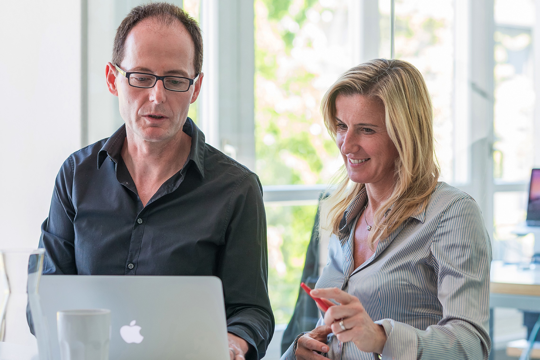
Ms Ruegg, Mr Camenzind, thanks very much for talking to us.
Header Photo: Evolution Design, Photographer: Peter Würmli
Author: Jonas Demel
© Office Inspiration
For the commercial re-publishing please contact office@officeinspiration.com

