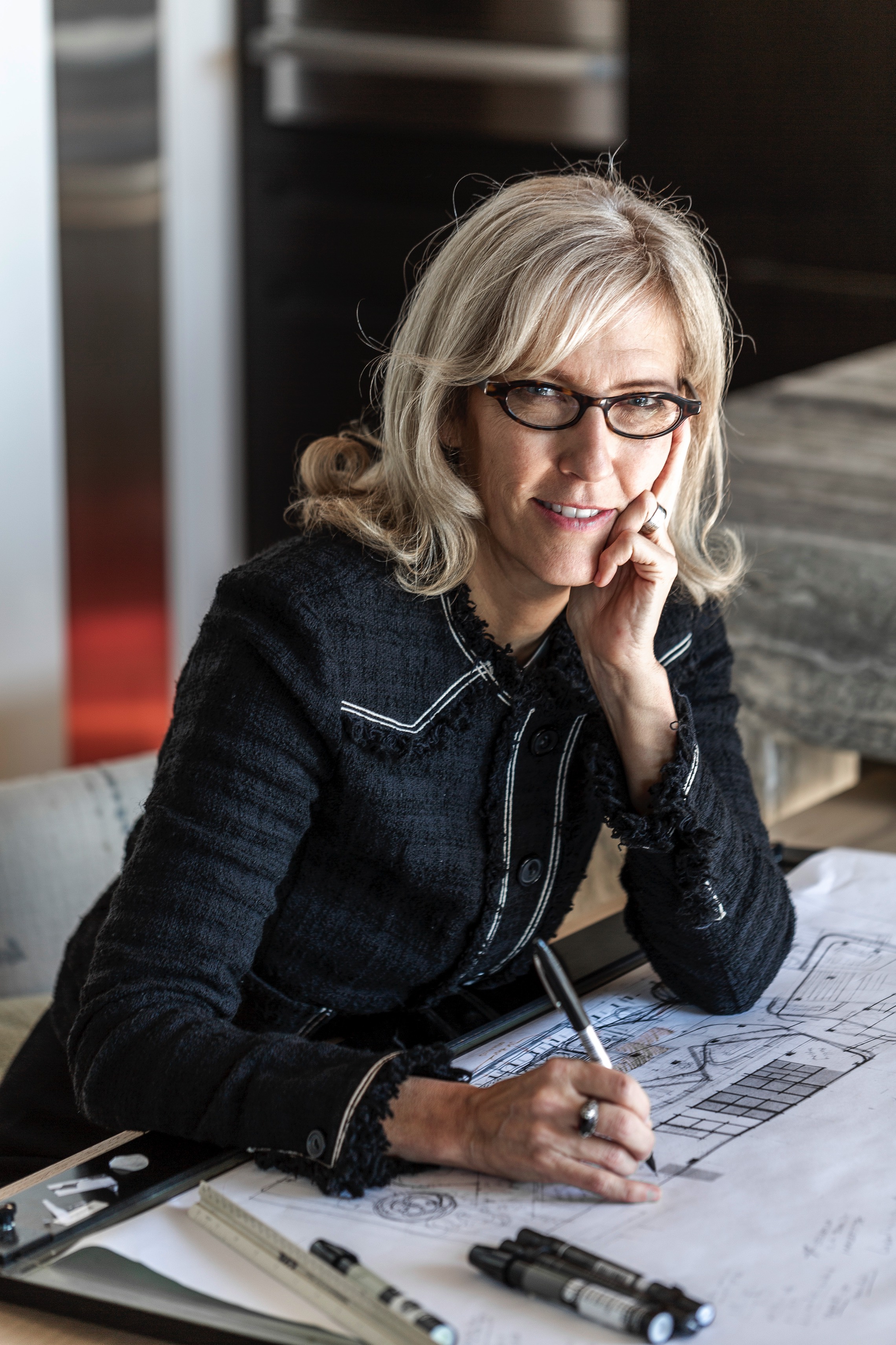
SkB is a full service architecture and interior design firm located in Seattle, Washington, which considers itself as a "boutique design firm“. Sounds modest and cosy. But SkB Architects developed the Microsoft Design Language for Place, which is essentially a "living" guide for the design of all Microsoft facilities worldwide, which means: 45.9 million square feet spanning over 779 global sites.
Shannon, let us start big: What must the ideal workplace solution – apart from specific demands – take into account in any case?
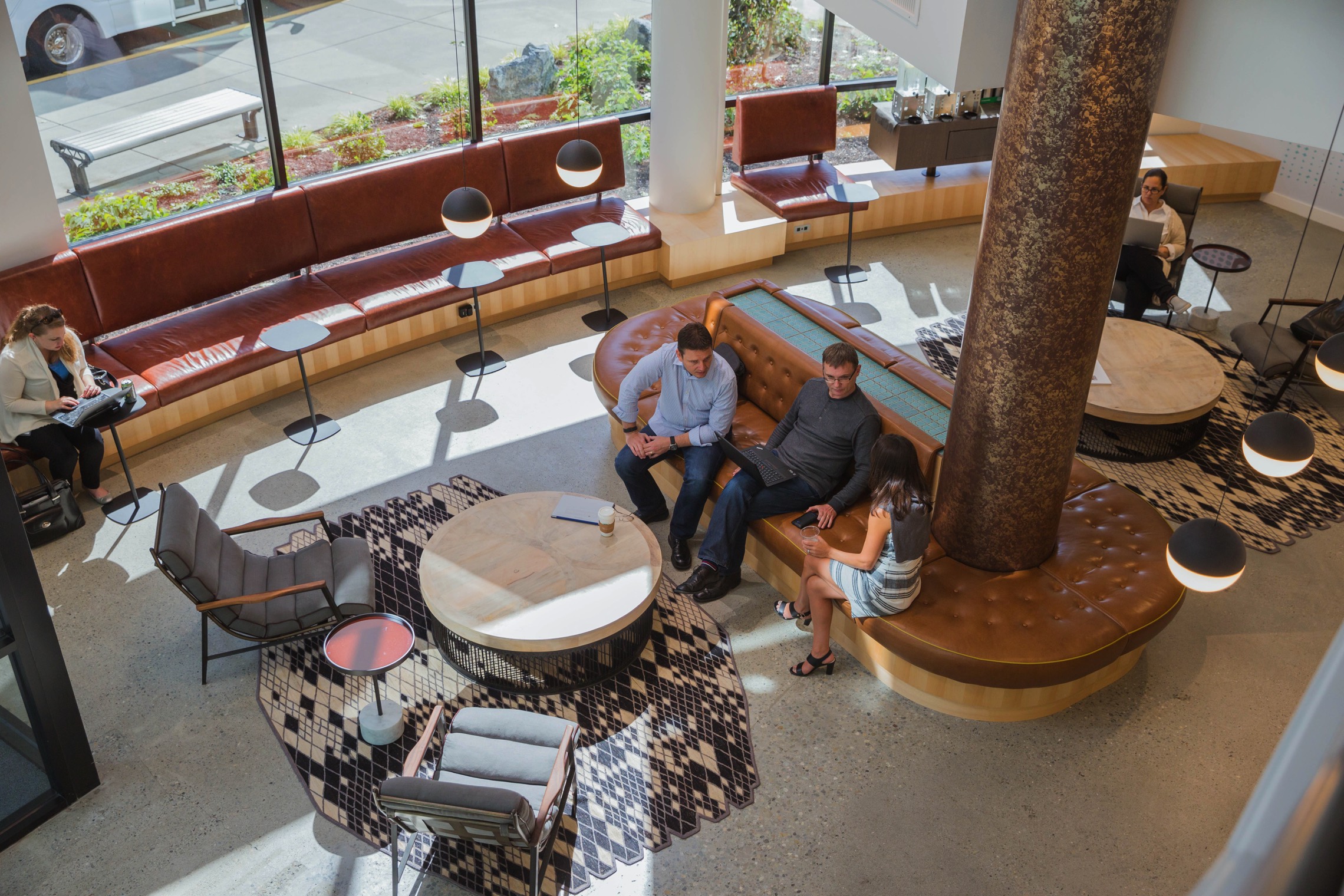
Shannon Gaffney: Start with the people and move to the processes. Time and again, our research and design practice has shown us that the ideal "workplace" doesn't feel like an office at all. It offers a wonderful variety in privacy types and seating. The most successful spaces are often a blend of hospitality and residential qualities coupled with any specific spaces necessary to operations - labs or clean rooms for example.
A focal point of your work is the interdependence between productivity and workplaces. How does this approach fits to the SkB-guidance which puts in your own words "people first". And what does that mean to your regular work?
Shannon Gaffney: There may be too much emphasis on the word "productivity". It has a little inference of "factory -like production." We're students of the human condition. Make employees, guests and customers happy and good things for the business will inevitably follow. We like to think that we are social psychologists and creative strategists – and that is being a Designer.
When SkB starts a new workplace project: is there something like a "general approach"?
Shannon Gaffney: There is always a visioning or goal setting session at the start of every project. Its important to understand where the workplace culture is coming from, where they think they want to be as well as to get glimpse of the social dynamics within the decision-making group. So it starts with understanding the culture – the now and where they want to go. At some level we actually try not to ask what they want as most people invent a solution without fully digesting the goals or challenges. We tend to, very quickly, put ideas and big picture schemes in front of them, not as a solution but as a discovery tool to help them visualize ideas they might never be able to visualize or explain for themselves.
Let us continue big and talk about Microsoft: In collaboration with Microsoft you developed nothing less than a so called "living guide" for the design of all Microsoft workplace facilities worldwide. Which means for an inconceivable number of square feet and global sites. In which period did the work come into being?
Shannon Gaffney: That initiative launched in 2015 and continues to this day. There were many projects going on where we ran parallel paths in 2015 with completing the document, while advising design teams concurrently. You know, designing the plane while it's in flight.
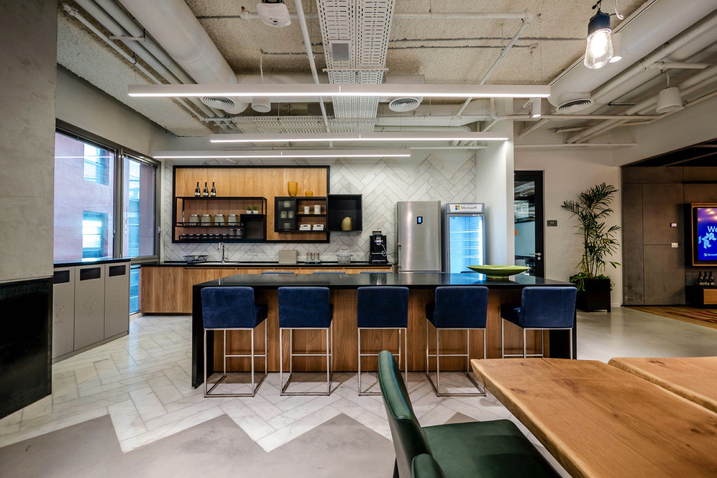
Before, during and after your guideline work: How often did you personally visit different Microsoft offices?
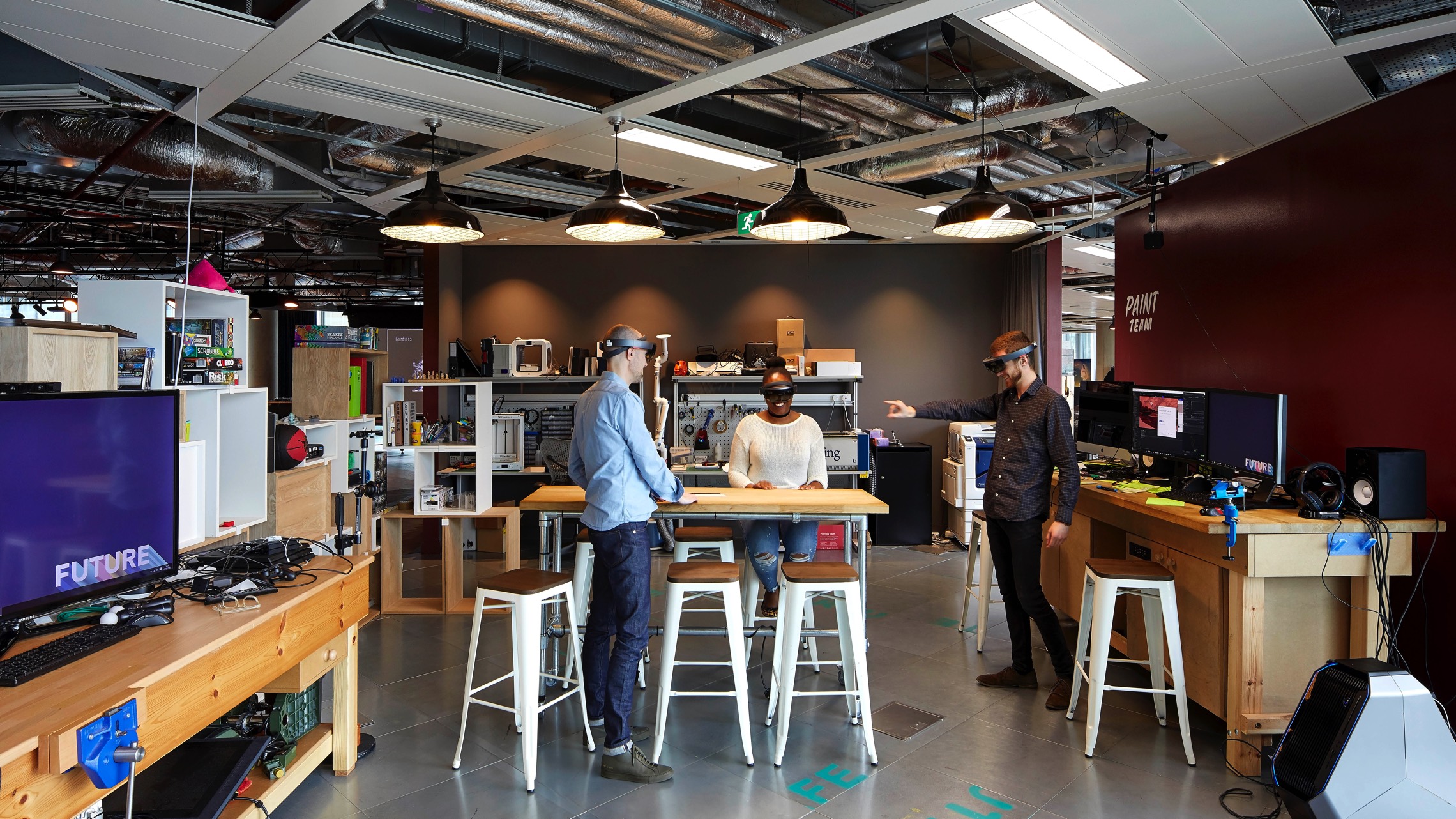
Shannon Gaffney: A fair amount. We have consulted for offices in London, Dublin, Sao Paulo, Costa Rica and Sillicon Valley.
How did the Microsoft offices all over the world looked like when you started? What – if so at all – did Microsoft offices have in common back then?
Shannon Gaffney: The challenge was that there was no consistent look or feel globally. Microsoft had dozens and dozens of real esate professionals and designers all over the world implementing their best take on Microsoft guidelines - with wildly varying results - few of which recognized the unique context for the given office. Outside of key global sites, many environments relied on the colors from Microsoft's logo to make it "feel like Microsoft". Not a great strategy. Also at the time there was a language perpetuated by many real estate-esque groups that continually used the word "tech" when describing what Microsoft and other technology or social media companies should look like. White walls, red chair, bright screen accents, seven on a wall – same old, same old. We tried to break people of using that word as a descriptor of space because it didn't mean anything.
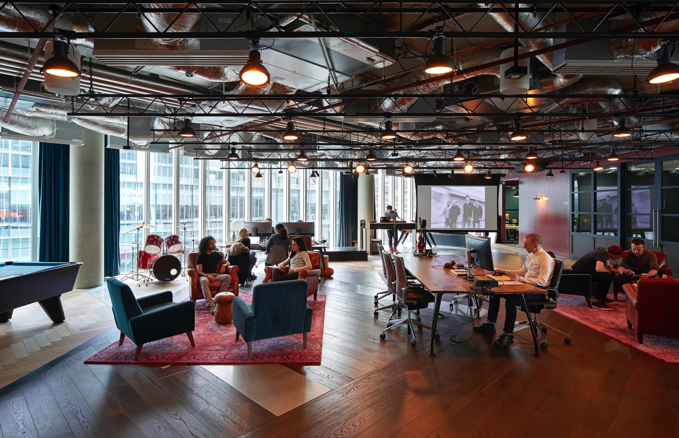
What did you want to achieve by creating this living guide? What was your main goal?
Shannon Gaffney: The goal of Microsoft's Design Language is to provide guiding principles, attributes and qualities that should embody and convey Microsoft in a visual, but also in an emotional way, plus it's particular locale in the world. It's equally important to tease out. I say "tease" because we encourage people to go beyond cliches and typical metaphors, like the Eiffel Tower in Paris or salmon here in Seattle.
Salmon for Seattle? I rather think of Kurt Cobain or Tom Hanks on a landing stage, which does not appear more original I have to admit.
Shannon Gaffney: I agree, that is just as boring. That is why we advocate for people to dig deeper to convey a sense of place. Before the Design Language there was nothing a design team or design manager could point to that adequately expressed the visual brand and identity that Microsoft was looking to convey. Spaces should be unique and reflect their region but still be a part of a single Microsoft family. The visual attitude should holistically represent Microsoft. You should know you are at Microsoft without seeing a sign.
How should I literally imagine that living guide? How explicit, detailed and fragmented are these guidelines?
Shannon Gaffney: The Design Language for Place starts very broad and progressively dives deeper and gets more specific. It is a guide that should inspire design solutions and not be taken as a directive to do exactly what is shown. It intentionally avoids "do this". It hopefully explains the "why" and gives one examples of the "what". The guidelines are explicit and very specific. Specific examples - from flooring to acoustic considerations - are there to help explain ideas. Imagine one of those "choose your own adventure" books, except for design and real estate professionals.
What were the biggest obstacles to create a coherent design language for Microsoft offices all over the world?
Shannon Gaffney: One of the biggest challenges was that non-Puget Sound. Microsoft real estate people believed the ideas and visuals were too "Seattle-ish"; too soft; too casual; too tactic, not bold, polished, slick and colorful enough. We quickly illustrated that some of the inspirational imagery was from around the world, China, Brazil, Australia, etc. We obviously listened but more or less stayed the course. It did raise our awareness about how each place in the world views themselves and we needed to be very mindful of that.
Which communication challenges were connected with that gigantic project? How close was your exchange of views with the board of Microsoft?
Shannon Gaffney: The typical challenge, conveying intent and spirit without explicit solutions and defining specific ideas that would eventually become signature characters - defining elements. That usually has to happen over time. A recurring idea that morphs a bit from project to project.
In which respect do the space feel, look and function of todays Microsoft offices reflects the new culture of Microsoft? Especially in terms of brand messaging, workplace design and culture fit?
Shannon Gaffney: Short answer: a more human tactile feel, but also a living experiment and work in progress.
Is it possible for you to give me a specific example for the design-coherence in, lets say, the offices in Auckland, Noida, Nashville, Moscow and London?
Shannon Gaffney: If it's a developer community spacial arrangement is common. They arrange themselves in 8 to 12 person neighborhoods that have an autonomous feel. This functional approach inherently shapes relationships that can feel similar. Very seldom is it any longer a bright white cold office in one plan and a cozy homelike environment in the other. A slightly more casual attitude permeates in all places now.
Is your Microsoft-project ever about to end or do you see it as an ongoing process? And is this "living guide" written in stone or does it change regularly?
Shannon Gaffney: It's evolving. Many brands evolve as culture evolves.
In the second part of our interview, Shannon Gaffney talks about her work for Boston Consulting and a local radio station and why she does not fancy fixed office hours for her staff and herself.
Author: Jonas Demel
© Office Inspiration
For commercial republication, please contact office@officeinspiration.com

